“Mere colour, unspoiled by meaning, and unallied with definite form, can speak to the soul in a thousand different ways.”
– Oscar Wilde
I like to look at the question “Why that color?” a little bit as if it were Alfred Hitchcock’s MacGuffin — a plot device that drives the story, but is ultimately of little importance. Even as I write the last blog post of this series, the question is far from being answered, and anyway who cares why this color and not that color? Physically, color doesn’t even exist. It’s our brain’s interpretation of the light stimuli and a part of our mechanism of interpreting the world around us. That interpretation is on the other hand heavily conditioned by culture, and delving deeper reveals countless relations and conditions that tell us a lot about the culture itself and finally about ourselves.
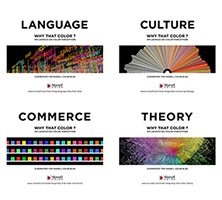
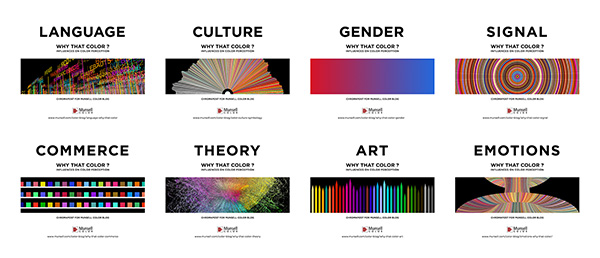
Of eight chapters dealing with influences on our color perception, only the last one is about our inner self, about psychology and physiology of vision. The rest is about the cultural influences and color being a cultural construct whose meaning is not innate but learned. Even though I tried to divide the blog into sections, all of the cultural influences discussed are tightly intertwined and can never be viewed in isolation or as a stand-alone concept. The notion of gender is a consequence of the local culture, color theory cannot go without art history, color as communication is a part of contemporary branding, language is one of the keys for defining culture… we could draw many lines from each mentioned influence on color perception to every other influence.

What Does Color Mean?
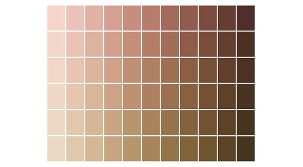
Under this elusive phenomenon we call color lies an intricate network of cultural practices and their relations to power. “Pink for girls and everything else for boys” speaks volumes about deeply embedded sexism in our society. Color today can be a trademarked product and a commodity, something you can buy and own exclusively. The magazine, “Colors”, is not about color, but about cultural diversity. Colorful vs. muted reveals the obvious western-centric colonial bias towards the other, the primitive and the lesser. Colorful is frivolous, girlish, gay, cheap, offensive… Color reveals our cultural bias and it is also central to some extremely sinister aspects of every society. Human beings are still being deemed less worthy just on the basis of their skin color. Many artists and theorists dealt with the apparent absurdity of racial color labels. But objective reality, as we have seen many times, has nothing to do with how we see things. We freely lump people into black, yellow, white, red. What’s worse we think that the problem can be solved by being color-blind. Unfortunately we are now witnessing the consequences of a wishfully proclaimed post-racial (post-color?) world.

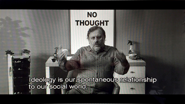
Another prematurely diagnosed post-condition, like the so-called post-ideological world after the fall of the Berlin Wall, has been the subject of critique by quite a few contemporary thinkers, including Slovenian cultural critic and philosopher Slavoj Žižek. Ideology, according to him, is our spontaneous relationship to our social world and we can hardly escape it. And if we think that it doesn’t exist, it means that it works pretty well. He offered an illustration of this through an interesting interpretation of John Carpenter’s movie ‘They Live’. The usual notion of ideology was that we are looking at the world through ideologically colored glasses that filter the truth. In this movie, however, the protagonist discovers the truth by the opposite, by putting the glasses on and looking through them. I like to think of this series of blog posts as a chance to put on those glasses and get a glimpse of the ideology underneath. This might not free you from ideology but at least it can show you one of the many ways how it works.

Apart from critical theory and cultural studies color was often a useful tool in philosophy. Like in illustrating the idea of qualia, which implies, to put it crudely, something that you just have to experience and where sheer explanation of it won’t do. You can read everything ever written about the color, red; you can learn everything about the physics of it and about the physiology of eyesight; you can talk to people who have seen it, but you will be totally clueless what red is until you see it for yourself for the first time. That also leads us to solipsism, an idea that I can be sure of the existence of only one thing, my mind. I can never be 100% sure about the objective qualities of the external world or the existence thereof, about how people really feel or what they think, and I will never know for sure if your red is the same as my red. The idea that we are profoundly alone and that any kind of communication is just a rough approximation based on cultural conventions may sound depressing, but we are also deeply social beings regardless of the illusion of communication. In the movie, ‘The Matrix’, the character, Cypher, a villain who is also the most human, knows that it’s all an illusion but he still wants it. Often, if it appears real, then it is real.
Why is Color Important?
Like Cypher we can also know that color is an illusion, but still want it and enjoy it. We never enjoy color alone, because it is impossible to isolate “pure color”. When we are enjoying a gorgeous sunset, we talk about its color. But our experience also includes the hum of waves, the warm breeze, the smell of summer and closeness of the person we care about. Or in colorful light and video installations by Brian Eno where most of the viewers would mention color as crucial, the sheer slow transitions between colors and forms are what provide that meditative quality. And as we mentioned before, color is not just a color chip, but the overall experience is influenced also by texture, material, quality of surface, its reflectivity and opacity. Color might not be essential, but it is very influential. Studying its elusive nature prompts us to be flexible and adaptable, to trade the Universalist view for the relativist one. To be open and to enjoy it in a wide-eyed, child-like way.
I don’t have an answer to “Why that color?” but I was able to stumble upon countless other answers on my way there. It’s the colorful journey that counts.
Resources
Some of the sources I consulted many times and I warmly recommend:
‘The Visual Nature of Color’, Patricia Sloane
‘Primary Sources: Selected Writings on Color from Aristotle to Albers’, Patricia Sloane
‘Color and Culture’, John Gage
‘Color and Meaning’, John Gage
‘The Secret Language of Color’, Joann and Arielle Eckstut
‘The Colors of Our Memories’, Michel Pastoureau
‘Color Codes’, Charles A Riley II
‘Vision and Art, Biology of Seeing’, Margaret Livingstone
‘Color, a natural history of the palette’, Victoria Finlay
‘Colour (Whitechapel: Documents of Contemporary Art)’, David Batchelor
‘Chromophobia’, David Batchelor
‘Color Chart’, Ann Temkin, Briony Fer, Melissa Ho, Nora Lawrence
‘Chroma: A Book of Color’, Derek Jarman
‘Interaction of Color’, Josef Albers
About the Author
 Aleksandar Macasev is a visual artist and graphic designer who lives and works in New York City. Everything about the Chromapost project can be found at www.chromapost.com. He invites you to join the Chromapost Social Network at www.chromapost.net, where users can post colors based on their emotions and create art out of it.
I dedicate “Why That Color?” to my grandparents Jelena and Ivan Macašev, color lovers of my childhood.


Leave a Reply