Color has always fascinated me. When I was a young girl I was flabbergasted when I’d witness a woman whose outfit combined two different reds. I wondered ~ did she KNOW the colors didn’t “match?” Did she realize it was a huge error in judgement when she chose that outfit? It disturbed me. If I had any clairvoyance, I would have known that those curiosities would fuel me forward to my career.
I made it one of my life’s missions to understand color ~ so I could solve those pesky little mysteries. Now, at this ripe age, the more I learn about color the more I realize a lifetime won’t be enough. In the meantime, I’m happy to live in a world where color drives my daily orbit.
History
My mother was a painter. My father had artistic pursuits. My grandmother was a painter. My aunt was a painter. My uncles were textile collectors. So, I was surrounded by active participation of art my entire life > with an emphasis on color appreciation. I started studying art as a young girl. All my education was directed toward a career in the arts. Every job I’ve ever had was in the visual arts. But a big question continues to puzzle me: Why was there such inadequate color training during my academic education? I learned while on the job. My first job was with a textile silkscreen company. Day one the owner commented that none of the people he’d interviewed for the job came out of art school knowing how to mix colors. Though I got the job, I was solidly in that lackluster group. Fast forward ~ I decided I needed to KNOW more. So, I’ve been on a quest to learn learn learn. While intuition led me to creating “successful” color combinations… I wanted to know WHY or HOW these elements related or worked together.
Throughout my school years I learned color through the primaries of red, blue, and yellow. For over 20 years I worked in publishing where CMYK were my primaries. As I evolved into a surface designer, the PANTONE system became the dominant color system. In the past few years I’ve taken many classes ~ including the Fundamentals of Color Science, twice, through the Munsell Color Science Lab at RIT, to further my knowledge and understanding of how color works.
Career
All of my creative pursuits lead me in the direction of my current career: designing custom carpets. I am third generation in the rug business so I think I was destined to produce carpets. When I was researching carpet manufacturing it was clear that the rugs I wanted to create were woven in Nepal. So, off I went to explore the industry and find a weaver in Nepal. I had a long list of questions about the process and naturally, seamless color communication was high on my list of must-haves. Aside from not speaking English I wanted to know – did we speak the same “color” language?
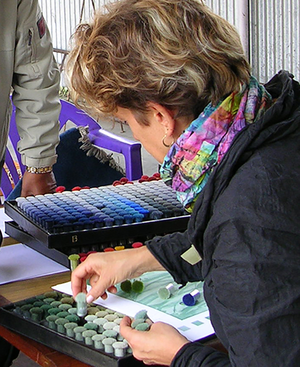
On my first visit to Nepal I ordered my first collection of rugs. I was instantly using the new pom box to assign colors to the designs.
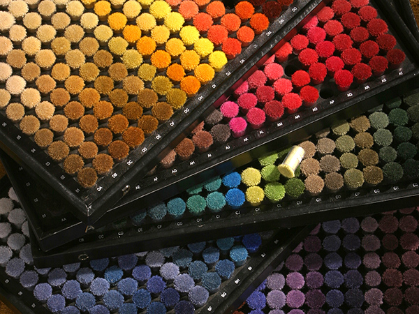
As I visited different weaving facilities I would ask, “If we work together how would we communicate color?” What color system did they use? One gentleman gave me an odd, quizzical look, tilted his head in confusion. Then he leaned over, picked up a piece of red yarn from the weaving floor and said “you can take this.” Well, I knew I was in trouble. After years of art direction, I couldn’t go backwards. Proper color communication would be an essential ingredient to the success of my new endeavor. Out of the 15 weavers I met, only one of them had an acceptable answer. When I asked about color communication he pulled out a case. In that case lived five trays of color poms (dyed yarn samples) all in chromatic order. I was filled with such delight that in that moment I heard a choir of angels singing.
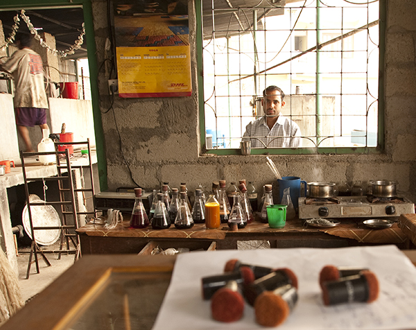
Here is the dye master at my weaver’s facility. While it appears rustic and antiquated they produce perfect matches every time. In the background, on the left, they are in the process of dying the yarns in large pots over fire.
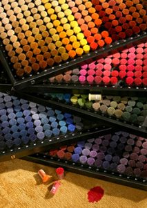
Each tray was a hue family. Within each tray value and chroma lined up with military precision. This pom box enables me to select colors with confidence.
My pom box has 1200 standard colors in the set.
Process
My job is to meet a client – then look and listen. Quietly, I process all the information I take in. Often it’s simply observing their personal style and what they have to offer consciously or unconsciously. What is the intention? What is needed? What room will the rug live in? Is the room a sanctuary? Does the space need energy? Then I go through the process of interpreting the information into a story which then translates into a color direction and later a design.
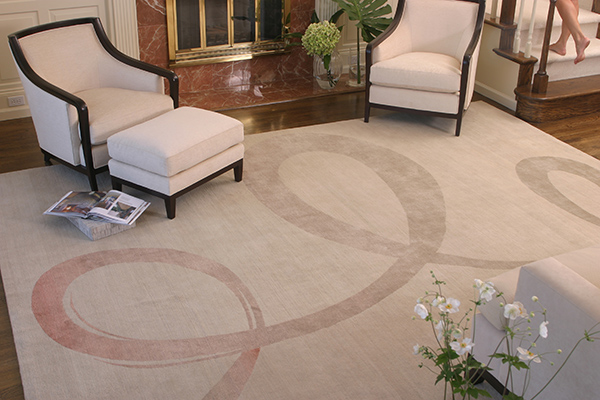
This is an example of a carpet with a narrow range of values within the same hue family.
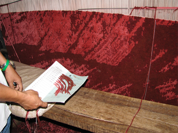
The color yarn chart is what the weavers use for reference as they work.
When creating a design ~ my first consideration is color. Early on it became clear to me that clients have a strong affinity toward color. Everyone has a personal color palette. Once the color direction is established we can move on to pattern ~ which always follows as a distant second element. The pattern won’t register until they see it in a colorway they relate to. Playing with pattern is just a vehicle for color.
GEOLOGY
How much traffic will the rug be subject to? Are there pets? Is the room active? If so, perhaps I use highly chromatic ~ saturated colors. Perhaps use of strong contrast. Complimentary colors. If it’s a quiet and serene direction, say a bedroom, then I consider colors in the same value range or monochromatic colors. The hue family is the dominant piece of information. Where will the accent colors appear? How will the colors relate? Which colors will be the accents? Where is the surprise? Value relationships are critical. I work with tonal shifts which are due to use of silk and the reflective nature of silk. With years of experience I have come to learn how many value steps are needed to effectively separate the areas of color or which will take advantage of the silk.
CIRCUITOUS
Colorways are like little stories. What is the story necessary for any particular job? What do the colors say and how does that relate to the client and their needs? The psychology of color is an important element when creating a living space so I listen carefully to the answers because my carpets are all custom and made-to-order. Clients will live with the rugs every single day so it’s critical that the client is satisfied. Happy weavers make happy carpets and happy carpets make happy clients. That is my goal.
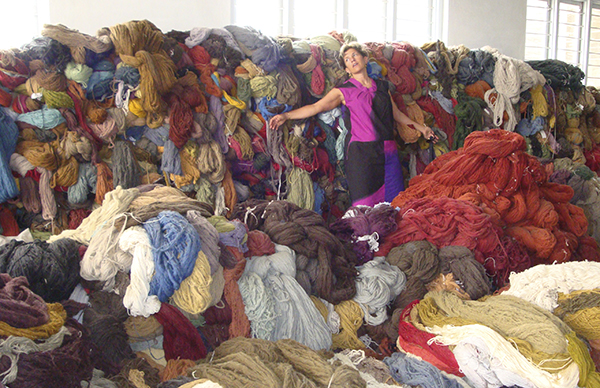
While visiting the weaving facility I was mesmerized by the quantities of surplus yarns left over from all the previous projects.
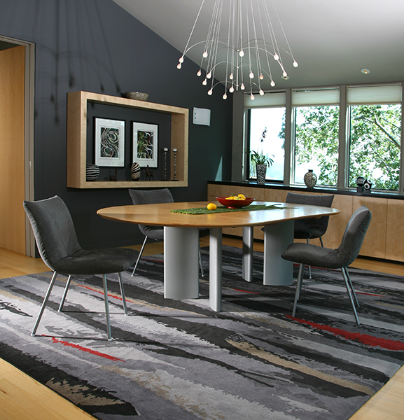
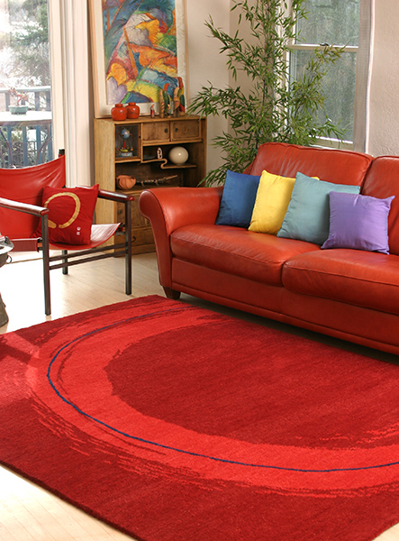
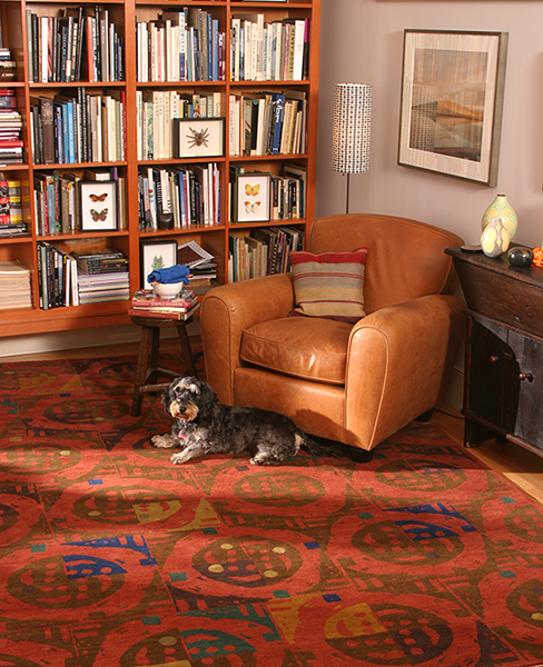
More Carpets Example
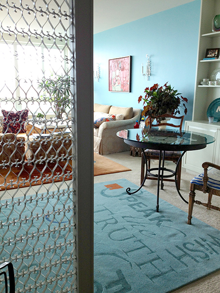
SPEAK
TRAVEL
BEVERLY
The Munsell system is the foundation for color knowledge – as with many of the color systems, understanding the Munsell system is fundamental. Full comprehension the HVC system takes the mystery out of color selection. It allows for more time on the creative side since the workings of color are taken care of. Once you know this system most of the other color systems fall into place.
This HVC exercise sheet is one of my favorites and I use it as a foundation when I teach color workshops. (PS this is a movie)
About the Author
In the X-Rite room at the Munsell Symposium in Boston.
Alicia’s true loves have always been color and texture. Coming from a long line of accomplished artists, her emergence into rug design is thanks to her family. Her Armenian-born grandfather was a renowned Oriental rug authority, uncles continued in his footsteps and were major collectors of international textiles, and Mark Keshishian & Sons, which her grandfather founded decades ago, is managed to this day by her cousin in the Washington, D.C. area. Carpets, art, and color have been part of her life for as long as she can remember: the smell of the wool, the touch of the fibers, and the variety of patterns are in her DNA. She loves to design and carpets are an exciting way to live with design everyday. Visit her website to see more work.

Love the story of the poms! And the movie is an excellent resource for teaching about the three dimensions of color. Hurrah!