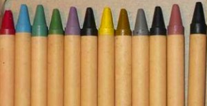
That feeling of awe when I received a set of 24 color markers as a kid has never gone away. That box contained the whole world. The possibilities were endless and just waiting to be released. My generation grew up in a world where every color was accessible in pretty much any form. Of course it wasn’t always like that (it’s still hard to imagine, isn’t it?).
The use of color in art through history encompasses and reflects all of the aspects of color that were previously discussed in this blog. Art usually reflects and anticipates changes in a society or culture, and color plays not a small part. How color is used and how artists approach color can tell us a lot about the culture and the period. From accidental to intentional, from very strict and coded, to free and random.
On the other hand, shape, light and dark contrast, and movement are much more important aspects of human vision than color, line almost always precedes color in art history. But color is always there — whether accidental or intentional — and it is an indelible part of the work of art, from the color traces left on cave walls by our prehistoric ancestors up to this very day.
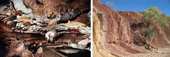
Lascaux Caves, Paleolithic Cave Paintings
Aboriginal Ochre Source
Artist Color Choices
Why did the artists use those particular colors? Most of the time the answer could be: “Those were available.” The earliest ritualistic cave drawings were made with whatever was around, a burnt stick, piece of clay, chalky rocks, or mud. It didn’t take long for the human race to develop a taste for decorating and a pure enjoyment of the visual. Being different and unique was particularly desirable. Color was the most suitable means to differentiate from (but also mimic) a wild and unruly nature, to distinguish tribes, clans and families, or to present oneself as god’s favorite. Since pigments were usually made of what could be found (minerals and plants), the hard-to-find colors were precious and highly desirable.
For thousands of years color was associated with material, i.e., a pigment, and an artist was usually also a paint maker. Getting the color right was very much part of the artist’s skill. But what was the right color? Depending on the period of time, the culture and location, that notion changed considerably. From getting as close as possible to what the artist saw (and tried to reproduce) to being faithful to some usually sacred symbolic code. Whatever the approach, an artist’s choice was influenced by the culture and the availability of pigments. The color was there to mimic, represent, symbolize, express and signal.
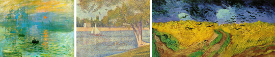
Claude Monet, Impression, Sunrise, 1872
Georges Seurat, The Seine and la Grande Jatte – Springtime 1888
Vincent Van Gogh, Wheatfield with Crows, 1890
Color in an Art World
Quite unjustly we will dash past brightly painted Greek temples, Roman frescoes, Byzantine mosaics, medieval illuminated manuscripts, stained glass windows and Renaissance painterly revolution and jump straight into XIX century Impressionism. At that point oil paint was already a usual and widespread medium and there was also an idea that color was not just a material. It was also light, thanks to Newton and many others after him. The Impressionists’ goal was to capture the ever-changing and unstable shimmer of physical reality. A well-defined structure of a drawing was still at the base of their paintings, but the main preoccupation was to capture the unstable visual nature of light in an immobile medium such as painting. The world was a sum of color patches. Color gained, at least for a little while (and definitely not for the last time), precedence over line and form. From that moment on we have seen an explosion of different approaches to color in art.
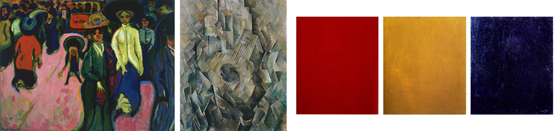
Ernst Ludwig Kirchner, Street, Dresden, 1908
Georges Braque, La guitare, 1910
Alexander Rodchenko, Pure Colors, red, Yellow and Blue, 1921
The Post-Impressionists of the late 1800s ventured into more scientific areas (pointillism) where dots of “pure” colors were mixed in our eyes, or on the other hand, a more subjective domain where color was an expression of the inner more than a reflection of the outer. Color gained new freedom from mimesis and symbology and new ways stood wide open. The palette went wild with Expressionism where color was a reflection of the artist’s feelings and inner life. It again became tamer with Cubism when the form took over. In avant-garde formalist manner, Alexander Rodchenko, in 1921, proclaimed the end of painting with his red, blue and yellow monochrome canvases, a revolutionary act that intended to terminate the sterile bourgeois norms, and that also brought another revolution. Color became an independent thing with a life and a message of its own.
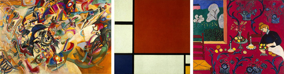
Wassily Kandinsky, Composition VII, 1913
Piet Mondrian, Composition II in Red, Blue, and Yellow, 1930
Henri Matisse, Red Room (Harmony in Red), 1908
Regardless of the new-found freedom, artists often tried to create a color system, no matter how self-referential or arcane it might have seemed. Color was of great importance in the career of Wassily Kandinsky from his early Expressionist days to Abstraction. He used to talk about color that causes vibrations in the soul of the observer or color that is directly analogous to music or shapes. No matter how esoteric he could get in his quest there was always a system that needed to be followed. He was the one who came up with the now iconic Bauhaus symbols, the red square, blue circle and yellow triangle, along with the claim that these color-shape connections are universal truths. Such a tendency with a very strong social undercurrent of the post-war search for the brave new world was widespread thanks to Bauhaus school and Dutch neo-plasticism (De Stijl). Color had a strict role in art, architecture, design and society in general. Color wheels and math-like harmonies such as complementarity, triads, and analogous sets, are still in use in many art schools. At the same time we have great colorists like Henri Matisse who denied any kind of objective assumptions about colors and whose guidance was just his pure inner urge.
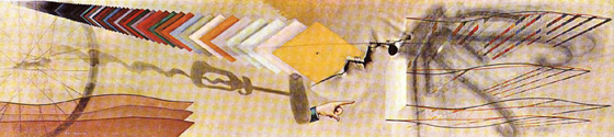
Marcel Duchamp, Tu m’, 1918
The post WWII period gave rise to the purely existentialist gesture of action painting with a more “industrial” and raw color palette. And again reaction followed. Robert Rauschenberg, a bit lost in the macho world of action painting, used color as an autonomous object in a collage, like in his painting ‘Rebus’ (1955). Such a practice was already anticipated by Marcel Duchamp’s “last” painting ‘Tu m’’ (1918) where color is used as a readymade. Rauschenberg also reacted to his teacher, Josef Albers’, teachings that Rauschenberg found dictatorial and restrictive. At the same time the first mass produced affordable acrylic paints hit the market, while color/paint in the design industry became an independent matter of standardized charts. Color did not belong to the exclusive art domain anymore. Everybody could buy and use color, as if buying a bottle of Coke, a kitchen mixer, or a pair of socks. Moreover, color became an autonomous object unto itself and was treated as such in art practice just like a fruit bowl or a nude were treated in the centuries before. Color became what it was, just color. No more no less.
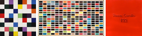
Ellsworth Kell, Colors for a Large Wall, 1951
Gerhard Richter, 256 Colors, 1974
Alighiero Boetti, Rosso Corallo 102, 1967
Changing Approaches to Color Theory
Entire generation of artists have now used this matter of fact approach to color, unburdened by theory, tradition or any kind of rules. Well, almost no rules. The rules were not related to color itself. Ellsworth Kelly used rules of randomness and chance under the influence of composer John Cage. Those were the internal rules that ruled only one piece of work at a time. Chance was a favorite approach of Gerhard Richter, whose ‘color chart’ paintings were not dissimilar to bingo boards, as he said “any sequence of numbers is always right and credible if it is the correct one at bingo”. The famous ‘dot paintings’ by Damien Hirst are also a product of chance and randomness guided by slight internal rules. Others prefer the readymade aspect of commercial paint. Frank Stella, famous for his usage of Benjamin Moore house paints, once said ‘I tried to keep the paint as good as it was in the can’. Some reflected the commercial aspect of color and paint. Many of Warhol’s paintings and their dominant colors and titles evoked products like cherry, mint or licorice. Alighiero Boetti painted with car paint in bodyshops and used industrial color code as the content of the painting. Yves Klein created and trademarked his own well-known color, International Klein Blue.
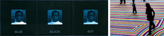
Carrie Mae Weems. Blue Black Boy from Colored People, 1989–90
Jim Lambie, ZOBOP, 2008
But color doesn’t have to be impersonal. It can be anything. Carrie Mae Weems used color as a commentary on race, and Byron Kim sampled actual color tones from his subjects. Mike Kelley sometimes used color as a memory device, while Jim Lambie has used colorful vinyl tape to create vibrant ambients. With the advent of widespread computer technology and the Internet everything is possible and every approach is equally valid. As mentioned at the beginning, we never know how much art reflects and how much anticipates and the same goes for the question “Why that color?” Art does in some ways influence our color choices, but the more valuable lesson that we can draw from art is that you don’t have to follow anybody’s rules but your own, and that color can be whatever you want it to be. And it can be very powerful.
About the Author
 Aleksandar Macasev is a visual artist and graphic designer who lives and works in New York City. Everything about the Chromapost project can be found at www.chromapost.com. He invites you to join the Chromapost Social Network at www.chromapost.net, where users can post colors based on their emotions and create art out of it.

Leave a Reply