The role of color in our contemporary consumerist culture combines all other aspects discussed in earlier posts (gender, culture, language, communication). It’s also brilliantly summed up by Miranda Priestly from “Devil Wears Prada” (2006) (mentioned in the first “Why That Color?” post).
After her assistant referred to clothing as ‘stuff’, the dragon lady of Runway snapped back:
“’This… stuff’? Oh. Okay. I see. You think this has nothing to do with you. You go to your closet and you select… I don’t know… that lumpy blue sweater, for instance because you’re trying to tell the world that you take yourself too seriously to care about what you put on your back. But what you don’t know is that that sweater is not just blue, it’s not turquoise. It’s not lapis. It’s actually cerulean. And you’re also blithely unaware of the fact that in 2002, Oscar de la Renta did a collection of cerulean gowns. And then I think it was Yves Saint Laurent… wasn’t it?… who showed cerulean military jackets? I think we need a jacket here. And then cerulean quickly showed up in the collections of eight different designers. And then it, uh, filtered down through the department stores and then trickled on down into some tragic Casual Corner where you, no doubt, fished it out of some clearance bin. However, that blue represents millions of dollars and countless jobs and it’s sort of comical how you think that you’ve made a choice that exempts you from the fashion industry when, in fact, you’re wearing the sweater that was selected for you by the people in this room from a ‘pile of stuff’.”
From the time of the industrial revolution there was a constant demand for new or updated products. Pigments and dyes became widely accessible and colorful products — from textiles to furniture — became more widely available. But you can produce only so many new things each season, and since the color aspect of the product is highly visible and easy to change, color became of paramount importance in creating the new and desirable. It all started with the textile industry, and through its development, the logic spread to other industries and to pretty much everything we can buy.
Color Trends
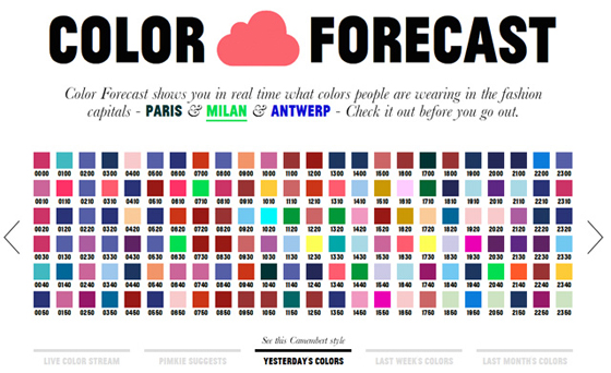
What will be the next big color? Can we tap into public conscience and see what people desire? The answers can expand or sink your business regardless of the other more ‘substantial’ qualities of your product. So we now have color forecasters who predict color trends and pass them on to the design industry. Tom Vanderbilt’s article in Salon gives us a peek into what these color gurus actually do. Do they set or predict color trends? Some of them try to map the global zeitgeist and then decide what colors might reflect it. After years of financial crises, wars, and overall instability, we offer an optimistic new beginning with bright yellows and oranges. That is if you think that these colors have that meaning in most of the cultures where you want to place your color. Other forecasters pay attention to color cycles. We didn’t have brown for a long time, let’s have it now. Some color forecasters likely rely on their gut feeling, while some may be receptive to colors around them; they may see trends and patterns and then try to follow them, change them, or improve them. And if you don’t trust your eyes leave it to the machines, such as on Color Forecast, where fashionable streets of European fashion capitals are being taped, footage is processed, and the dominant colors are extracted and presented as trendy. Whatever the approach, the choice is already made for us most of the time whether we like it or not. And of course, we are supposed to like it.
Color Choices
Consumers, more than anything, are looking for meaning behind their color choices. We need good stories and promises of a better and more fulfilled life, of success and happiness. Like Pantone’s Radiant Orchid for 2014:
“Radiant Orchid blooms with confidence and magical warmth that intrigues the eye and sparks the imagination. It is an expressive, creative and embracing purple—one that draws you in with its beguiling charm. A captivating harmony of fuchsia, purple and pink undertones, Radiant Orchid emanates great joy, love and health.”
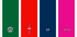
Of course, branding also comes into play with its well-known tactics of fabricating desire. Every product, service, and company is being enveloped in an intricate set of carefully planned values that communicate more than just the basic thing. And color we notice first. Everyone is familiar with Coca-Cola red, Facebook blue, UPS brown or McDonalds yellow to the point that many colors now bear the names of brands. Companies are willing to go to great lengths in order to protect such a powerful communication tool by trademarking it. But research suggests that “predicting consumer reaction to color appropriateness in relation to the product is far more important than the individual color itself”. The color’s culturally defined meaning has to correspond to the brand’s message. So we end up a with a fairly clear and overly simplified guide to color in branding where it’s taken for granted which color is supposed to mean what.

Right or Wrong Color?
People form strong emotional attachments to brands and products. They are all integral parts of our societies and cultures, of ourselves. I remember while I was waiting once in line in the branch of a certain bank, I noticed that their countertops were not of the exact corporate color and it drove me crazy. I am a person who never thinks in terms of wrong colors (I subscribe to the view that there are no such things as a “wrong color” or “mismatching colors”), but the countertops were just plain annoying. What were they thinking? If they don’t take their color seriously they might not take their business seriously. You can guess where I’m going with this. It’s never about the actual color, it’s always about the story behind it, consistency of it, and the color’s capacity to reassure us that the world is just as it’s supposed to be.
When I wrote about gender and color, I noted that the girls/boys split was created mostly for the market. The same also goes with those simplified color representations of modern historical periods or regions. They mostly depict what colors dominated the design industry.
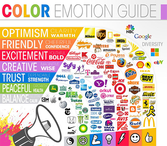
Image courtesy of The Logo Company, hosted on Visual.ly
Our clothes are costumes and house paints, appliances and furniture are part of the stage set in a play that is our life — or at least our life how we would like others to see it. Color in commerce further cements and intensifies cultural color codes that have already been set. And as Mrs. Priestly pointed out, we are often presented with choices already made for us. We may decide to accept them if we want to fit in. But we don’t have to.
About the Author
 Aleksandar Macasev is a visual artist and graphic designer who lives and works in New York City. Everything about the Chromapost project can be found at www.chromapost.com. He invites you to join the Chromapost Social Network at www.chromapost.net, where users can post colors based on their emotions and create art out of it.

Leave a Reply