“Because I like it,” could be an answer to the question from the title of this blog series and it wouldn’t be any less valid than any other answer. In previous posts I tried to analyze what influences our color choices from without, from our cultural and social environment.
But what tilts us this way or the other from within? (Although, we could agree that inner and outer influences are intertwined.) Colors powerfully affect our emotions. Preference towards certain colors is certainly connected to the emotional associations we have created with those colors. If a color is associated with something pleasurable we tend to like it and vice versa. Apart from very personal associations are there any more general rules in this color-mood game?
Many thinkers and theorists have claimed that there are. And as I described in earlier posts, many of them thought that there were common rules for the whole of the human kind with color vision. I am referring to the usual narrative that can be found in many design manuals, interior decoration how-to’s, branding books and even medical journals. Red agitates us and it gives us energy boosts, blue is calming and sometimes makes us sad, green is balanced and it’s good for tired eyes, yellow can make us happy… Whole alternative medicine systems were created based on such universal premises. Like chromatherapy where light of a certain color is supposed to balance your internal energy levels. There’s no scientific proof that any such thing works and I tend to agree with that view. But some things work because we believe that they work. If you are really convinced that red will raise your spirits then it might actually do so. Maybe.
The Science of Color and Emotion
At the beginning of the ‘90s British scientist Russell G. Foster and his team discovered a third type of photosensitive cells in mammalian retina, photosensitive ganglion cells. Unlike rods and cones these cells don’t have a big role in conscious sight. They regulate our circadian rhythms, our inner clock that makes us wake up and go to sleep. What‘s interesting is that these cells are most sensitive to the blue-violet part of the visible spectrum. Many experiments have shown that blue light wakes us up, makes us more alert and active regardless of whether we like blue. Some people suffering from seasonal affective disorder (SAD), myself included, use full spectrum lamps to alleviate their winter blues (curing blues with blue?). What we lack in the wintertime is that blue-violet portion of the spectrum. There’s not enough natural full spectrum light outside and the artificial indoor lighting usually lacks the blue portion. So, fairly hard scientific evidence seems to be on the side of a universal and innate sensitivity and response to blue light. Other scientists, like Jay Neitz, have an evolutionary explanation for this. Prehistoric single-celled organisms functioned in a very basic on/off switch fashion. They would float to the surface to soak up the sun’s energy when levels of ultraviolet radiation were low and less harmful and they would hide at the bottom and get inactive when they became too hot. Blue skies above meant safety and prompted them to get moving and the bright yellow of the sun cried danger and they would hide and stay put.
Ironically, blue is closer to the dangerous ultraviolet side of the spectrum (shorter wavelength), but it is perceived as safe and nurturing, while yellow is actually “colder” (longer wavelength) and further away from the ultraviolet portion, though it signaled the danger of the ultraviolet radiation. Thinking about color is still plagued by this paradox. Colors we call ‘cold’ (blue, green, violet) are physically warmer and the usual ‘warm’ colors (red, yellow, orange) are really colder. There is a big, often overlooked, difference between how we perceive color and what it actually does to us. So far the only biologically determined influence is that of the blue-yellow pair, with the accent on blue. All other reactions to color, no matter how natural they seem, are learned, but that often doesn’t mean they have less of an impact on us. Recognition of the red-green pair is learned, but experiments have shown that wearing red, and even while having in mind the culturally conditioned perception of red as energetic, can boost confidence and actual levels of testosterone. You can see more of the amazing story about contemporary scientific discoveries about color in “Do You See What I See?,” episode of Horizon, a production of BBC2.
Dr. Beau Lotto showed us in one of the experiments featured in the show that even when we are asked to arrange colored tiles completely randomly and to our liking we are actually reproducing patterns we have already seen in nature and all around us. And the intrinsic part of such an ongoing learning process is our emotional bond to colors. Our own memories of colors.
Color Memory
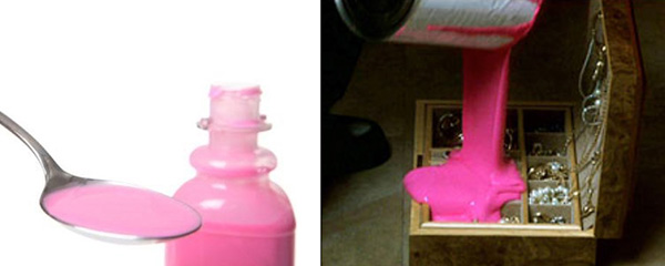
A contemporary authority on color, Michel Pastoureau, has written the excellent “The Colours of Our Memories,” a personal story of his earliest memories of colors and how they persisted throughout his entire life. Colors are like smells or tunes, they can carry a powerful emotional imprint that transports us to a different time and place or make us feel this way or the other in an instant. Pastoureau takes us on a delightful trip down his memory lane lined with navy-blue blazers, Mitterand beige, candy dispensers, superstition and various color anecdotes. It also prompted me to take a little trip to my own roots of color preferences, it’s a great exercise. For instance I remember this particularly nasty cough syrup called Bactrim that made me gag almost every time I took it when I was a child. It tasted like licorice (that I, needless to say, abhor) and it was pink. I didn’t develop a particular aversion to pink color in general, but the mere sight of a pink opaque liquid makes me queezy. That scene in David Lynch’s movie “Mulholland Drive” when one of the characters punishes his wife for infidelity by pouring pink paint in her jewel box is especially unnerving for me. Not to mention that Pepto-Bismol has quite an opposite effect from its intended one with me, just on the basis of its color.
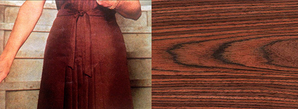
Then there was that muted pale green on the walls of hospitals and doctors’ offices. It makes me cringe to this very day. I also remember a bitter fight with my sister over the color of the sofa in our living room. Our parents decided to freshen up the drab looking living room suite with new upholstery and they consulted their young teenage son who dreamed of becoming an artist. I thought at the time that the intense burgundy velvet would be a bold statement. When the suite arrived freshly upholstered my sister’s only comment was “Oh great, now we’re living in a brothel.” Chaos ensued and that burgundy velvet was forevermore engraved in my mind as a symbol of our family dynamics.
Color and Emotion
Unpleasant memories are always more persistent than the pleasant ones again due to evolutionary heritage. It was much more important to remember what hurts us then what makes us feel good. But there are plenty of memories that make us feel warm and cozy, from the time when nothing could hurt us and when all seemed just right. I remember various browns from my childhood in the 70s. Everything was in some shade of brown from clothing to furniture (just imagine any Mary Tyler-Moore outfit).
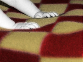
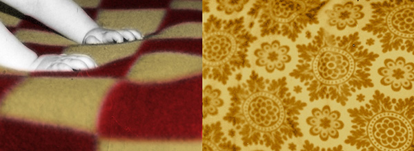
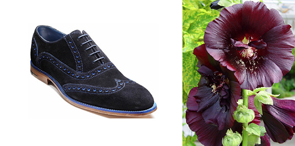
The neon 80s made me hate those terrible browns, but years later they became a nostalgic symbol of a more and more distant childhood. My earliest color memories reach to my first blanket that was checkered in honey yellow and dark red. And somewhere on the windows was also this golden yellow brocade curtain. Those warm reds and golden yellows still make me want to curl up. I also must acknowledge the influence of my paternal grandparents during my stays with them. Grandma, a skillful seamstress mentioned in the post about language, had these beautiful hollyhocks in the garden. They were a very deep purple that could swallow my gaze. Their discreet velvety shimmer promised some unfathomable and exciting mysteries and that deep purple still does. Grandpa had a rather idiosyncratic sense of fashion and he loved all things colorful. He was usually impeccably dressed and quite dapper, but there was always a detail or two that made a lasting impression like a screaming red handkerchief, blue suede shoes or grandma’s lemon yellow cardigan. When probed about his color choices he would usually snap back “Why? I like it.” And that’s the heritage I cherish the most.
About the Author
 Aleksandar Macasev is a visual artist and graphic designer who lives and works in New York City. Everything about the Chromapost project can be found at www.chromapost.com. He invites you to join the Chromapost Social Network at www.chromapost.net, where users can post colors based on their emotions and create art out of it.

Leave a Reply