This “little booklet” was originally published in 1929 and contains summarized materials from the Munsell Book of Color. It was intended to reach a wider audience, to help facilitate a basic understanding of the color system and to spark an interest in and appreciation of color.
Foreword
Color is the most persistent quality apparent in Nature and is the strongest single influence pervading our lives from without. It is present wherever the eye can see. No visible thing is without color. Every object is seen only as a color or combination of colors and every contour and detail of every object is seen only as color or colors. This is true even in the case of the color blind, for although their perception of HUE and CHROMA may be impaired or absent, the remaining characteristic of color, VALUE, cannot also be absent from their vision, for then they would have no vision. They would be totally blind.
The vast majority of persons are lacking in adequate color knowledge and must seek for themselves that information relating to its use and appreciation which is the inborn gift of the favored few. But natural taste or aptitude should not be mistaken for organized fundamental knowledge; the naturally gifted cannot accurately communicate their ideas of color without a common language of color, for intelligent discussion of the subject requires mutual understanding of the terms used.
Preface
Color systems and methods of describing and classifying colors date back hundreds of years. Chevreul, the pioneer in this field, although he did excellent work, did not influence the practical users of color because his color classification was based arbitrarily on the irregularities of dye and pigment mixture, which are very difficult to retain in one’s memory. Only a method of color notation that is simple to understand and easy to remember can adequately fill the practical needs of present day color users.
The great scientist, Helmholtz, gave considerable though to this question. He stated that color possesses three simple attributes or dimensions, which are determined directly by the eye, and which have no direct relation to dye or pigment mixtures. As he did not have the opportunity to illustrate just how these three dimensions were to be visualized, however, nor what standards should be set up for developing a general color language, his work remained for a time buried in the archives of science.
In the late nineties, it occurred to an instructor of art, Mr. Albert H. Munsell, to utilize the possibilities opened up by Helmholtz in practical color study. Mr. Munsell decided that the best way to bring about a popular understanding of this subject was to illustrate the three dimensions of color graphically on a color sphere. He therefore planned a series of color charts presenting carefully standardized scales of HUE, VALUE and CHROMA.
Seven years of study and experimentation finally made possible his first color chart, which appeared in 1905. This chart was accompanied by a text book, A Color Notation, by A. H. Munsell, Published by Munsell Color Company, Inc., describing the simple basis on which this and the succeeding charts were to be build, and suggesting the application of the proposed language of color to the field of art education. Eight more years of patient work resulted in the completion of fifteen standard color charts, which in 1913 were assembled in the, Atlas of the Munsell Color System. This useful piece of work immediately aroused widespread interest.
By 1913, the strain of carrying on not only the specifications of these color charts, but the presentation of this subject to audiences both in this country and abroad, in addition to his regular duties at the Massachusetts School of Art, showed itself in the weakening of an unusually robust constitution, and in a protracted period of invalidism which finally resulted in Mr. Munsell’s death in 1918.
Shortly before his passing, Mr. Munsell expressed the hope that the work to which he had dedicated his life would be carried on for the benefit of future generations. The Munsell Color Company was formed for this purpose, and for many years it has been engaged in the work of restandardizing and improving the color charts along the lines foreseen by their originator. The Atlas of the Munsell Color System has been replaced by the Munsell Book of Color which combines practical teaching experiences, derived from the field of art education, with the rigorous investigation of scientists from the time of Helmboltz down to the present day.
The remarkably simple and lucid article on “Color” which comprises the major portion of this little, “Manual of Color” was written and illustrated for “Life.” Mr. Cooper’s article and the “Dictionary of Color Terms” form a portion of the manuscript of the “Munsell Book of Color.” They are now reprinted in this inexpensive little booklet in order to give the widest publicity to this subject matter which merits the unqualified interest of all those who wish to increase their knowledge and appreciate of color.
A.E.O. Munsell
Baltimore, Md.
October 1929.
Color
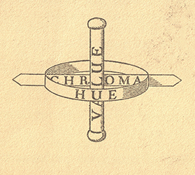
Color has three dimensions, HUE, VALUE, and CHROMA, which fully and accurately describe any color as readily as the three dimensions of a box describe its length, breadth, and thickness. Each of these dimensions of color can easily be measured (at a glance with practice) and stated simply in speech and writing.
Hue
Sunlight is comprised of every possible spectrally pure color, so balanced in combination that no one color is dominant and the result is a pure white light. Passing a ray of sunlight through a prism breaks the light up into a band (the spectrum) of its component colors, Red, Yellow, Green, Blue, etc., and this distinguishing by name of any color of the spectrum from the other colors, indicates the HUE, or common name, of that color. Any Red is Red in HUE, and any Green is a Green HUE, etc. HUE is the first characteristic of a color that the eye detects. It is how we know, for instance, that a Red is Red and not Green or any other color but Red. In notating a color, its HUE is indicated by the initial letter or letters of the color referred to — R for Red, YR for Yellow-Red, Y for Yellow, etc.
Value
Pure White is so light that no color can be seen in it. Pure Black is so dark that no color can be seen in it. But between the two can be distinguished various degrees of light strength, ranging from the darkest gray just above Black to the lightest gray just below White, and colors can be seen at these various intermediate levels of light strength. For instance, Yellow is usually a light color, nearer to White than to Black. Purple-Blue is usually a dark color, nearer to Black than to White. This variable light strength is called VALUE, most Yellows being rather high in VALUE, and most Purple-Blues being rather low in VALUE although of course Yellow can be very dark and Purple-Blue can be very light.
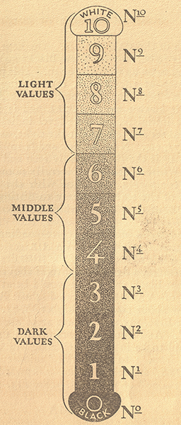
Fig. 1 – Diagram of the VALUE scale. Note on the left the indication of the three zones. Light, Middle and Dark; and on the right the notation of NEUTRAL at the various levels of VALUE.
The eye can readily distinguish and memorize ten different steps of VALUE, graduated from Black at the bottom up to White at the top. It is not difficult to estimate with the unaided eye the approximate VALUE of any color, and it can be done accurately by comparing the color with the VALUE scale.
Theoretically perfect White and theoretically perfect Black are practically unattainable, though they can be very closely approached. For instance, pure magnesium oxide is 9.9 to 9.9 in VALUE. Practically pure Black is obtained by lining the interior or a box with Black velvet and looking into it through a hole in the cover. Perfect Black is indicated by the numeral I at the bottom of the VALUE scale. The next step upward is 1 (below which few Blacks go), then 2, 3, 4 and so on up to White at 10. This places the fifth step at the middle, representing a Gray half-way between Black and White. Any pure Gray is known as NEUTRAL and is indicated by the initial N, with its level indicated by a numeral set above a line at the right, as N 2/, N 3/, N 7/, etc. N 0/ is Black and N 10/ is Whit, but N 1/ is the Black usually seen and N 9/ the usual White. They are generally notated so.
By comparing any color with the different Grays of the scale it is easy to distinguish the VALUE of that color, which simply indicated how light or dark that color is. VALUE is notated by a numeral (corresponding to the numbered levels in the VALUE scale) placed above a line to the right of the HUE designation. For instance, a Red of a lightness about half-way between Black and White would be at the fifth level of VALUE, indicated thus: R 5/. A Yellow about two steps higher, Y 7/. A dark Purple-Blue, say about three steps above Black, PB 3/. And so on. Colors up to 3 in VALUE are said to be in the “dark zone” of VALUES, those from 4 to 6, in the “middle zone” of VALUES, and those from 7 upward, in the “light zone” of VALUES. (See Fig. 1)
Chroma
Two colors may be the same in HUE (for instance, both Red) and the same in VALUE (that is, neither is lighter nor darker than the other), and yet be different in color strength. One may be a strong Red and the other a weak, grayish Red. This difference is in the dimension of CHROMA, by which the degree of color strength (intensity) is measured and indicated.
HUE is the name of a color. VALUE is the amount of light in a color. CHROMA is the degree of strength in a color.
A step in CHROMA is the unit of measure of change in a HUE between NEUTRAL Gray and maximum CHROMA of that HUE. Experiment has shown that it can readily be distinguished and remembered. These steps are graduated from NEUTRAL Gray out to the strongest CHROMA obtainable in any HUE at any given level of VALUE. The steps are numbered outward from N, toward the maximum CHROMA (See Fig. 2), and in notating the color the numeral is placed below the line, under the numeral VALUE. For instance, a Red midway between White and Black, and five steps out in CHROMA, would be written R 5/5. A Red at the sixth level of VALUE and three steps out in CHROMA would be written R 6/3. The color commonly known as “rose” is a grayish Red, a Red that is weak in CHROMA, generally in the neighborhood of R 6/4. Thus the arrangement in notation of HUE, VALUE and CHROMA is H V/C.
The CHROMAS close to NEUTRAL are known as weak CHROMAS: those at or near maximum strength are called strong CHROMAS; and those between the weak and the strong are known as moderate CHROMAS.
Red is a very powerful color at the fourth level of VALUE and can be graduated through a dozen or more distinguishable steps of CHROMA, but up at eighth level it cannot be carried out more than a third as far.
The strongest possible CHROMA obtainable in practically non-fading color substances varies with different HUES, and at different levels of VALUE. Yellow, for instance, which is strongest only when it is light, can be divided into more distinguishable steps of CHROMA at a high level of VALUE (say the eighth) than it can at any of the lower levels; and the reverse is true of Purple-Blue, which is strongest in CHROMA at a comparatively low level or VALUE but cannot be carried out many distinguishable steps of CHROMA at a high level. This variation in maximum CHROMA at different levels of VALUE is due simply to the vagaries of Nature – there is no one level of VALUE at which all HUES reach their strongest CHROMA. The level at which a HUE reaches its maximum CHROMA is called its “home” VALUE, but this may vary in the same HUE, in different pigments, dyes, etc.
The Color Sphere
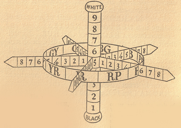
Since the three dimensions of color must be as readily understood as the three dimensions of a box, its is necessary to have in mind some simple, orderly arrangement of all color, in which HUE, VALUE, and CHROMA are separately identified and yet comprehended together. A sphere serves this purpose. (See Fig. 3.) The top pole of the Color Sphere is White, the bottom pole Black, and the axis is the graduated scale of NEUTRAL Grays, which places N 5/ in the exact center of the Sphere. Clockwise, or “westward,” around the equator of the Sphere (as seen from the top pole), and at equal distances apart, are the five Principal HUES – Red, Yellow, Green, Blue, and Purple. Spaced evenly between each two of these, in the order names, are the five Intermediate HUES – Yellow-Red, Green-Yellow, Blue-Green, Purple, Blue, and Red-Purple. These ten HUES are called the Major HUES.
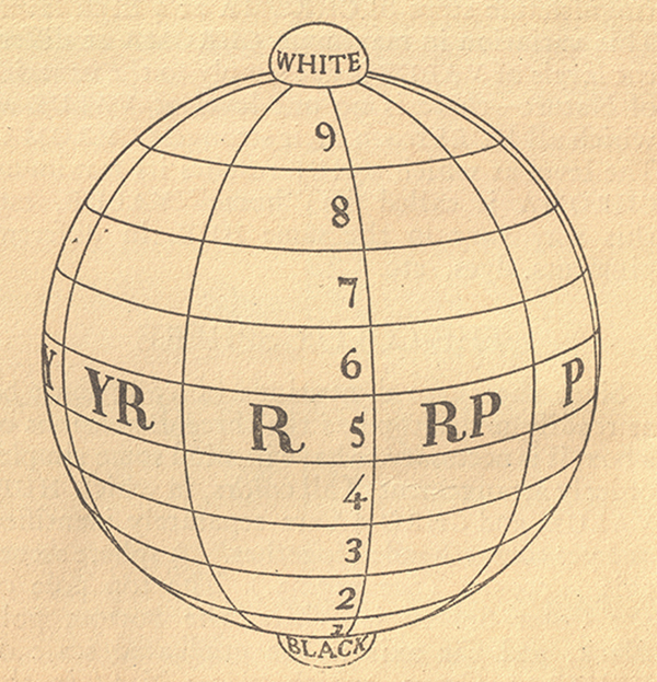
Fig. 3 – The Color Sphere. The HUES are placed in sequence around the NEUTRAL axis. The axis and all the HUES surrounding it are all of the same VALUE (lightness or darkness) at any given level, increasingly lighter to White at the top and increasingly darker to Black at the bottom. From NEUTRAL gray at the center axis, the HUES increase in color strength or intensity (CHROMA) as the distance outward from the axis is increased.
Comparing the Color Sphere to a peeled orange composed of ten segments (See Fig. 4) each of the ten Major HUES would occupy one segment, its upper half blending through light VALUES to White at the top and its lower half blending through darker VALUES to Black at the bottom. Its inner edge, along the perpendicular axis of the Sphere, would be the graduated series of NEUTRAL Grays from Black up to White. Outward horizontally (at a right angle) from the NEUTRAL axis, at any level of VALUE, the color would become more intense in color strength, in measured steps of CHROMA. The HUES become lighter as they go upward in VALUE; darker as they go inward toward the NEUTRAL axis; and stronger in CHROMA as they go outward toward maximum strength.
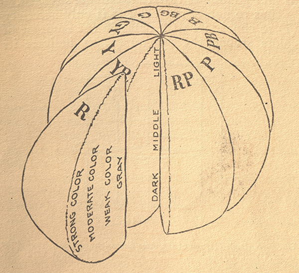
Fig. 4 – An orange assumed to represent the Color Sphere, with a segment displaced to show the NEUTRAL gray center, which is Black at the bottom and blends upward through increasing lightness to White at the top. Note the change in color strength (CHROMA) outward from center.
Thus to notate any color it is only necessary (1) to choose its HUE name in the sequence of colors around the Sphere; (2) to indicate its VALUE according to the NEUTRAL scale axis of the Sphere; and (3) to indicate its CHROMA according to the CHROMA scales of color strength. The MUNSELL BOOK OF COLOR provides accurate, scientific charts for this purpose.
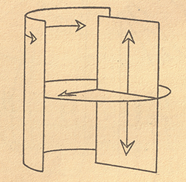
Fig. 5 – A simple diagram of the three dimensions of color. Around the center, HUES. Up and down, VALUE. Outward from the center, CHROMA.
Second Intermediate Hues
The device of the Color Sphere is used as an aid to orderly thinking. After mastering the basic idea of HUE, VALUE, and CHROMA and their relation to the Color Sphere, there are certain details concerning it which may now be considered.
Ten HUES have been mentioned as placed around the axis of the Sphere, but obviously they are not enough, for there is possible a much larger choice of color HUES, without reference to the qualities of VALUE and CHROMA. To facilitate the ready identification of “in-between” HUES, second intermediate HUES are added in logical sequence in the succession of Principal and Intermediate HUES around the Color Sphere. Reading clockwise from Red, the sequence is: Red, Red Yellow-Red, Yellow-Red, Yellow-Red, Yellow, Yellow, Yellow Green-Yellow, and so forth (R-YR, YR, YR-Y, Y-Y-GY, etc.). See any chart of Constant VALUE for the complete gamut. (Also see Fig. 6) Note that in the Second Intermediate HUES, which include three initial letters, the letter which occurs twice is that of the adjoining Principal HUE, but it does not occur twice in sucession in naming any of the Second Intermediate HUES. For instance, R-YR is correct, but YR-R is incorrect. YR-Y is correct, but Y-YR is incorrect.
Special Intermediate Hues
To facilitate the identification of special intermediate HUES, a hundred numerals (ten sets of ten each) are placed in clockwise sequence around the Color Sphere. And since further combinations of HUE initials (beyond three as used in a Second Intermediate HUE) would be clumsy, each of the ten Major HUES has ten numerals (1 to 10) assigned to it, indicating graduated steps of HUE changes from one HUE to another around the Sphere, horizontally. Number 1 of every Major HUE is placed four steps before the exact center of that HUE, which places the number 5 directly on the HUE itself. The numbers 6, 7, 8, etc. proceed in a clockwise direction, bringing ten directly on the Second Intermediate HUE. In notating colors the HUE number is placed before the HUE intial, as 2R, 7Y, 9YR, etc. Any Principal or Intermediate HUE is understood as being the number 5 of that HUE series of ten numbers, but any Second Intermediate HUE is understood as being the number 10 of the preceding Principal or INtermediate HUE. The reason for this is that most requirements of color description are accommodated simply by the initails of the Principal, Intermediate, or Second Intermediate HUES, the use of numerical HUE notation being confined to the relatively few cases where such fine HUE distinctions are required. Of course any fractional step of HUE, VALUE, or CHROMA can be written decimally.
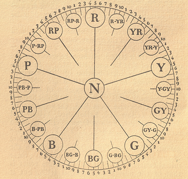
Fig. 6 – Diagram showing the 5 Principal HUES, the 5 Intermediate HUES, the 10 Second Intermediate HUES, and the 80 Special Intermediate HUES (indicated by the numerals, 1, 2, 3, 4 and 6, 7, 8, 9), in the 100 HUE circuit.
Chromas Beyond the Surface of the Sphere
At the middle level of VALUE, the fifth step in CHROMA is placed at the surface of the Sphere, but HUES of stronger CHROMA extend some steps out beyond the surface (See Fig. 7), like immense buildings (always at right angles to the axis) on a very small Earth; or like level limbs on a Color Tree (see the description of the Color Tree on page 25) extending through and beyond the surface of a sphere within which the tree has growth.
Fig. 7 – Diagram showing characteristic CHROMAS extending beyond the surface of the Color Sphere, the Yellow reaching its strongest CHROMA at the 8th level of VALUE, while its opposite, Purple-Blue, reaches its strongest CHROMA at VALUE 3.
The Color Sphere does not contain all colors compressed into a symmetrically spherical form, but it is the basic idea for an orderly arrangement presenting the three dimensions of color — HUE, VALUE, and CHROMA. Let the fifth or sixth step of CHROMA serve as a “checking station” in memorizing the various steps in CHROMA of any HUE. Memorizing even approxiamately the HUES at the fifth level or VALUE and the sixth step of CHROMA is of great help in judging colors generally.
F.G. Cooper
Munsell Book of Color Standard Edition
The Munsell Book of Color is a fundamental work on color which represents the last word in color standardization.
The Munsell Book of Color presents:
(1) Samples of 400 carefully standardized colors mounted in uniform sequences on
(2) twenty-six standard color charts which illustrate the three psychological attributes of color – hue, value, and chroma;
(3) a brief general description of the system devised by A.H. Munsell for coordinating the three color qualities mentioned above and instructions for the use of the standard color charts in the analysis and specifications of colors;
(4) a section on traditional color names showing the relation of these names to the Munsell system of color notation;
(5) a dictionary of color terms.
The Charts
Colors of Constant Hue – Ten Charts
A chard of constant hue shows measured steps of chroma at seven value levels in one particular hue.
Colors of Constant Value – Six Charts
A chart of constant value shows twenty hues in measured steps of chroma radiating from the neutral gray axis on one particular value level.
Colors of Constant Chroma – Eight Charts
A chart of constant chroma shows the sequence of hues at seven levels of value, but at one particular strength of chroma.
Special Hue Charts – Two Charts
These charts show the sequence of twenty hues at seven levels of value. Each hue is shown in the maximum of chroma which it attains at each level of value.
Abridged Edition
The Munsell Book of Color is also published in an Abridged Edition which contains loose-leaf sheets (6 3/4 3 3/4 inches in size) in a standard pocket size binder. This edition contains a minimum of descriptive matter, but illustrates the same number of colors as the standard edition. The Abridged Edition is especially designed to be a handy reference book for those who are already familiar with the Munsell Color System.
The Charts
Neutral Value Scale
A chart which shows nine measured steps of neutral gray lying between absolute black and absolute white.
Colors of Constant Hue – Twenty Charts
A chart of constant hue shows measured steps of value and chroma in that particular hue. Twenty equally spaced hues are illustrated in this manner.
Fields of Distribution
The Munsell Book of Color has already received the unqualified approval of representative individuals and organizations in all of the fields mentioned below.
Educational Institutions
Research Laboratories
Libraries and Museums
Artists and Designers
Printers and Advertisers
Manufacturers of: Pigments, Dyes, Inks, Cement, Ceramics, Electrical Supplies, Chemicals, Soaps, Paper, Textiles, Leather, Celluloid, Tobacco, Cigars, Food Products, Etc.
Department and Furniture Stores
Agriculturalists
Physicians
Copyright, 1907-1915-1929
by Munsell Color Company, Inc.
10 East Franklin St.
Baltimore, Maryland U.S.A
Printed in U.S.A.
Composed and Printed at the Waverly Press, Inc. Baltimore, Md., U.S.A.
Color Instruments Color Standards Color Service
The Munsell Manual of Color also includes a Dictionary of Color Terms.
A full vintage version of the Munsell Manual of Color is available for download.

Leave a Reply