The words chroma and saturation are often used interchangeably, but are defined as distinct concepts by the Commission Internationale de l’Eclairage (CIE), whose terminology is widely accepted as standard in science and technology. The distinction rests on an important difference between the colours of light reaching our eyes from the various parts of an object and the colour we see as belonging to the object itself. In CIE terminology1:
- Colourfulness is the “attribute of a visual perception according to which the perceived colour of an area appears to be more or less chromatic” (17-233).
- Saturation is the “colourfulness of an area judged in proportion to its brightness” (17-1136).
- Chroma is the “colourfulness of an area judged as a proportion of the brightness of a similarly illuminated area that appears white or highly transmitting” (17-139).
Saturation Defined
Saturation is defined in terms of two attributes of the appearance of a single area, and thus like those attributes (colourfulness and brightness) depends entirely on the appearance of the light remitted by that area to the eye. Saturation is the relative colourfulness of that light, independent of its brightness, or its freedom from whitishness, and is our perception of its relative energy imbalance through the spectrum, as detected by our visual receptors. Figure 1 illustrates three series of areas in each of which saturation should appear approximately constant. Within each series the light emitted by the areas has the same ratio of RGB components, varying only in brightness, and is seen respectively as relatively pure red light (high saturation, R1-R3), as white light (zero saturation, W1-W3), and as a fixed ratio of red and white light components (moderate saturation, P1-P3).
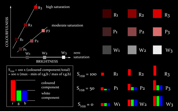
Figure 1. Areas displaying high saturation (R1-R3), moderate saturation (P1-P3) and zero saturation (W1-W3).
The parameter called “Saturation” (S) in HSB colour space, used for example in the Adobe Photoshop colour picker, is a physical estimate of the saturation of an RGB colour relative to the maximum possible for its Hue Angle (H), and is based on a very simple calculation from its r, g and b components (inset, Fig. 1). In other digital colour spaces and contexts so-called “saturation” can be a very different parameter, such as chroma or a relative chroma of some kind.
Illumination in Relation to Chroma & Saturation
If we were to view the world through a hole in a screen that appeared as a mere speck of light, we would be able to describe the hue, brightness, colourfulness and saturation of that light, but we could not tell if the darker, duller specks represented dark, dull objects in bright light, or bright, coloured objects in dim light. To perceive colours of objects we must be able to make comparisons between areas of the visual field. As an object is more strongly lit, its brightness and colourfulness increase, but its lightness (=value) and chroma, or brightness and colourfulness respectively “judged relative to the brightness of a similarly illuminated area that appears to be white or highly transmitting”, show a high degree of constancy through different levels of illumination, and so are perceived as attributes belonging to the object itself (Figure 2). Lightness is our perception of an object’s efficiency as a reflector/ transmitter of light, and chroma is our perception of an object’s efficiency as a spectrally selective reflector/ transmitter; for an object to have high chroma it must reflect/ transmit saturated light in relatively large amounts.
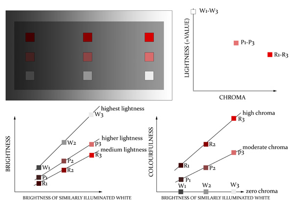
Figure 2. Illustration of the definitions of lightness and chroma.
Chroma, Saturation & Colorfulness
Figures 2 and 3 show the areas from Figure 1 in two different contexts, producing very different chroma and lightness perceptions. When the brightness of an area judged to be white changes in step with the brightness and colourfulness of each saturation series, the areas are perceived to maintain uniform lightness and chroma, and thus appear to have the same object colour (Fig. 2). But when judged against the same white the areas in each saturation series are seen as differing in lightness and chroma (Fig. 3): now the saturation series form lines radiating from near the black point, following paths of roughly uniform chroma to lightness ratios, in contrast to the vertical lines of uniform chroma. This is to be expected because chroma and lightness are colourfulness and brightness judged relative to the same thing, so their ratio reduces to the ratio of colourfulness to brightness, that is, saturation. These radiating lines of uniform saturation are important to painters because they define the image colours that create the appearance of a uniformly coloured diffusely reflecting object turning towards a light source2. To epitomize the distinction between saturation and chroma, R1 and R3 have the same high saturation, because both emit light that looks relatively pure red, but judged against the same white R3 has higher chroma, because it emits more of this saturated red light, and is therefore more colourful.
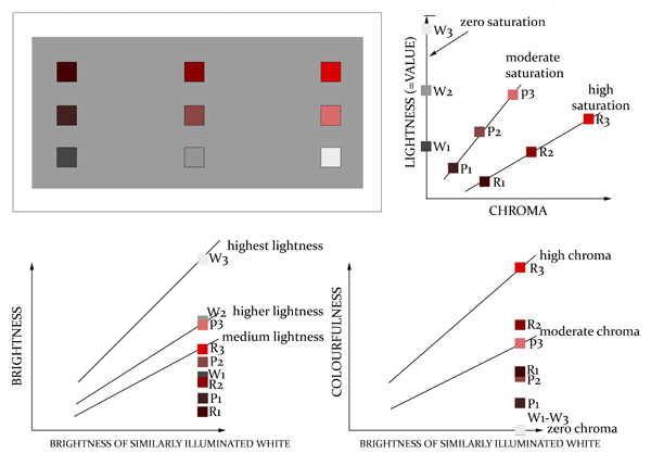
Figure 3. Areas from Figure 1 in a different context to Figure 2, resulting in very different lightness and chroma perceptions.
1Commission Internationale de L’Eclairage (CIE) (2011). International Lighting Vocabulary. CIE S 017/E:2011. Searchable online at http://eilv.cie.co.at/.
2Briggs, D.J.C. (2007). Shading series. http://www.huevaluechroma.com/101.php#shadingseries
About the Author

Dr. David Briggs is the author of the website The Dimensions of Colour, and has taught classes in color for artists and designers for over twenty years at institutions including the Julian Ashton Art School and the National Art School, Sydney, Australia.

An interesting article by RWG Hunt on the same theme:
http://www.imaging.org/ist/publications/reporter/issues/Reporter16_6.pdf
Thank you for sharing
This article explains the science and technology behind what makes and object red. Artists are not concerned with the science behind what makes the object red but how to paint it red. “Frank J Reilly The Elements of Painting” explains the Munsell Color system on how to paint the red object.
the difference between saturation and chroma is still rather fuzzy to me! Great website though!
agreed
Thanks for the comment Rinald. I’ve recently added seven new pages on my site that explain each of the basic colour attributes in turn and which might be easier to understand. These are the pages on chroma and saturation:
http://www.huevaluechroma.com/015.php
http://www.huevaluechroma.com/017.php
An important distinction. Thank you!