“…it’s sort of comical how you think that you’ve made a choice that exempts you from the fashion industry when, in fact, you’re wearing the sweater that was selected for you by the people in this room from a pile of stuff.”
– Miranda Priestly
Devil Wears Prada, 2006
Chromapost Project
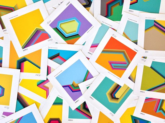
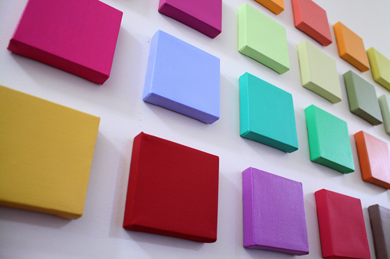
Five years ago I started a little blog experiment where I would post a single color tone daily at the end of the day. I tried to compress my daily emotional experience into one single color. I was wondering how far we could go in compressing information, beyond Twitter’s 140 characters for instance. More importantly I wanted to establish a very personal and emotional connection with color. Color would be an immediate expression of my feelings with as little external influence as possible. And by influence I mean all the things I was taught in school about color theories and harmonies, color trends and palettes, color coded visual communication, and culture in general. That little blogging experiment has grown into a full-fledged ongoing art project called Chromapost with its many outgrowths.

Photo Credit: Collin Erickson
Color Perception, Preference and Expression
Getting rid of external influences on our color choices is quite an impossible task, but aiming in that direction can give us a valuable insight into the nature of those influences and provide us with deeper understanding of color as a cultural phenomenon. We prefer one color to the other when we buy clothes, furniture, house paint, appliances or any product for that matter. If you are a designer, you have to deal with color choices daily. Do you pick them randomly, based on client’s wishes, according to your own tastes, in accordance with a ready-made color palette (we are certainly flooded with those) or based on what those colors culturally communicate in a particular period? It’s hard to give a straightforward answer, isn’t it? And if you’re an artist, color choice options simply explode from copying nature and sticking to a set of made up rules to following your intuition or picking colors by pure chance. The question remains. Why this and not that color?

Let’s take a big step back for a second in setting our stage and try to establish what we mean when we say color. The usual scientific consensus says that color is a perceptual phenomenon. In very common terms we could say that there is no color outside our brains. Neither of us can ever truly know if other people see the same color the way we do. Among many episodes I remember one where a friend of mine and I had a heated debate whether the pedestrian stop light (hand) in New York was orange or red. I said orange, he said red and neither would budge an inch. What the other one really sees and what he refers to by saying ‘orange’ or ‘red’ we’ll never find out. This autistic brain cage situation made color studies extremely frustrating, but also challenging and exciting. Since I am going to discuss various relational and cultural aspects of everyday life, color could also be pigment, material, paint, surface, light, message, symbol, idea…
From Color Classification Systems to Meaning
There has always been a tendency to classify and name colors for the sake of understanding what color exactly we are referring to when discussing or using it. The linear spectrum of visible light has been hammered into circles, spheres, double cones or digital color pickers with an exact position for every color within a given system. A breakthrough in industrial standardization of color came with the Munsell color system, which was based on thorough practical research and naming that enabled exact mass reproduction.

Apart from giving colors a name and an exact place within a system we have always tried to attach meaning to it, as we pretty much do with everything else. Depending on a particular culture and its complex set of values, commercial practices, price of a color pigment and other various contingent influences color alone began to represent something and to have a widespread symbolic meaning. Color itself became a message. You know, red=stop, green=go, pink=girls, blue=boys… Such processes within society and culture are extremely complex especially when it comes to something so elusive as color. Nonetheless, in the following series of blog posts I will try to scratch the surface and present you with the chief influences on our perception of color, color preferences and expression through color. Examining as much as possible from culture, language and personal memories to commerce, color theory and art history might get us closer to answering the question from the title.
About the Author
 Aleksandar Macasev is a visual artist and graphic designer who lives and works in New York City. Everything about the Chromapost project can be found at www.chromapost.com. He invites you to join the Chromapost Social Network at www.chromapost.net, where users can post colors based on their emotions and create art out of it.


[…] is zero. The color always has to be shown and then have the name tag slapped onto it. I was always wondering about how I arrived at the images I associate with the definitions of colors in my own life. What did my parents point to when they […]
[…] by our own culture might at least show us direction toward a Dionysian color utopia where we could use the color freely as we like. Where we could loosen up and get in touch with our own feelings and the feelings of […]
[…] such as clove, broccoli, and chestnut. All of this highlights that ideas of color are very much rooted in personal experience. Choices in names evoke a whole slew of […]
[…] a passion for color for as long as I can remember. I am fascinated by its use, meaning and how it affects human behavior. Although I consider myself a fairly sensible person when choosing colors for my design projects, I […]