Statistics on Colors
The data from the World Color Survey was extracted from handwritten notes to an electronic data set where each data point connects one speaker, one language, one specific Munsell color and one color term with each other. The data set contains 21,993 of these couplings, connecting 2,619 speakers with 2,300 color terms across 110 languages.
Languages were chosen to be small, non-European and non-written. For each of the color terms, the data also contains responses from all speakers of that language, on which Munsell color sample best corresponds to that color term: the bluest of the blue chips, the reddest of the reds.
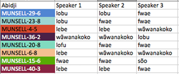
Extract of The World Color Survey Data pairings. The first 8 colors displayed in the experiment are listed to the left, and the first three test subjects and their answers are listed next to the color list.
From this data it is a matter of straightforward data wrangling to create descriptions of how a speaker uses one of their color terms: as a map of the extent of that color term across the sample chart. By combining these for all speakers in a language, a map for the coverage area of a color term in the interviewed speaker population can be created, where the extent to which speakers agree on the use of a word for a specific color can easily be read. These two maps – the speaker density and language density of a color term – are two representations that have garnered a lot of attention in later statistical studies of the data.

The chart with the full selection of 330 test color chips. From The World Color Survey Database.
The first conclusions drawn from the data set were presented by Kay, Berlin, Maffi and Merrifield (1997). Reporting from the then ongoing analysis of the World Color Survey data set, they refine the hierarchy originally proposed by Berlin and Kay (1969), into a five-step hierarchy branching out to several different options in steps III and IV. The first few stages are similar, but languages with 4 or 5 major basic color terms come in three or even five variants each.
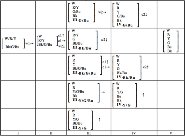
The World Color Survey refined hierarchy of color naming evolution: The stages are illustrated by which of 6 basic color types are grouped together in each stage. Figure from Berlin, Kay, Maffi and Merrifield 1997.
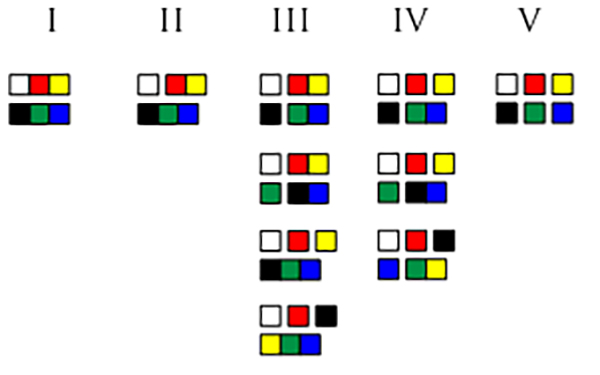
The World Color Survey refined hierarchy of color naming evolution: The stages are illustrated by which of 6 basic color types are grouped together in each stage. Figure by Mikael Veidemo-Johansson, CC-BY
Using Clusters for Color Naming Universals
Relativists and anthropologists did not tarry in pointing out weak spots in their work. Lucy (1997) leveled critique against the early analyses:
“[Work in the B&K tradition] not only seeks universals, but sets up a procedure which guarantees both their discovery and their form. … when a category is identified … it is really the investigator who decides which ‘color’ it will count as … What appears to be objective – in this case, a statement of statistical odds – is [not].” (p. 334)
By this Lucy means that if the researcher expects their study to prove that all languages share systems in color naming, that there are universal tendencies for color naming, then merely “eye-balling” the data is not enough: that way their own expectations bias the analysis towards confirmation of their hypothesis.
As a direct response to this criticism, possibly the first of many papers working on the World Color Survey with statistical tools was Kay and Regier’s paper Resolving the Question of Color Naming Universals. One imaginable way to give statistical rigor and objectivity to the universality claim could be to build clusters of similar color words and analyze how tight or spread out each cluster is. Comparing this to simulated virtual color words created by a random process, one could quantify whether the structures observed in human languages are specific to languages, or a statistically expected effect of an essentially random process.
In other words, by using statistical testing on the dataset human subjectivity could be removed.
Kay and Regier start out with the speaker density maps, and for each speaker and color term, compute an average color using CIE LAB color space coordinates. The CIE LAB coordinates are constructed to encode perceptual color differences as measured by psychologists in the color space distances themselves. This is essentially the same feature that we mentioned in a previous blog post, where Lenneberg and Roberts picked the Munsell Book of Color partially because the book contains positions on the perceptual color solid for each color. The CIE LAB space is a coordinate system for this color solid that makes perceptual distances easy to calculate. For instance, the CIE LAB distance between the red of a strawberry and the red of a raspberry would be much smaller than between the red of a strawberry and the blue of a blueberry.
From these average colors for each term and speaker, an average of the speaker averages is computed – forming a language-wide average color value for that word. This means that all words, like fwae or lobu in Abidji, are boiled down to a single point on the color solid. The point in the center of all responses is used to represent the entire spread of the word. It would be as if pink in English is represented only by a particular shade of hot pink. All these 2,300 language-wide average word colors are then finally clustered.
As a comparison, Kay and Regier go through the exact same clustering process, but with the hue angle for each speaker map rotated at random. By computing these random rotations repeatedly and analyzing each repetition, a statistical picture emerges of how the measure of spread in the clusters varies across random variations. Finally, they compared this statistical picture to the actual results of the unrotated data, showing that the observed clusters are far tighter, less spread out, than should be expected from a random process.
In other words, Kay and Regier claimed to have found universals in color naming, this time with a less subjective statistical method.
Kay and Regier also tested the difference between written and unwritten languages, and found that they behave more or less the same.
Lindsey and Brown (2006) criticize the previous statistical analyses, pointing to the representation of color terms as only their average color chip as a problem in the analysis. This criticism comes after a longer academic discussion involving Lindsey and Brown on the roles of blue/green terms and lens yellowing with age distorting color vision.
Lindsey and Brown point out that the process used by Kay and Regier completely erases the kind of information needed to tell the difference between qualitatively different possible color terms. Something that is primarily turquoise, but can be used for blues and greens would be a different color word from something that is primarily green but can be used for blues, or something that is primarily blue but can be used for greens. They point out that an analysis method that works with the entire distribution of color name responses would do a far better job at distinguishing these cases than the single point representation used by Kay and Regier.
As an improved approach, they use a statistical method called k-means clustering. This k-means clustering divides a data set into k different parts, each described by a central point. The cluster centers are chosen to create the best possible division by assigning each data point to its closest cluster center. Best here is taken to mean that distances within a cluster should be smaller than distances between different clusters.
They use statistical correlation between speaker distribution maps to generate a similarity measure and then run this k-means clustering on these distributions of speaker responses. This picks apart the data into separated chunks of color words.
A New Way to See the Color Data
Jäger, in 2012, wrote the paper that made us, the authors of this blog post, interested in the field. He tries to produce statistically sound and reliable foundations for the analysis of the World Color Survey data. Jäger’s study uses established statistical techniques – Principal Component Analysis (PCA) – to compute likely building blocks for a more complex data set. There are techniques associated to PCA that can guess at a likely total complexity of the data: the number of building blocks needed to describe everything in the data set sufficiently well. Using these, Jäger finds 15 essential color word footprints on the color solid, or in other words 15 potential universal colors.
In a recent paper, (Vejdemo-Johansson, Vejdemo and Ek 2014), we challenge the metric choices made by Lindsey and Brown and by Jäger.
Their choice to compare distributions using correlation metrics means that they only compare the sizes of actual overlaps between different words. In order to build a metric that compares color words in a way that relates to the perceptual distances of colors, something more complex has to be used.
One particularly illustrative example of the problems we observe is given by the language Amuzgo. In Amuzgo, there are well established color terms that cover colors like green, yellow-green, blue-green, red, purple and several other color regions. Because of the sharp borders between the different green areas, at least these five words cover completely disjoint areas from each other.
If we use the techniques suggested by Lindsey and Brown and by Jäger to tell us which color words are perceptually closer to one another, we get strange results for the Amuzgo words. We would like the blue-green and the green color words to be considered rather similar to each other, and definitely more so than the green and the purple. But Lindsey and Brown’s and Jäger’s method sorts these colors the other way around: purple is more similar to green than blue-green is.
Why is this a problem? If you get this stage of the data processing wrong, the clustering that relies on these distances will also be wrong. Any conclusions drawn from that clustering expecting statistical rigor and objectivity ends up suffering under a choice of comparison that excludes important features from the data.
Summary
We believe that for a statistical analysis to actually carry weight, it needs to be handled with care. Since we do not actually know a ground truth for either the universality question itself or a true hierarchy of color terms, we are using statistics to give us confidence in possible responses. When doing this, it is imperative that the statistical analysis itself gives the responses we believe it to give: that things that are considered to be similar statistically correspond to the linguistically or anthropologically similar things. Similarly, the choice of cluster analysis tool is also a potential source for mistakes.
Nevertheless, we believe the World Color Survey to be a fantastic source of data from an amazing data collection effort, and we firmly believe that exciting and deeply significant results have been found and are yet to be found in the data set.
Not everyone agrees. Conklin’s argument that the Munsell testing excludes important sensory features of color perception, such as texture, luster, transparency, etc., still stands. Several researchers (Lucy 1997, Wierzbicka 2006, Saunders 1995 and 1997) argue that just knowing what hue in the real world a color word typically refers to is only a small part of understanding the full meaning of a color term. Speakers from one of the languages in the World Color Survey flatly refused to name most of the displayed color chips – and Levinson (2000) points out that maybe not all languages name all colors.
The quest for universals of color naming, if they indeed exist, is still ongoing, and the Munsell Book of Color remains at the heart of the debate.
References
Hickerson NP (1971) Review of Berlin and Kay (1969). International Journal of American Linguistics 37: 257-270.
Conklin HC (1973) Color categorization. American Anthropologist 75.4: 931-942.
Kay P, Berlin B, Maffi L, Merrifield W. (1997) Color naming across languages. Hardin CL and Maffi L (eds.), Color Categories in Thought and Language. Cambridge.
Kay P, Regier T (2003) Resolving the question of color naming universals. Proceedings of the National Academy of Sciences. 100(15) 9085-9089
Lindsey DT, Brown AM (2006) Universality of color names. Proceedings of the National Academy of Sciences. 103(44): 16608-16613.
Jäger G (2012). Using statistics for cross-linguistic semantics: a quantitative investigation of the typology of colour naming systems. Journal of semantics, ffs006.
Vejdemo-Johansson M, Vejdemo S, & Ek CH. (2014). Comparing Distributions of Color Words: Pitfalls and Metric Choices. PloS one, 9(2), e89184. DOI: 10.1371/journal.pone.0089184
Cook RS, Kay P, Regier T. (2005). The world color survey database: History and use. Handbook of Categorisation in the Cognitive Sciences. Amsterdam and London: Elsevier.
Lucy JA. (1997) The linguistics of color. Hardin CL and Maffi L (eds.), Color Categories in Thought and Language. Cambridge
Wierzbicka A. (2006) The semantics of colour. Progress in Colour Studies: Language and culture 1.
Saunders B. (1995). Disinterring Basic Color Terms: a study in the mystique of cognitivism. History of the human sciences, 8(4), 19-38.
Saunders B. (1998). What is colour?. British Journal of Psychology, 89(4), 697-704.
Saunders B, Van Brakel J. (1997). Colour: An exosomatic organ? Behavioral and Brain Sciences, 20(02), 212-220.
Levinson SC. (2000) Yélî dnye and the theory of basic color terms. Journal of Linguistic Anthropology 10.1 (2000): 3-55.
Related Posts
- How the Munsell Book of Color Revolutionized Linguistics Part 1
- How the Munsell Book of Color Revolutionized Linguistics Part 2
- How the Munsell Book of Color Revolutionized Linguistics Part 3
- How the Munsell Book of Color Revolutionized Linguistics Part 4
About the Authors
 Mikael Vejdemo-Johansson is a mathematician, postdoctoral researcher, programmer, system administrator, photographer and amateur musician. He received an Fil.Mag. (M.Sc.) in Mathematics at Stockholm University in 2005 and doctorate from Friedrich-Schiller-Universität Jena, Germany, in 2008. Since then he has been at Stanford, the University of St Andrews, KTH and the Jozef Stefan Institute as a postdoctoral researcher.
 Susanne Vejdemo is a PhD student in the Special Doctoral Programme in Language and Linguistics at Stockholm University. The goal of her PhD project is to try to determine what kinds of semantic content have an effect on the speed of lexical change, and to present a theory about the relative importance of semantically-triggered change, in contrast to such factors as psychological forces, sociocultural forces, cultural/encyclopedic forces and other linguistic forces.


Leave a Reply