We sat down with Jennifer Cohlman Bracchi, Reference Librarian at Cooper Hewitt, Smithsonian Design Museum in New York City, to talk about the exhibit, Color in a New Light. The exhibition follows the theme of color through the vast collections of the Smithsonian Libraries. Color is something many of us take for granted and it plays a role across so many disciplines. Learn more about this exciting exhibit that helps connect the dots between the world of color and finds new and meaningful discoveries along the way.
Who came up with the idea for this exhibit?
The Smithsonian Libraries has 21 branches and 2 exhibition spaces, both on the mall in Washington, D.C. We were thinking about new exhibitions for the cases that are in the Natural History Museum, wanting an exhibit focused on the strengths and diversity of our libraries collection, which expands to many subject areas and disciplines. I was on a small team that was presented with the task to come up with an idea that could pull from as many library collections as possible and the idea of color came to mind. Working at Cooper Hewitt, I knew we had a great color collection in our rare book and special collections, but I wasn’t sure what I would find throughout the other branches. Luckily I found really amazing titles and seminal works on color theory. It ended up being a really fabulous topic that demonstrated the strengths of the Smithsonian Library’s collections.
While working on the exhibit, I became fascinated by the topic of color. It was incredibly fun to research, so much so that I felt like I could research color for the rest of my life and probably still discover new, exciting things. The whole journey has been a really wonderful one.
What was your favorite discovery?
There were so many discoveries. The topic of color is so broad that one of the big challenges was trying to narrow it down in a narrative that made sense. After dividing it up in 4 main categories: the Science of Color, the Making of Color, Matching Color (color standards and color naming) and finally, Using Color. I had a list of 200 books I had to narrow down within these categories.
It’s hard to pick a favorite, but the real standout was a book called, Colorito by Jacob Christoph Le Blon. The book was published in 1722; only 15 copies were ever printed and only 3 of those ever came to the United States at the time. I was really fascinated to find we had it in our collection even though it was within the rare books division. It was not necessarily recognized for its significance until the topic of color came up. This book not only documents, for the very first time, primary colors mixing into secondary colors, i.e. yellow and blue made green and red and yellow make orange, but it also presented what is essentially our modern-day printing process: using 3 primary colors, plus black, to create the colors of the spectrum. CMYK printing was invented (in 1722) by Le Blon and published in this book for the very first time.
Le Blon was from Germany but patented this process in England. He was really the only one that mastered the printing technique. Even with the process outlined, it took over 100 years for others to be adept at it.
Are you using any special lighting for the exhibit?
Not special lights but the light levels are at a very specific range that is safe for the display. There will also be some rotations of the display to prevent potential light damage. We only keep displays up for 3 to 4 months, turn pages in the books or swap out books when we have extra copies of them. That is how we deal with a lengthy exhibit when you’re dealing with paper and color printing.
Do you have any special programs that are running in conjunction with the exhibit?
We have a lecture series kicking off on June 21st and a few workshops, one in New York and one in Washington D.C., on color harmony and using paint chips to create a flap book (pop-up book), with book artist Esther K. Smith, who will be demonstrating how to create this form.
We had a few events including a reception with our lead sponsor, Benjamin Moore and their Vice President of Color Engineering, talking about how they come up with the color of the year. We also did an installation tour using Periscope showing the exhibit being installed.
What made you decide to include Munsell?
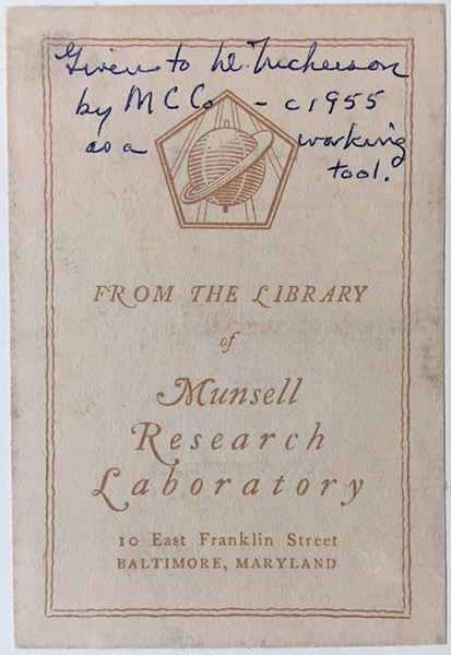
How could you not include Munsell?! I’m sure Munsell loves to hear that [laughing], but it is so true. Not only did we have many Munsell pieces in our collection, but there is an interesting backstory.
At some point, the Inter-Society Color Council, whom Dorothy Nickerson was a member, had a collection of color related materials and were looking for a home for them. Some of them ended up at the Cooper Hewitt (this pre-dates our library director, so unfortunately he can’t speak to the acquisition of it) in our rare books and special collections and some of the archival material went to the Hagley Museum. They also have a treasuretrove of color-related resources and primary documents that relate to this original collection. Many of the books have Dorothy Nickerson’s book plates in them and some of those are Munsell related.
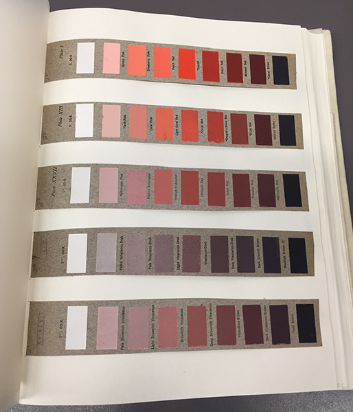
You will find Munsell items throughout other branches as well, for example, The Color Atlas from 1915, which was held in a few of our branches and is the earliest Munsell holding. It is also one of the nicest to display; it’s big and colorful and show the system early in its development. It was a key book to include in the Matching Color section. Matching Color brings awareness to the fact that the way you see green is not necessarily the same way that I see green. If that is the case, then how do we know we are talking about the same color green? This is where color charts come in. There is a long history of color charts. This exhibit features many, including a really early one from the 1600’s up through to Munsell and the modern day Pantone system. These systems sought to create a reference for color standards, either through naming (which Albert Munsell felt was foolish) or numbering (Albert’s preferred choice for describing color).
Color experts from Benjamin Moore came to visit our collection when they were interested in potentially funding the show. When they saw the Munsell works on display, they immediately were drawn to it and said, Oh Munsell, of course, it’s still one of the standards we use today.” Albert Munsell is truly fascinating for what he achieved in the standardization of colors, and the fact that it is still used in so many disciplines. I think it speaks to what a great achievement he made in the world of color.
In the book, The Color Revolution, Regina Blaszczyk talks about the different swatchbooks that sales people would use to sell products through the use of color. Did you include any of the old swatchbooks in this exhibit?
We did! They are on display in the section called, Using Color. We include early house paint catalogues from Seeley Brothers. They feature beautiful Victorian painted homes in which 3 to 5 color would be selected that would complement each other. There is a page with all of the paint chips that were offered at the time.
We included a coach and car paint chip catalogue by Benjamin Moore from 1898. Who knew they use to manufacture paints for cars? It features bright, beautiful, bold colors that were being used for cars at that time.
We have a catalogue which served as a fashion forecast of color trends from 1950. It used these adorable cutouts of fabrics and little high-heeled shapes and hosiery, all pasted together in a pleasing display on the page.
We wanted to finish the show with something people could relate to so we feature a Fiestawear picture that talks about how Fiestaware was one of the original companies that brought bold colors into the household.
There’s a whole series of trade cards that the brands would put out as they created new colors. We have volumes of different materials that illustrate the many colors people could choose from at various points in time.
Was there anything that you excluded that you really wish could have been included?
There’s so much that had to be excluded. One of the books I really wish was in the exhibit is a book entitled, Sphaera Mundi, from 1485 by a man named Erhard Ratdolt. He was extremely important in the history of printing and had studied under Guttenberg. Most objects, up until the early to mid 1800’s were hand-colored in books if they were colored at all. Then mechanical color printing, chromolithography, was developed at the beginning of the 19th century and reached its heyday around the middle of the 1800’s. The diagrams in the book depict astronomical ellipses. This book is credited as the first book to include a printed illustration using three colors of ink. It just fascinated me; it is so old. He also invented the the modern day title page.
We ended up not being able to focus on the history of color printing other than with the Le Blon. With all the materials we have, we could do an entire show on the history of color printing. I was on The Met’s website recently and there it was… it’s part of their show on the history of printing that’s up now.
Have you studied color theory or had any previous knowledge before putting this exhibit together?
No, not really, nothing formal. When researching for this show, it got me thinking about the pedagogy of color and how we learn it. I have a 10 month old at home right now and so many of the toys and the books are all about color. Learning your colors is one of the basic things you teach a newborn. But as adults, we get away from it unless you are an artist, designer or use color in your field. The last time I formally learned about color was probably in a high school art class. It was fascinating to me. Learning from, oddly enough, Milton Bradley who was famous for his board games, but was also a very big color education enthusiast. He compared it to learning a musical instrument and how the earlier you developed the language of color, the more literate you are in the world of color.
There’s so much about color that we just don’t understand. Things like how our eyes work, how colors can change in different light, how putting two colors next to one another can affect what you see. I approached this topic very naively, not knowing how complex it was, and then realized how illiterate I was in looking at the world of color, realizing how these colors interact with one another and how my eyes see things differently than other. I think if I knew more about color I might have been too scared to even take on this topic because it is so complex. This is the most I ever dove into this subject area.
Based on what you have learned, where do you think color is headed? If you were gonna have another section in the exhibit 30 years from now, what do you think would be there?
Part of wanting to do this show was hoping to inspire others to start thinking about color more and not taking it for granted. This show demonstrates how the study of color has led to so many achievements and paved the way to so many accomplishments. I think the further study of color can potentially unlock more mysteries of the universe. This might sound like a really grand notion, but if you look at the objects in this exhibition, it paved the way for areas of study like quantum theory which then led to astrophysics.
I think the most important thing is to address the subject of color in a way that is not passive but by really bringing it the full attention is deserves. There’s no limit to what might be discovered. It is great to see there is more attention being placed on this subject. There has been a few exhibitions recently addressing color history in a new and unexplored way. Munsell was trying to develop a beautiful model to easily describe color. Although there is still no universal model, i.e. no mathematician has discovered a universal theorem that can explain color, the fact that color has been contemplated by some of the greatest minds in history, means we will keep leaping forward to fascinating discoveries. There is still much unknown in the world of color and much to still be explored.
Color in a new Light runs through March 2017. You can learn more about the exhibit here: http://library.si.edu/exhibition/color-in-a-new-light, but we recommend seeing it in person if you can.
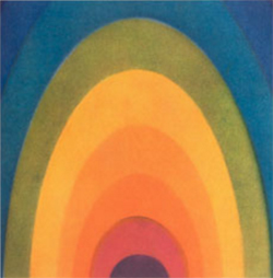
Featured image by Winstone & Sons and available as a 500-piece puzzle from Cooper Hewitt.

Wish I could watch Benjamin Moore Vice President of Color Engineering, talking about how they come up with the color of the year.