The 9th part in our series of excerpts from the 1921 book, “A Grammar of Color,” continues with a detailed color balance definition in the chapter “A Practical Description of the Munsell Color System With Suggestions For Its Use”, written by T.M. Cleland. So far, this chapter which explains color theory, has covered Hue, Value and Chroma, the Color Chroma Scale and Opposite or Complementary Colors.
In this part, the discussion continues with a detailed technical explanation on how to do color balancing to form a more harmonious color design. The brilliance of the Munsell Color System is that “we may prove that we have attained Balance by the fact that everything in our design, thus apportioned as to area and strength of Chroma, if mixed together, would produce a perfect gray.”
The last section of this chapter and our next blog post with an excerpt from “A Grammar of Color” will cover Color Combinations.
BALANCE
In describing the dimension known as Chroma, we noted the fact that certain of the Hues were much more powerful than others, in this regard, and were only to be represented by lines or paths extending beyond the others and outside of the sphere. We found that Red, for example, on any step of Value is more powerful and requires a longer path than its opposite, Blue-Green; and that Yellow is longer than its opposite, Purple-Blue, on the high steps of Value, but shorter on the lower steps of Value. This brings us naturally to the question of Balance of Color, the vital question in all applications of color to practice. Now if we mixed equal parts of Red at its maximum Chroma with its opposite, Blue-Green, at its maximum, we would not get a perfectly neutral gray, but one in which the Red predominated very decidedly. It would be somewhat like a tug-of-war in which there were ten men, each representing a step of Chroma, on one side and only five on the other.
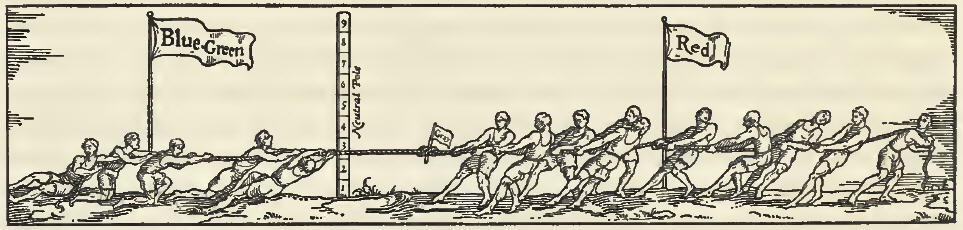
The resulting color would be pulled well over on to the Red side, because of the fact already stated that Red at its maximum Chroma is so much stronger than Blue-Green at its maximum Chroma. If, however, instead of taking equal amounts of the two colors, that is to say equal quantities of pigment or equal printed areas of each, we take what would correspond to an equal number of steps upon the scale of Chroma, we find that they do balance and produce a perfectly neutral gray, in which neither the one Hue nor the other predominates. Let us glance for a moment at these two diagrams, in which a bar represents the line of Red and Blue-Green, with five steps of Chroma for Blue-Green and ten steps of Chroma for Red, as is the case with these two Hues at Middle Value. The bar rests upon a fulcrum at the neutral point and obviously it will not balance, but will fall to the Red side, as in Figure 1.
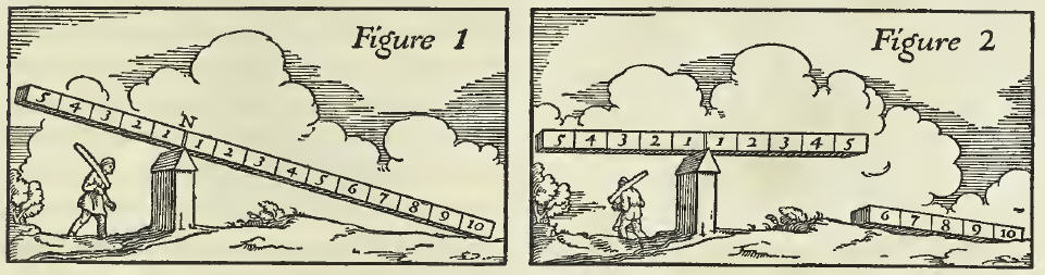
But if we cut off steps 6, 7, 8, 9 and 10 from the Red side of the bar, it will balance upon the neutral gray, as in Figure 2. This will doubtless strike the reader as so simple and obvious that it scarcely merits statement; but it is just this simplicity which is characteristic of the Munsell System throughout, if approached from the same point of view. This, too, will explain why the diameter of our Color Sphere is limited to the shortest Chroma path at Middle Value. It will at once be apparent that within a sphere thus limited, all opposite colors will balance because being all of equal length at each level of Value no Chroma path can be longer than another or outbalance it.
Thus we see how two opposite colors may be balanced by employing only equal Chroma steps of each on the same level of Value, that R 5/5 will balance B-G 5/5 or G 5/3 will balance R-P 5/3 and so on throughout all of the Hues.* But in practice we may wish to employ a weak Chroma of one Hue with a strong Chroma of its opposite. In this case we cannot resort to the simple expedient of chopping off the excess strength of color on one end of the line, but must attain the desired Balance by another means. If our purpose is merely to make a perfect gray, we would use a greater amount of the weaker color; but if, as in general practice, we wish to produce a balanced or harmonious color design, we would employ a larger area of the weaker color than of the stronger. If we do this in correct proportions, relative to the strength of Chroma in each of the colors, we will attain Balance. We may prove that we have attained Balance by the fact that everything in our design, thus apportioned as to area and strength of Chroma, if mixed together, would produce a perfect gray. Let us suppose, for example, that we wish to employ in our design the maximum of Red and Blue-Green at Middle Value.
*Examples of this will be found on the first three color sheets, where all of the Hues are shown thus simply balanced with their opposites, each sheet showing them at a different step of Value.
Since we are speaking of Balance a pair of scales is an apt figure with which to illustrate the point. Into the pan on one side we will put Jive blocks of Red 5/10, its maximum Chroma. In order to balance this we must put into the other pan ten blocks of the strongest Blue-Green, which is only 5/5.
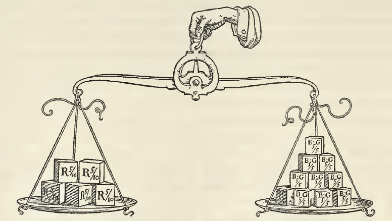
So we find that in order to balance two colors of unequal Chroma, but of the same Value, we use a larger area of the weaker Chroma with a lesser area of the stronger, and that the proportions are simply in inverse ratio to the strength of Chroma of each. That is, we use ten parts of Blue-Green at /5 Chroma with five parts of Red at /10 Chroma, or let us say six parts of Yellow-Red 3/4 with four parts of Blue 3/6, etc.
Thus far we have considered only Balance of opposite Hues on the same level of Value; but more often than not it will occur that we wish to print a design in colors which are not only different in Chroma strength but also on different levels of Value, and this difference of Value will also affect the question of Balance and of the amount of area which each color should occupy in order to attain it. Let us assume that we wish to print a design in Yellow of a high Value and strong Chroma, say Y 7/9, with its opposite, Purple-Blue, at low value and weak Chroma, say P-B 3/4. The path formed by a line drawn between these colors, passing through the neutral pole would not be horizontal in this case, since they are at different levels of Value, but would appear as in this diagram.
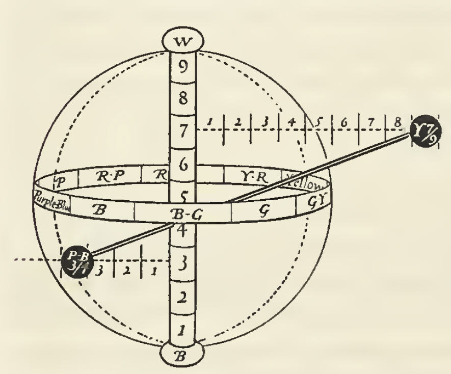
We now have to take the Value into account in determining the amount of area of each of these two colors to be used if we are to arrive at a perfectly balanced color design; and this is done by the simple process of multiplying the Chroma by the Value of each of the colors. Multiplying the Chroma by the Value of Yellow 7/9, 7×9 = 63, and doing the same with Purple-Blue 3/4, 3×4 = 12, we get these two products 63 and 12. These are applied inversely, as in the former case, and we use 63 parts of Purple-Blue 3/4 with 12 parts of Yellow 7/9. The conclusion is that the stronger Chroma and higher Value should occupy the lesser area and the weaker Chroma and lower Value should occupy the greater area.
All of the areas on the color sheets throughout this book have been measured and apportioned upon this principle with as great a degree of accuracy as possible, to better exemplify the rule; but it is not assumed that in printing a complicated color design the areas could all be measured and made to conform strictly to this law; or that the effect would necessarily be inharmonious if they did not. This is merely a guiding principle or ideal point at which we may aim in the actual printing of a color design. If we had such a design to print in two colors, for example, and one of the blocks from which we were to print it occupied what we would estimate by eye to be about twice as much surface or area as the other block, it would be a simple matter to choose colors to conform. We might take Purple 4/6 for the larger area and Green-Yellow 6/8 for the smaller, or Blue 2/3 for the larger and Yellow-Red 3/4 for the smaller, or any other colors which would give us a proportion approximating that of the difference between the areas of our design. Circumstances will not always permit a strict adherence to the proportions indicated by this formula; but it will rarely, if ever, be impossible to follow the general principle of printing the larger area in the lower Value and weaker Chroma and the smaller area in the higher Value and stronger Chroma.
For purposes of illustration we have considered only designs in two colors; but it is scarcely necessary to say that the same rule would apply to three or any other number of colors. Reference to the prints of the design by Miss Helen Dryden, which appears at the end of this article with an analysis of their color Balance, will make this fact clear.
Related Links:
- Part 1: Home Page
- Part 2: Preface, by the Strathmore Paper Company
- Part 3: Introduction to the Munsell Color System – The Color Sphere
- Part 4: Introduction to the Munsell Color System – Balance of Color
- Part 5: Introduction to the Munsell Color System – Unbalance of Color
- Part 6: A Practical Description of the Munsell Color System with Suggestions for Its Use – Section One: Hue, Value, Chroma
- Part 7: A Practical Description of the Munsell Color System with Suggestions for its Use: Color Chroma Scale
- Part 8: A Practical Description of the Munsell Color System with Suggestions for its Use: Opposite or Complementary Colors
- Part 10: A Practical Description of the Munsell Color System with Suggestions for its Use: Color Combinations
- Part 11: Suggestions for Use & A Note on the Printing of this Book
- Part 12: Two Proofs of a Design by Miss Helen Dryden for Vogue
- Part 13: The Color Sheets – Frost Gray; The Three Dimensions of Color
- Part 14: The Color Sheets – Gray, Pyro Brown
- Part 15: The Color Sheets – Brown, Grouse Drab

Thank you for publishing this.