
I originally came across the Munsell Colour System when I bought the student set back in 2001. Compact, but nonetheless very comprehensive, the set also included practical exercises which were a great way to apply theory to practice. I was looking for something that would complement my existing knowledge of colour theory, something that was accessible and that I could also use for my work as an emerging designer. Books on colour theory at the time were great in many ways, but didn’t really help me refine my understanding of colour when it came to practical design applications. Using Munsell was a real eye opener. I started thinking about colours in a completely different way… and in the third dimension! As a spatial designer whose work is mostly 3D, this notion is very important. I also enjoyed putting together the colour charts that came with the student folder (not as easy as it first seemed) and experimenting with colours using the exercises, or making my own palettes.
Teaching Colour Theory in Spatial Design
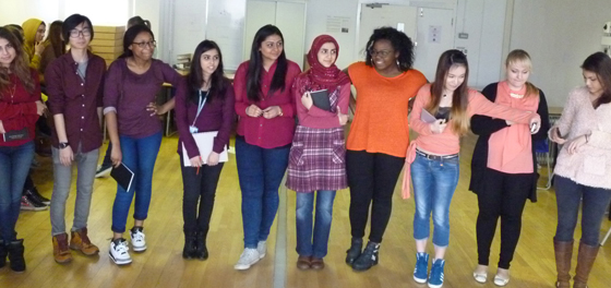
So when we thought about ways to engage students of the BA Spatial Design at London College of Communication with colour theory, we referred to the Munsell Colour System. Spatial Design is an emerging practice that explores the relationship between people and their surroundings. How we experience spaces, interaction, integration or wellbeing, and understanding as well as being able to manipulate colours, is of course, essential to spatial designers. We wanted a workshop that was fun and memorable, a workshop where students would be able to learn through direct experience. So a few days before the workshop, we asked them to come in wearing a coloured top, any colour except black, grey or white. They were very curious about why we were making such a request, and although we did explain a little, we didn’t reveal everything. On the day of the workshop we were met with an eager audience full of anticipation. No one was disappointed, we had a lot of fun and everyone experienced the power and complexity of colour.
How to Conduct a Spatial Art Design Workshop
Following a short lecture on colour theory, including the Munsell classification, we asked students to organise themselves across colour palettes following specific criteria we gave them. We asked them to organise themselves,
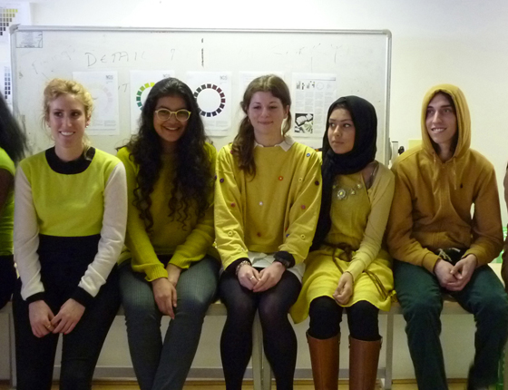
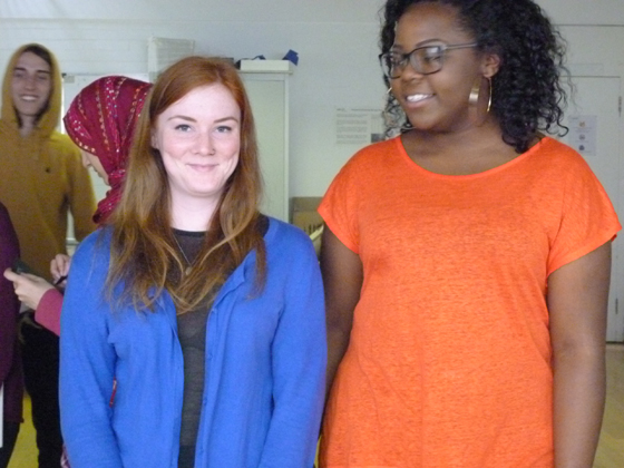
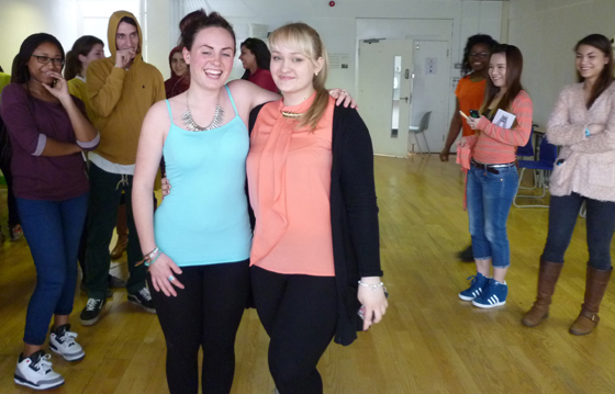
If we took 5Y (Yellow) as the Hue, the range of values would go from 3 to 8 and Chroma from 2 to 12. We mounted examples of Munsell charts from the student set on the wall of the studio to use as reference throughout the course. Our approach was a little more experimental, but it worked because students had to think on the spot to get it right, creating interaction and discussion between them. It was incredibly lively. The point wasn’t to be absolutely accurate but to be able to understand and identify colours and their relationships. We continued with students making monochromatic, harmonious and contrasting palettes. For the grand finale, everyone had to find their complementary.
During the workshop, something wonderful happened. Students in the course come from many different countries across different continents. They took it upon themselves to explore the concept of cultural identity through colour skin tones, making their own palettes which included a lovely palette of hands. In addition to being fun, this simple but highly effective workshop was a significant turning point for our first year Spatial Design students’ appreciation of colour.

About the Author
 Valerie joined LCC in 2003 as a lecturer in digital drawing and developed an e-learning site for Vectorworks as part of a pedagogic research project. As a spatial designer, Valerie usually works within architectural environments and, in collaboration with Silvia Grimaldi, is joint Course Leader of the BA (Hons) Spatial Design at LCC. Her teaching is influenced by what she sees as the exciting and transformational future for designing spaces and past students have received 3 awards from the D&AD students’ competition in the spatial design category.
Her research focuses on sensory characteristics and perceptual atmospheric qualities in the built environment. She was invited as a guest lecturer on Spatial Experience at the Royal College of Arts, completed a thesis on Interior Practices in Urban Environments and published a paper called Re-Imaging the Environment at the Electronic Visualisation and the Arts London 2013 conference. She also recently completed a paper called ‘Sensing the Urban Interior’ for the [in]arch conference taking place at Universitas Indonesia (Jakarta) in September 2014.

Wonderful!