Many artists find the colors of flesh elusive. After all, most can bring to mind ultramarine blue and cadmium yellow. Yet when it comes to flesh, many are left scratching their forehead. Flesh tones are hard to describe. Luckily, that area being scratched can be studied in Munsell terms using Munsell notation: hue, value and chroma. This makes the task of identifying then mixing the color much easier.
First, we must consider the average local color of flesh. Think of the local color as the area unaltered by shadow, halftone, highlight or reflected light. The local color is an area in the general light… the color that can be matched directly by paint. To go back to the forehead, imagine a spot of paint placed directly on it that matches perfectly, and you will understand the local.
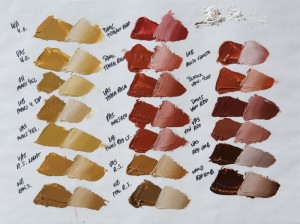
According to where you are from, your habits and occupation, this may seem to vary substantially. After all, we can tell each other apart and our coloring has something to do with this. However, after studying many foreheads, not to mention other parts of the face and body, you will likely see a pattern in the local color of humans. The fact is that most of us, the vast majority, range in color from 5R to 10 YR, values 2 to 7, and chromas 2 to 6. To make it even easier, our average local complexion, the areas not influenced by hair, tans or ruddiness, ranges in hue between 2.5YR to 7.5YR , chromas 2 to 4. Some say everyone averages 5YR, chroma 3.
Matching Flesh Tones in Painting
What does this mean? Well, the most refreshing thing is that we are not as different as we assume. Secondly, this makes painting portraits much easier if we simply start within the gamut of flesh colors.
Whether you choose high chroma colorants like cadmium orange and cobalt blue or lower chroma earth pigments like yellow ochre, burnt sienna and ivory black, you will need to address the facts at hand: flesh occupies a specific area of Munsell color space. If the values are too light or dark, the chromas too high or low, or the hue too red or too yellow, the results will be less convincing. So, when in doubt, begin with the local color and work outwards, seeing how subsequent hues, values or chromas differ from the average.
Finally, painting hair well is also critical to portrait painting. The nice thing about hair is that it is composed of the same colors. So unless you have a penchant for unnatural dyes such as hot pink, stick with lower chroma reds, yellow-reds and yellows.
Stay tuned for more information on using Munsell for portrait art in The Color of Flesh Part 2 and tell us your story about how you use color theory to enhance your work.

[…] continents. They took it upon themselves to explore the concept of cultural identity through colour skin tones, making their own palettes which included a lovely palette of hands. In addition to being fun, this […]
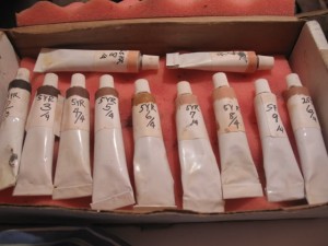
Hey Graydon, those flesh tone tubes look familiar! Yeah, those are mine. I still make them, along with neutral grays in 9 values and others pre-mixes.
Mixing color systems are great today. I mixed color for a large dinnerware company by the hook or crook method for over 20 years. Back then I would almost have given my left arm to have a good system as we have today. For those mixing colors today, appreciate what you have today. Consider “The good days” as experience. The benefit for me today is I can apply it to my oil painting as a retired printer.