
Artist and author Petra van Cronenburg tells stories in paper, beads and strings, choosing materials that combine both sustainability and the luxury of traditional craftsmanship. The paper beads and art originate from “garbage”… old and damaged books, newspapers, magazines and packaging, and she sources non-toxic paint materials, natural materials and other found objects. We spoke about her process and the impact color has on her work.
Tell Us About Your Art
Last year I started my studio for paper art and paper jewellery, “Atelier Tetebrec”, in Eastern France. I had always hand-crafted my own jewellery and featured it in exhibitions, but in earlier years it was just a hobby. My background is as a journalist and book author. It was difficult to throw away books and I finally realized I could perfectly join my passions and be a paper addict.
I sometimes made the joke, that in times when you can buy books for 0.99 cents, and many people do not value books any more, we just had to limit their quantity. For this reason, I became curious about sketchbooks, artist books and especially the use of normal books for paper jewellery.
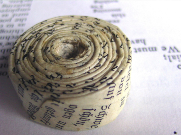
Working with old paper from 19th century is not easy, because you never know how the colour will change after processing.
Here I used a painting from Leon Bakst for Vaslav Nijinsky’s costume to create hand-painted paper beads made with finest hand-made paper.
My studio stands for jewellery full of “joie de vivre”, the zest for life. I can’t live without colours, even if I also design jewellery in black & white. “Tetebrec” is an ancient Celtic word meaning “sparkling treasure”. It was the perfect symbol for my love for crystal and glass, and the inspirations I get from Celtic findings in our Nature Park.
My artist jewellery lives by its colours and combinations of textures, of contrasting materials. I love to design a custom piece for a personality, a special event or the favourite dress of a customer. On the paper side, I use modern or old books and prints, fine artist papers or handmade mulberry paper, sometimes painted, sometimes embellished with coloured decoupage. My favourite combinations are beads of Czech crystal or Japanese glass, but I also use wood, different metals, semi-precious stones and other materials.
Combination of paper yarn and Czech glass beads. I am selling necklaces ready like this, but I can change the colours for my client’s wishes.
Where Do You Find Your Inspiration From?
Living in the Nature Park of the Vosges Mountains with dense forests and rocks of rose coloured sandstones, I adore the fascinating forms of nature as well as archaeological jewellery findings from stone ages and Celtic times.
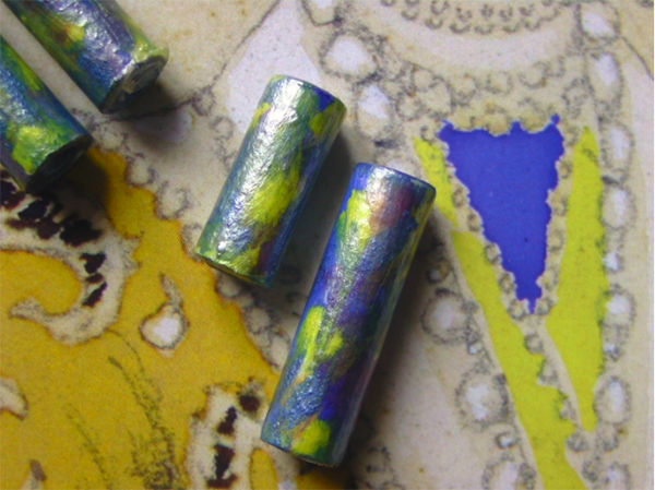
Looking for matching paper beads for a certain fabric style à la Ballets Russes. The beads are hand-rolled and refined with copper powder.
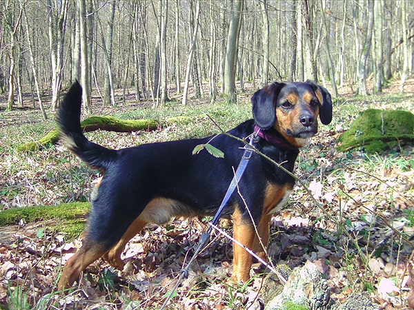
Every day I take a long walk with my beagle-mix Bilbo, collecting seed pods and wood or taking photos of plants and mushrooms. As for the colours, I am strongly influenced by the Ballets Russes, since I wrote a book about their famous dancer Vaslav Nijinsky. During this time, from 1909 to 1929, there was a real explosion of colours. Artists like Pablo Picasso, Sonia Delaunay-Terk, Leon Bakst, Natalia Goncharova and Henri Matisse worked for the designs of sets and costumes, but also famous fashion designers like Coco Chanel and Paul Poiret were on the scene at that time. I love their work and I can’t live without colours!
You Mention A Particular Color Is Not As Important As the Feeling It Imparts – Can You Explain What You Mean By That?
Let’s take an example: One of the trending colours in 2017 is “greenery”, invented by Pantone (“15-0343 TPG” in their system). It is a relatively natural green with a little splash of yellow. You can wear it, just because it’s a trend – but how will you feel in your greenery dress or greenery jewellery?
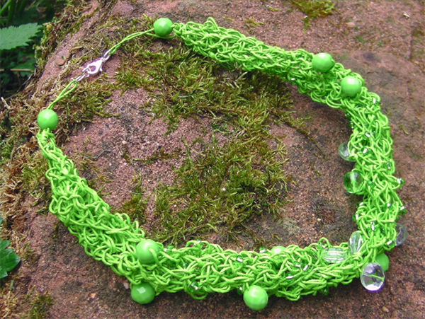
This is nearly the trend colour of 2017, “greenery”. Paper Yarn + Czech glass beads – and a typical rose coloured sandstone rock of our natural park.
My work is also to give advice to ensure clients if it is really “their” colour: matching their mood or clothing, their personality or the colour of their eyes and the hue of their skin. Wrong colours can make you look older or even ill.
If you have natural red hair and grey eyes, a colder green can make your eyes sparkle, like on the Munsell scale 10 G or 5BG. But sometimes people feel uncomfortable with clear crayon colours, even though they look great in them. So you can move chroma and / or value of the colour.
Some months ago, two singers commissioned me to design jewellery for their set. One of the singers is a powerful woman, and also a painter with a soft spot for dresses full of bright and happy colours. The other singer is a petite woman, and she loves all the colours of the sea. So I designed a long necklace in yellow green and pea green for the first one, using her own graphics for the paper elements. The second singer got a precious combination of clear and aquamarine Swarovski crystals, white silk, and beads made from 1900’s music paper. They both felt these colours matched “their energy”.
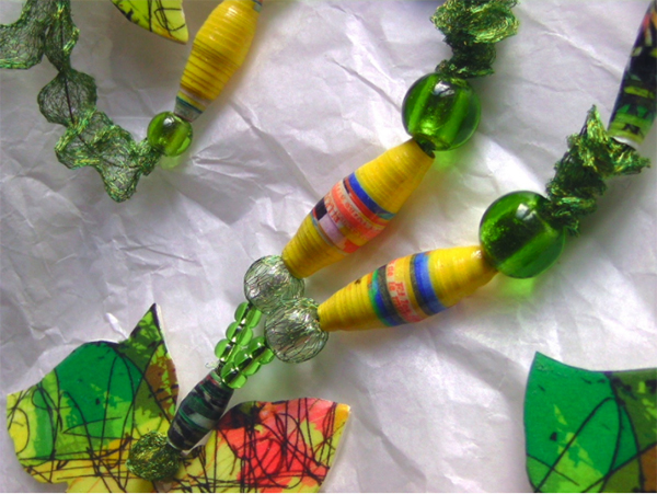
The necklace for a singer with yellow and green paper beads.
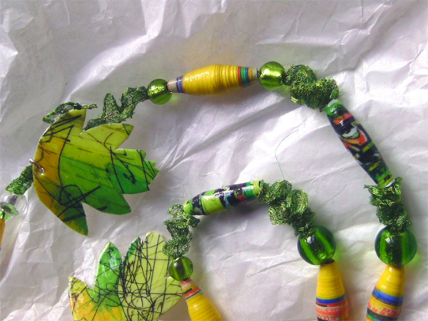
Another view of the necklace for a singer with yellow and green paper beads.
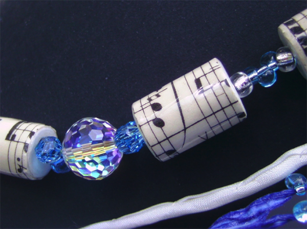
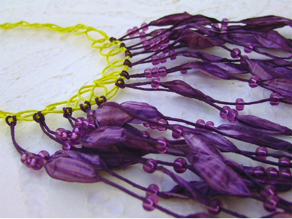
Necklace made for a singer with paper beads from a 1900’s score, Swarovski crystals and silk, glass.
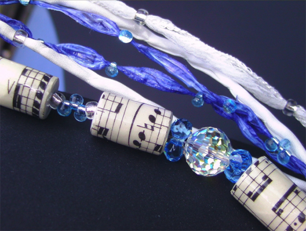
Another view of the necklace made for a singer with paper beads from a 1900’s score, Swarovski crystals and silk, glass.
Can You Talk About What It Means To Create Harmony With Jewelry And The Colors One Wears
Before I talk about colour systems to customers, which is always a little bit theoretical, I talk about warm and cold colours. Nearly everybody has a feeling for it. I can explain warm colours with a component of yellow, cold colours with a component of blue. The easiest way to create harmony is combining only warm or only cold colours. You can also “dim” one colour in its chroma. Perhaps you have a dress in a pastel rose colour, but you feel a little bit pale. Wear a necklace in exactly the same colour tone, but with a stronger chroma!
There are also theories about different types of color harmonies depending on your colour of skin, eyes and hair. These can be cold, warm or mixed colours, too. To create harmony means just to look better. So I look absolutely terrible in warm, especially yellowish colours, my face ends up looking ill in orange. But I can dare to wear every cold colour that I can imagine. Another example: So many women prefer black dresses for elegant events. Nevertheless black is not always nice to your skin, it can make you look older by years! Change it to a very dark blue or brown and the same dress has a totally different effect. And if you love your black dress too much, wear a coloured statement necklace.
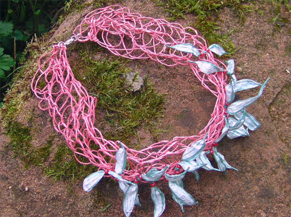
Choker in “dusty pink” and light emerald paper yarn, berry-red glass beads.
Is How Someone Wears Your Jewelry (what colors they pair it with) Important To You?
The most important thing for me is happy clients. Hand-crafted jewellery is like a book, which belongs to me only as long as I am writing it. The moment it is released, it is the customer who then images her or his own stories and feelings.
Do Color Trends Play A Role In What You Are Designing?
Not too much, because customized, handmade artist jewellery is made for more than one season. On the other hand, I am interested in fashion colours, because my clients will ask for them, and because wholesalers of glass or crystal sell trending colours too.
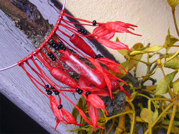
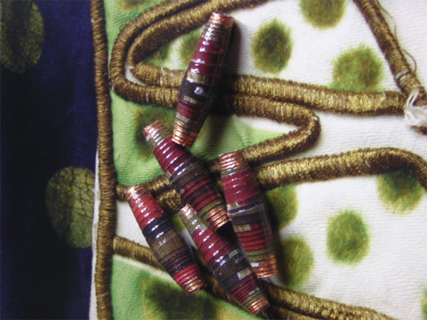
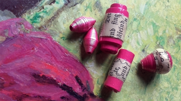
Red handmade mulberry paper, paper yarn and black glass – I was inspired by these mistletoes and red peppers.
Are There Any Particular Jewelry Fads Or Styles That Make You Cringe?
Kitsch in modelling clay like those mini-doughnuts or pieces of cakes. Pink unicorns. No, unicorns in every colour.
You Are Synesthete – How Does This Impact Your Art Process?
Well, I’ll try to explain what synesthesia is, even if it is difficult to describe the simultaneous mixture of sensory perceptions. It gets even more complex, as every synesthete has individual combinations, and “inner dictionaries” of this talent.
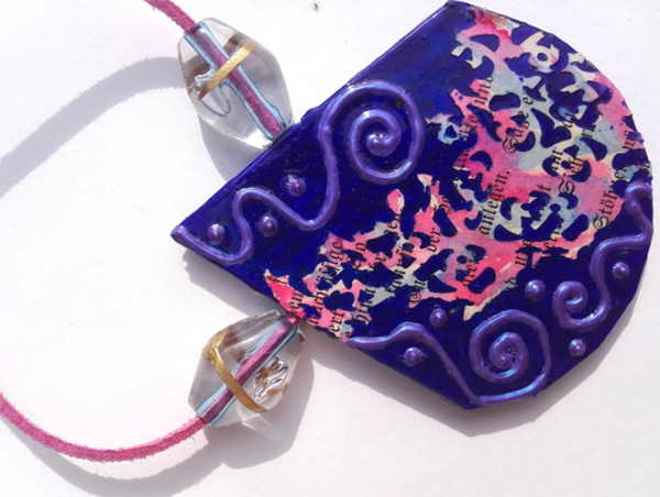
Paper pendant with paper lace and natural ultramarine pigment, 3-D-Colour, glass beads
So I can “hear” colours. A painting of Kandinsky is like a wonderful music composition for me – at the same time while regarding it. But I also have a sort of three-dimensional feeling about colour rhythms and shades outside of my body. And that is nearly impossible for me to explain.
I took the “Online Colour IQ Test” and had absolutely no mistakes. While sorting out these colours, I can hear if it is a harmony or if something is disturbing the sequence. And I feel a regularity of shades, or if there is a too big hop in chroma. So I see-hear-feel colours.
I have absolutely no idea how I would make art without synesthesia, because for me these observations are normal every day life. Perhaps it is a little bit like composing music and writing a score for many instruments. Composers hear their music while they are writing notes.
Sometimes I have no clear idea what will be created: I play with materials, touch their textures and try to listen and feel to the effect of their colours. Intuitively my hands begin to combine beads or other items – and then I have ideas to change sequences or to add paper yarn to massive beads, or glass to paper. I like opposites in harmony with each other.
Does Sensory Stimulation Play A Big Role In Your Process?
My senses are always stimulated, but I do have some “rituals”. There’s an old church nearby with windows of Romanesque Art. Sitting there and “listening” to these windows is like being in a wonderful concert! But it works only with special colours of Romanesque and early Gothic art, it comes from their ruby red, from a deep blue and emerald green. The same colours of later times don’t resonate in the same way.
Even non-synesthetes can do something for stimulation. Go to a specific place by a meadow or a garden and visit it for several days. On day one, try to look intensively at it, as if you had never seen this meadow. Write down what you see. If we are not blind, that’s our normal, but superficial way of experiencing the world… by sight. Come back on the next day and try only to listen to the meadow, the sound of the wind, of small animals and birds, the sound of your hands stroking the grass. Close your eyes. Try to do this with every sense.
Custom-made necklace in pea green paper yarn with glass beads. Such a necklace I can craft in different colours.
There will be two surprises: After these days, the meadow will change into a fascinating complex world. Regarding your notes, you will perhaps realize, that we have many words for our sense of sight, but it is very hard to find words for smelling and tasting. We neglect some sensory perceptions.
Are You Familiar With The Munsell Color System?
Yes, I am really not a specialist, but sometimes I work with it to describe a colour more exactly. I am very interested in Munsell’s 1921 book, “A Grammar of Colour”. His colour sheets for brown (Part 15) are interesting for my work with very old paper, as it changes the colour hue after being processed, depending on the paper mixture. To see green or yellow on different brown backs in this book helps me to decide how other colours can change the effect of the book paper beads.
How Does Hearing Color Compare With Using A Physical Color Order System?
It is nearly the opposite. There is no theory or mathematics behind, it is pure and direct cognitive perception. And most of all, it is absolutely individual – two synesthetes will have two totally different ways of perception. The stories about my synesthesia may be only nice or weird anecdotes that nobody else can use in the same way – so I need an established colour system to communicate with others. It is like a dictionary.
How Do You Use Color Systems To Guide Your Clients?
It is not easy to have the right one. Fashion professionals in Europe are using the Pantone system and you can show it to everyone in the internet. Czech bead producers have their own system with numbers, which I never really understood. If you have the number of a certain red, you can order with this number from every bead producer and it will be the same red. Nevertheless I have to order samplings to really know what it looks like in reality. All this is much too complicated for everyday clients. I ask them for their favourite colours and if they say “red”, I ask, if they could compare it to other red hues, f.e. dark cherry red or red of a fire truck. And we work with photos.
Here I had the print of a painting to produce matching paper beads. It is never as exact as with a colour system.
Do You Ever Find Yourself Dealing With Color Calibration Issues And People Expecting The Jewelry To Be A Different Color?
Until now my clients are satisfied with the good old system of describing colours and looking at photos. And if I made a green choker, they can ask me for a blue one in a custom order. Jewellery making is not an exact science, it’s hand-crafting beauty. I work with exact calibration in printing, there you need the CMYK colour model.
What Is Your Personal Color Palette Like?
I am crazy about blue and I like pink and violet shades between 5RP and 10PB (Munsell).
What Is On The Horizon For You?
Artist Books. I just joined “The Sketchbook Project” of the Brooklyn Art Library for 2018. I want to tell a story in mixed media. I also would like to create more artist or altered books using techniques from my work with paper. So my two professions can meet – being a book author and a paper artist.
Anything Else You Would Like To Share?
You can learn more about me and my work on my website and at Instagram. And I will write a diary about my Sketchbook Project in English on my blog. After moving to a new platform, my internet shop for Paper Jewellery will reopen in August, 2017 here and later also on my website.
About the Author
 After studying theology and religions, Petra van Cronenburg received training as a newspaper editor. Writing for more than 30 years, mainly about culture and arts, she published several books with well-known publishing houses in Germany, and produced the first original biography of Vaslav Nijinsky, star of the Ballets Russes.
Her enthusiasm for Avant-garde design met with an old hobby: In the 1980s she began exhibiting her self-designed hand-crafted jewellery.
As a paper addict and book lover she opened “Tetebrec” in 2016, her studio for Paper Art & Storytelling. Her colourful jewellery is hand-crafted from papers, paper yarn and noble materials like crystal and glass. She is also working on artist books. Petra currently lives in eastern France.

Leave a Reply