Albert H. Munsell’s true passion and the driver behind his color order system was color education. Munsell’s color training endeavor started at the university level. As early as 1904, Munsell was lobbying the local Boston schools to adopt his method of teaching color using the Munsell three-dimensional model. The model was adopted in New York and Chicago and the Munsell Color Education business was born.
Mundane to Meaningful… Color Basics from Which Everyone Can Benefit
When you understand Munsell’s basic principles of color—hue, value and chroma—and how they work, the often mundane tasks of putting an outfit together or painting your living space can have an improved result. We explored a few real world color-related tasks to show how color training can help.
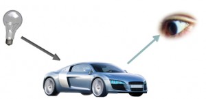
Before you explore real world tasks, it’s important to remember a color education basic. Matching color depends on three variables: (1) light source; (2) object; and (3) observer. Any change in any or all of the variables can affect how the color “appears.” The light source represents the lighting under which you view a color… daylight, cool white fluorescent, incandescent, etc. Yes, the “appearance” of any two or more colors will vary under different lighting conditions. The object is what you’re viewing … paint samples, fabric, etc. Finally, you are the observer. How’s your color vision? Do see color accurately or do you have a deficiency in distinguishing between hues (seven percent of American males experience red-green color deficiency).
Applying Color Education to Real-World Color Decisions
So assuming that you’ve standardized on a given light source and object; and you’re able to see color accurately, you’re ready to apply Munsell’s color education principles to real-world color. Let’s use the task of painting your living space. Before you make a trip to your local paint store, you probably have an idea of the color you want.

Using the color education principles of object, light source and observer, you identify that the room you’ll be painting has a southern exposure and an abundance of natural daylight. Daylight is one of the best light sources for matching color because it is balanced in the amount of red, green and blue energy. However, keep in mind that daylight, as the day goes by, tends to shift from an early morning bluish tint to a more yellowish tint around noon and then more orange as the sun sets.
What Are “Hue” Doing?
Now apply Munsell color education principles to the object (painted walls) to understand how the observer may interpret hue as the day wears on. So using the Munsell hue circle, you decide on the hue, yellow, that’s light in value (closer to white) and has a bright chroma (vivid yellow). Going back to the Munsell hue circle you see that blue (actually purple blue) is opposite yellow. This means that in the early morning your yellow room will appear less yellow because blue minimizes the appearance of yellow. However for most of the day the color will appear yellow.

But let’s say the afternoon yellow is a bit too bright… bordering on fluorescent. Using the Munsell three-dimensional model you can reduce the chroma without changing the hue or the value and still maintain the yellow hue. We recommend getting color swatches from your local paint store and observing them under these varying viewing conditions to better experience the affect of the light source on hue. More importantly, you won’t waste time or money painting a room, only to repaint it because it wasn’t what you had intended.
Shift Happens: Why the Color Looked Good in the Store, but Not at Home

Now let’s take a look at an apparel example. You like the hue, red. But given your skin tone, hair and eye color, a more bluish red looks best. According to the Munsell hue circle, a red purple hue that’s a darker value (closer to black than white) and lower chroma (not too saturated or vivid) looks perfect on you. So you go to your local outlet, which offers reasonable prices on famous designer clothing, due in part to the energy savings from the cool white fluorescent lamps installed throughout the outlet. You locate the “perfect” red dress. It looks fabulous in the store. Then you try it on at home and “yikes!” what were you thinking. You were the victim of a shift in color light perception from the store to your home. Here’s where a little color education could have helped avoid the situation. Remember those cool white fluorescent lamps in the outlet? Well, they tend to accent greens and blues, which suppresses the appearance of red, so what you thought was a bluish red hue, was actually a red or red yellow hue when you viewed it under daylight or incandescent light.
What are your experiences with color perception… we would love to hear your stories.
Related Color Education Resources:
Choosing the Right Paint Color:
- Behr
- Benjamin Moore
- PPG Paints
- Pratt and Lambert
- Sherwin Williams
- Color Matters
- X-Rite color education programs for business and industry
- BrainPop
- Metropolitan Museum of Art’s Learn About Color
- Teaching color to children
- Science with Me
Art and Science of Color:
Color Education for Kids:

Leave a Reply