
Color Theory was a required foundations course in the Visual Communication Design program at BYU, so all the design students took it–the interior designers, graphic designers, industrial designers, and the illustrators.
That last group included me. I had grown up in Silicon Valley and never heard of art school, so when I found out you could get a degree by taking drawing and design classes I was thrilled and slightly suspicious, and signed up immediately.
I remember going to the campus bookstore and buying the mysterious and costly “Munsell student kit,’ which was the first assignment we did in class.
We all sorted those lovely little color chips with our brand new No. 11 X-acto blades and the grammar of hue, value, and chroma was explained. I had been one of those kids who always sorted my crayons by color (rainbow order, of course). Now after 20 years as a freelance artist, I still have my student charts and I still think about color every day. I think the question I’ve most asked myself throughout my life is “How would I mix that color?”
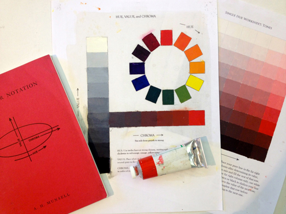
Hue, Value, and Chroma is the first chart we do after value scales. On the left is my college textbook and on the right is a worksheet manipulating value and chroma for a single hue.
I started teaching painting and drawing classes to adults about ten years ago. Adults who simply sign up for a painting class and did not go through the foundations program seemed to me to be at a distinct disadvantage. I decided to teach a color theory class for painters. I recreated the Munsell charts, larger this time, and adjusted for oil painting. I’ve taught this class for several years now and have developed an entire curriculum with worksheets and assignments.
Why Study Color Theory?
The principles are simple to understand, but in painting, they are pretty darn complicated in practice. As the saying goes, “If painting were easy, lots of people would be doing it.” In math we learn first to count, then to add and subtract, and eventually we get to calculus. If we use that as a metaphor, we could say portraiture is trigonometry and color theory is arithmetic.
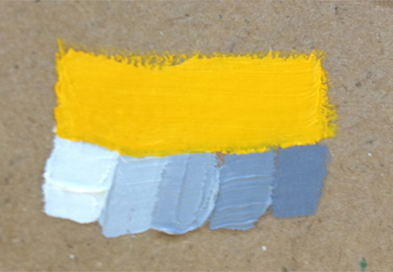
Testing to see which value best matches the value of this yellow. It helps to bracket by intentionally going too light and too dark.
Students often think they just don’t have an eye for color because they’ve been attempting things way beyond their skills, but when the exercise is an abstract one, just one color next to another (instead of a representative image and all the complications that introduces), they easily learn to see more. The class also allows students to become familiar with the medium because so much time is spent laying out paint, making mixtures and adjusting them, and laying down paint. Many students have come back from doing chart after chart of colors and said that it’s a very Zen experience. I’ve felt that too. Value scales are like a meditation for me.
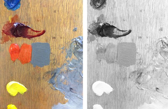
Left: Testing my best guess at finding a gray that is the same value as cadmium red light. This is one of the more difficult things to see because a high-chroma color feels so much more lit than a gray.
Right: The same photo, desaturated, shows that the values are about the same. The sheen makes it a little hard to tell, but close enough is close enough!
I’ve come to wish that color theory was a standard curriculum for third graders. Color is such a basic part of our lives and having a vocabulary for seeing it gives us a richer visual experience.

In practice, we can make an object feel more lit by making it lighter than the shadow side, but with enough color that it doesn’t look bleached out.
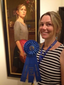
Aimee Erickson’s painting “Sarah” was awarded Best of Show at the 2014 American Women Artists national Juried Exhibition.
About the Author
 Aimee Erickson graduated from Brigham Young University with a BFA in Illustration in 1991. Now an award-winning fine artist, she has been painting professionally for 25 years as well as teaching art classes, painting murals, and doing architectural color consulting. She lives in Portland, Oregon.
www.aimeeerickson.com

So great to read this Aimee! I never got the opportunity to take formal color theory as an in-person class and I do still struggle with it. Online instruction has helped to explain it but I agree that classroom hands-on instruction would be so much better.