How well do you know your shades of orange? Let’s find out with a game of match the color sample to its name.
Here are their names
(in alphabetical order)
chrome orange
golden poppy
international orange
vermillion
Here are the samples1
(to match the name to)
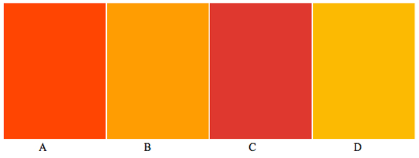
Now if you’re up on your colors, this might be an easy task. If that’s not the case, however, here are the definitions of these for colors from Webster’s Third New International Dictionary (W3) to help you out:
- chrome orange 3: a vivid reddish orange that is yellower, less strong, and much lighter than international orange and duller and slightly yellower than golden poppy
- golden poppy 2: a vivid reddish orange that is yellower and much lighter than international orange and stronger and slightly redder and lighter than chrome orange
- international orange: a vivid reddish orange that is redder and much darker than golden poppy and redder, stronger, and much darker than chrome orange
- vermillion 2b: a variable color averaging a vivid reddish orange that is redder, darker, and slightly stronger than golden poppy, and redder and lighter than international orange
You may notice that each of these definitions includes two of the other colors. Even though all four are defined as a “vivid reddish orange,”2 we can now relate them to each other.
Munsell Color helped establish the guidelines for color defining in W3 using Munsell Color System’s variables Hue, Value, and Chroma (sometimes called Hue, Brightness/Lightness, and Saturation, although I recently learned thanks to this blog that there is a difference between chroma and saturation). Thus colors could be defined by relating them to one another. This makes a good deal of sense. If you and I both look at a color, there’s no way of knowing whether we are experiencing the same thing. However, you and I can both look at two colors and agree (most of the time) that, “This one is redder than that one,” or “This one is lighter than that one,” or “This one has more gray in it than that one.” W3 used words like light, medium, and dark to describe brightness, and grayish, moderate, strong, and vivid to describe saturation.
So hopefully, with this information in hand, you have figured out that the correct combinations are:
A. international orange
B. chrome orange3
C. vermillion
D. golden poppy
Job well done!
For more insight on W3’s color defining, lexicographer Kory Stamper wrote an excellent post on this topic on her blog in 2012.
References
1 Samples from http://www.colorhexa.com/
2 Personally, I’d only consider two of the four to be “vivid reddish orange,” but I digress.
3 I cheated a little bit here. I actually used a color swatch called “chrome yellow,” which seems to be what this particular website calls chrome orange.
About the Author
 Krista Williams is Assistant Professor of French at the University of Evansville in Evansville, IN. She earned her PhD in French Linguistics from Indiana University, Bloomington. Her research concerns the definitions of colors in monolingual dictionaries and their translations in bilingual or multilingual dictionaries. She may be reached at krimwill@indiana.edu.

A quite vivid discussion. But which is closest to Clemson orange and Princeton orange?
In fact, some universities’ colors are recognized as their own shade, occasionally even defined in dictionaries as such! See “harvard crimson,” “yale blue,” and (he-hem) “carolina blue,” for example here: https://en.wikipedia.org/wiki/List_of_colors_(compact). However, this list seems to simply include the colors for which a university has specified a shade that must be used for marketing purposes–one for web use, and another for print media.
Some ambiguity about “International Orange”….It all depends on which one you’re talking about. It can be much brighter in the US than the example. See https://en.wikipedia.org/wiki/International_orange
Very true. The sample here is closest to the Aerospace variety. Isn’t it incredible how even such a specific color name can represent multiple shades? Makes it even harder for lexicographers.