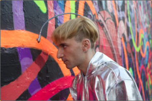
For cyborg Neil Harbisson, the visual concept of color is absent, but his world is full of color, perceived by sounds mapped to the light frequencies of colors. The antenna on his head has a camera to see colors, and he hears the sounds of these colors via bone induction from the chip embedded in his skull.
Swapping the concept of color from a visual to an auditory sense mixes things up a bit. While many people are attracted to sparkly objects, they create interference for Harbisson. The image of a beach with deep blue skies and a deep blue sea is the ultimate in relaxation for most people, but those colors are high pitched and not soothing to the ear. Dull grey cities are full of the sounds of colors, and the type of lighting in a room can alter the true colors we see, and the colors he hears. Harbisson was free of any cultural meaning of different colors – how colors should make us feel or predefined meanings to color – such color associations had to be learned, not experienced.
In part 3 of our 6 part series, we continue our interview with Neil Harbisson, discussing the perception of color when it is through hearing instead of vision, and how it changes the meaning of different colors.
Munsell: How do you perceive the color of things that are highly reflective?
NH: They create interference, so if it’s silver it will keep changing, depending on the colours of the light. It will change a lot.
Munsell: That’s interesting, because cars a lot of the time are using interference colors; they paint them so they have that shifting tone. I can imagine a lot of sound coming at you if you move around.
NH: Yes, things that shine as well. If an object shines, then it will reflect the colour around, so it could be confusing if I didn’t know where I am. So I’m always subtracting the sound of the light. [In this room] most people would say [the wall is] white, but we all know it’s actually [looking] yellow now, because the lighting is yellow, but we know that it’s white. So in this case, I know that the light sounds G, so when I look at the wall and I hear G, I know that [it’s from the lighting]. So I do the same with sound. I subtract the sound of the light. When there is reflection, or silver, then depending on the context, I subtract the sound of the light.
Munsell: Are there particular types of lighting situations that translates to types that sound better and some that aren’t as pleasing? How does the type of lighting affect your perception of color?
NH: Well, I really like fluorescent lights because they tend to be very neutral in some places. So, supermarkets, for example, have really white light which allows you to perceive the colours of the produce very clearly and without any interference of colour, basically. But, I don’t know, red light makes everything sound lower, as well as yellow and orange makes objects sound a bit lower because they bring the spectrum of the light to lower colours.
Munsell: Have you been in a blacklight room, with ultraviolet that makes all the white objects glow purple?
NH: Yes, it’s usually silent or sometimes a very high pitched.
Munsell: And tungsten, which is usually a very yellow, very hot light?
NH: It would have an effect, like also G. Most lights sound yellowish, it brings down the high pitched noise, so there would be less high pitched, everything would go down.

Munsell: There’s a certain cultural aspect to color, like we may always think of images of going to a beach with blue sky and blue water and create a color association of blue with feeling soothing and relaxing. So how do those kinds of things translate to what you hear? Is blue relaxing to you or is it actually a different color that we might find un-relaxing?
NH: To me it’s completely different. To me, red is the relaxing colour, it’s the one with the lowest frequency, visually, so if I had to choose a relaxing space it would have to be a red space. I would never, it would never make sense to do traffic lights red or stops red. It doesn’t make sense.
Munsell: Do you feel like you’re free of cultural meanings of color?
NH: Yes. But I know about it because I’ve learned. I feel completely disconnected.
(photo credit: Lars Norgaard)
Munsell: You’ve created a lot of images of what different cities sound like. Have you also created soundscapes of scenic areas like National Parks such as Yellowstone or the Grand Canyon?
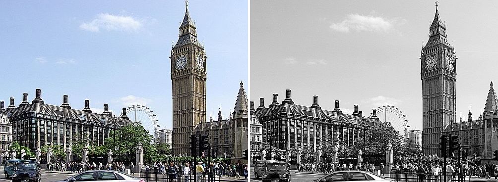
NH: No, I’ve only done cities because when I grew up people told me that their city was gray. Every time I asked “What colour is London?” or “What colour is Paris?” “What colour is Barcelona?” Everyone, like 99% of people said grey. “My city is grey, totally grey.” And I was so shocked when I started to perceive colour, to realize that it was completely false. People look at that building and they say that the building is grey, but it’s not grey. It has a hue and it has a colour. It’s very unsaturated but it has colour, so I was interested in detecting the colours of cities and they all have different dominate hues, basically and I found it fascinating how different the dominate colour in each city was.
Munsell: So you wanted to focus on cities to prove something?
NH: Yes, to prove that cities were not grey.
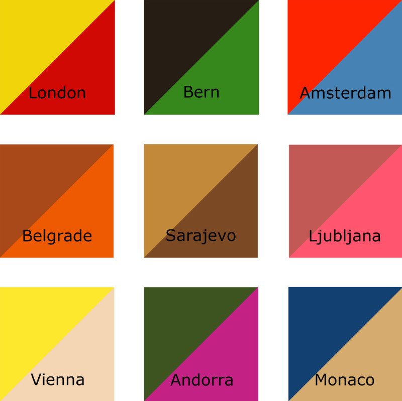
City Colours by Neil Harbisson
Our interview will be continued with Part 4: Colorblind Artist. For the first post of this series, as well as links to future posts about Harbisson, read Neil Harbisson – Part 1: Rearranging the Senses of Color Sight and Sound.

Interesting point of view.