A. H. Munsell provided the Introduction for the 1921 book, A Grammar of Color, which was published posthumously by the Strathmore Paper Company. The introduction includes sections on The Color Sphere, Balance of Color, and Unbalance of Color.We are presenting each section of the Introduction as well as the rest of the book as part of series of blog posts to make the entire text available online here in our Munsell Color Blog. This section, The Color Sphere, addresses an explanation of color relationships and defining a color notation represented in the form of a color sphere.
An Introduction to the Munsell Color System By A.H. Munsell
The Color Sphere
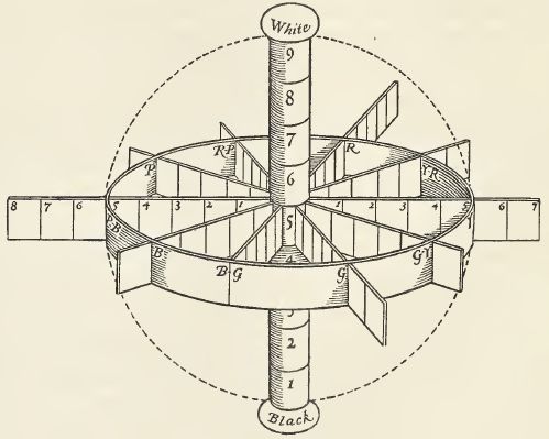
A CLEAR mental image of color relations must underlie any intelligent grouping of its hues in the best degrees of strength and light. This image is best produced by using a sphere to represent the world of color. With white at the North pole and black at the South pole; and its axis between these points a measured scale of grays, we have a decimal neutral scale which painters call Value. The middle point of this axis must be a middle gray and a plane passing through to the equator must contain colors of middle value. If therefore the equator be spread with a color circle of Red, Yellow, Green, Blue, Purple; and the half-way points by their mixtures in Yellow-Red, Green-Yellow, Blue-Green, Purple-Blue, Red-Purple, we have the equator as a decimal scale of hues merging gradually from one to the next and returning upon itself at Red. Each of these hues is supposed to grow lighter until it merges into the North pole at white, and darker similarly to black, and these are called the values (light) of color. They may also be imagined as passing inward until they disappear in the gray axis. Should there be still stronger colors they will continue upon the same radii outside the sphere. These we call the Chromas (strength) of color. In this way every point inside of the sphere and some upon the outside are arranged in three scales as follows : A vertical scale of light values, a horizontal scale of Chromas, and a circular scale of Hues; and since these are all in decimal divisions it becomes easy to make it a permanent mental image in which to see all color relations. Naturally every point in these three scales has its defined number, just as a solid object has its three dimensions; and to write them as a symbol of that color, thus doing away with the foolish misleading names which are prevalent, we have only to image the three angles of a triangle occupied with the three parts of that symbol—the left hand angle by the Hue initial (Red, Yellow-Red, etc.); the upper angle by a number describing its value in the scale of light; and the right hand angle by a similar number describing its Chroma in the scale from the axis outward. Thus, Vermillion has for its symbol R5/10.
This may seem revolutionary to the business man who has heard no end of fanciful names which fail to describe colors; but each symbol accurately describes the color in its dimensions of Hue, Value and Chroma.
This has all been worked out in permanent color in the “Atlas of the Munsell Color System” and each step bears its permanent symbol. There can be no new color discovered for which a place and symbol is not waiting. With this system in mind it is as easy to understand color relations as to understand musical relations on the written score. Indeed it furnishes the written score which is described in the hand book “A Color Notation.” From this “Atlas”* the pairs of colors shown on each page of this book are mere suggestions to the color printer of combinations which harmonize with that particular cover paper. Always refer back to the “Atlas of the Munsell Color System”* where many other combinations are awaiting.
* “A Color Notation” and the “Atlas of the Munsell Color System” may be purchased at any bookstore.
Related Links:
- Part 1: Home Page
- Part 2: Preface, by the Strathmore Paper Company
- Part 4: Introduction to the Munsell Color System – Balance of Color
- Part 5: Introduction to the Munsell Color System – Unbalance of Color
- Part 6: A Practical Description of the Munsell Color System with Suggestions for Its Use – Section One: Hue, Value, Chroma
- Part 7: A Practical Description of the Munsell Color System with Suggestions for its Use: Color Chroma Scale
- Part 8: A Practical Description of the Munsell Color System with Suggestions for its Use: Opposite or Complementary Colors
- Part 10: A Practical Description of the Munsell Color System with Suggestions for its Use: Color Combinations
- Part 11: Suggestions for Use & A Note on the Printing of this Book
- Part 12: Two Proofs of a Design by Miss Helen Dryden for Vogue
- Part 13: The Color Sheets – Frost Gray; The Three Dimensions of Color
- Part 14: The Color Sheets – Gray, Pyro Brown
- Part 15: The Color Sheets – Brown, Grouse Drab


[…] of Color. The previous excerpts covered the chapters written by A.H. Munsell himself, entitled “An Introduction to the Munsell Color System”. The next series of excerpts will cover sections of the chapter, “A Practical Description of […]