Our series of excerpts from the 1921 book, “A Grammar of Color” continues with the 10th in the series. The chapter “A Practical Description of the Munsell Color System With Suggestions For Its Use”, written by T.M. Cleland, goes into depth about the color theory introduced earlier in the book by Albert Munsell.
Previous sections in this chapter covered Hue, Value, Chroma, Chroma Scale, Opposite or Complementary Colors, and Color Balance.
In this fifth and final section of the chapter, Cleland discusses some of the many ways to achieve good color combinations, getting into more detail about how to make two color combinations as well as three color combinations while maintaining color harmony, that “agreeable sensation which we seek in all color relations.”
A Practical Description of the Munsell Color System with Suggestions for its Use
Section Five: Color Combinations
By T. M. CLELAND

COLOR COMBINATIONS
If in the foregoing we have touched upon the combining of colors in use, it has been only by way of explanation of some point in the laws of Measurement and Balance; and it is hoped that no impression has been created that the color combinations possible within the range of the Munsell System are limited to the examples which have thus far been mentioned. This is so far from being the case that any attempt to cover the subject of color combinations possible to this System would be quite futile within the limited scope of this article. A logical and orderly system will, in fact, offer a greater range of possibilities for the combination of color than could be discovered at random.
We must, therefore, be content to mention here only a few of the directions or paths which offer harmonious color combinations, trusting that the reader may be sufficiently interested by these to seek other possibilities of his own accord.
In considering the use of two colors together, we have repeatedly alluded to those having opposite Hues, because this appeared to be the clearest example with which to explain the idea of Balance. This combination of opposites is one of the simplest and surest of color harmonies. We have seen how, if properly proportioned as to amount or area, these opposite colors will balance in perfect neutrality; but another interesting fact with regard to them is that when placed together these contrasting colors tend to stimulate and enhance each other. This effect of contrast may be noted on the three gray sheets — the first of the color sheets, where the ten Hues are shown at three levels of Value, each printed with its opposite. Though none of these colors is more than Middle Chroma, the effect is of their being much stronger. Other examples of opposite colors will be found on sheets 8, 9, 12, 1 6, 17 and 18.
Another very simple and practically infallible series of color harmonies may be made within a single Hue. Thus we may combine a low Value of any Hue with a high Value of the same; or, a weak Chroma of any Hue with a stronger Chroma of the same. A more interesting combination within a single Hue is that of a low Value and weak Chroma with a high Value and stronger Chroma or vice versa.
Experiments with the possibilities of single Hues will yield very interesting results in the great variety of colors thus obtainable. The areas printed on sheet 10, for example, are all derived from various steps of the single Hue, Yellow; and some of them will be a source of surprise to those who are accustomed to think of yellow within the limited field assigned to it by popular belief. Examples of other single Hue combinations will be found on sheets 6, 7 and 11.
Successful combinations can also be made between what are known as neighboring Hues, that is of any Hue with the Hue which immediately precedes or follows it on the scale — Green with Green-Yellow, Red with Yellow-Red, Yellow with Yellow-Red, etc. These may in turn be varied by taking them at different steps of Value and different strengths of Chroma. In the same way, Hues may be combined with neighboring intermediary Hues. In all of these cases the harmony depends upon proximity rather than contrast, as in the case of opposites. Examples of neighboring Hue combinations are to be found on sheets 4, 5, 6, 7, 13, 14 and 15.
The use of three or more colors will present a problem at once more complex and more interesting and which, if approached in any regular order may assuredly be solved harmoniously. One method is to choose a certain restricted field of Hues such as Yellow to Red, for example, and then to select within this field regular steps of Hue, Value and Chroma which bear an orderly relation to each other. Examples of combinations thus planned will be found on sheets 4, 5, 6, 7, 13 and 15.
 The principle governing the Balance of opposite colors will also apply to combinations of three colors. Let us assume that Blue is required as one of the colors in a three-color combination. We find that its opposite Hue is Yellow-Red, and as this is merely an admixture of Yellow and Red, it follows logically that the use of these two Hues, with due regard to proportion of areas or strength of Chroma, will yield a perfect color Balance. In order to determine the correct proportion of areas, or strength of Chroma of Red and Yellow which will balance harmoniously with our Blue, we may proceed exactly as in the case of a two-color combination of Blue and Yellow-Red; but in this case we would divide the amount or strength of a correct Yellow-Red between our Yellow and our Red. For example, let us take Blue 4/5 and assume that we wish to combine it with a Yellow and a Red of higher Value and stronger Chroma, say 6/7. Following the rule already stated, we multiply the Value of our Blue by its Chroma, that is 4 x 5, which gives the product, 20. Now taking its opposite Yellow-Red at 6/7 and doing the same we get 6 x 7=42. If we were combining Blue 4/5 with Yellow-Red 6/7 we would use their products inversely, that is we would use 42 parts of Blue 4/5 with 20 parts of Yellow-Red 6/7. This gives us the amount of area for Yellow and for Red, because if we would use 20 parts of Yellow-Red, 6/7, it naturally follows that we would use 10 parts of Red 6/7 and 10 parts of Yellow 6/7 to effect the same Balance.
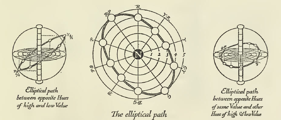
We may note one more interesting point which will be of value in connection with the use of several colors, two of which are of opposite Hues. In studying the dimension Chroma we have seen that all of the Hues cross and meet in the neutral pole, which represents the point of their union. It follows naturally that the nearer our colors approach to this common center (the weaker they are in Chroma) the more nearly they are related; and the easier it becomes to harmonize them. Now two of our Hues being direct opposites will balance each other very well; but in the choice of other Hues between these we shall be in danger of discord as we leave their immediate proximity and arrive at points half-way between them, where we find neither the balance of proximity nor of contrast. We may avoid this danger in the selection of our colors between these opposites by choosing steps of Chroma for them which shall be nearer to the neutral pole and approach to within, let us say, three steps of it. The line thus traced between our opposite Hues will form an ellipse and colors taken anywhere on this line will safely accord. This may be more readily comprehended by a glance at this diagram.
This suggests variations in the application of the rule, such as are indicated in the smaller perspectives above, where the elliptical path is shown tilted to different levels of Value.
A further study of Color thus arranged in measurable order will assuredly be rewarded by the discovery of many interesting possibilities which we have failed to note here. The subject is endless and unless this article is to be likewise endless, the few suggestions which it offers must suffice. The deeper we penetrate this always fascinating subject, the more clearly we shall see that “color harmony” is only another term for color order; that order will yield order; and that any path in the Color Sphere, and some paths outside it, which are themselves orderly in form and interval, will lead through a series of colors which accord, and when used together will render the agreeable sensation which we seek in all color relations.
Related Links:
- Part 1: Home Page
- Part 2: Preface, by the Strathmore Paper Company
- Part 3: Introduction to the Munsell Color System – The Color Sphere
- Part 4: Introduction to the Munsell Color System – Balance of Color
- Part 5: Introduction to the Munsell Color System – Unbalance of Color
- Part 6: A Practical Description of the Munsell Color System with Suggestions for Its Use – Section One: Hue, Value, Chroma
- Part 7: A Practical Description of the Munsell Color System with Suggestions for its Use: Color Chroma Scale
- Part 8: A Practical Description of the Munsell Color System with Suggestions for its Use: Opposite or Complementary Colors
- Part 11: Suggestions for Use & A Note on the Printing of this Book
- Part 12: Two Proofs of a Design by Miss Helen Dryden for Vogue
- Part 13: The Color Sheets – Frost Gray; The Three Dimensions of Color
- Part 14: The Color Sheets – Gray, Pyro Brown
- Part 15: The Color Sheets – Brown, Grouse Drab


Leave a Reply