by Maria Elkins
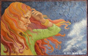
(Image: Windblown, an original art quilt by Maria Elkins)
I’ve spent most of my life either drawing or sewing. About twenty years ago, I finally realized I could combine the two. Now I am an artist who uses quiltmaking as my medium. The quilts I make are not traditional bed quilts. They are hung on walls like paintings. I am particularly interested in drawing people and portraits, and I have spent nearly twenty years experimenting with various techniques for portraying the human figure in fabric and thread. I often enter my art in quilt shows, and they’ve won various ribbons. My most significant award came in 2011 when my quilt, Windblown, won a top award at the International Quilt Festival, which is the largest quilt show and quilt competition in the world.
I find it fascinating how I learn things in spurts. I brush by a wide variety of topics during my pursuit of art, but only one or two capture my attention at a time. That has certainly been the case with color. Early on, I developed a strong foundation in drawing, but I mostly used black and white mediums: pencil, charcoal, Conté crayon, and the like. As a result, I’ve never felt completely confident working with color. Yes, I’ve known and understood the traditional color wheel and the various color schemes for a long time, and I even teach them to other quilters, but I still feel like I haven’t mastered the use of color. Sometimes the colors interact in an unexpected way, or one previously “perfect” color looks completely wrong, or I forget to use enough contrast. I want to be able to use color successfully without all the pitfalls. So, I’ve begun a new quest to better understand color, especially when working with fabric.
One thing that makes quiltmaking different from many other art forms, however, is that I have a limited number of colors to work with. My fabrics are like tubes of paint, but I can’t just mix a specific color unless I choose to paint or dye my own fabric. I am not always interested in doing that so, I choose to accept the challenge of using the more limited palette of commercially available fabrics.
For years, I organized my palette of fabric according to the traditional, red-yellow-blue, twelve-step color wheel, plus browns, blacks and whites. That worked fairly well but like many quilters, I found that I gravitated mainly toward middle values and I completely ignored certain colors. I realized I needed to pay more attention to using a wide variety of tonal values in my artwork.
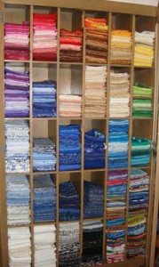
My palette of fabric arranged in color wheel order
Lately, I have been experimenting with more improvisational, abstract quilts. I’ve often heard the phrase, “Value does all the work and color gets all the glory,” but I never really understood it. However, it made me wonder if I would work differently if I organized my fabric by value instead of color. I spent a few days working with a grayscale tool and I sorted all my solid-colored fabric by value. This hands-on process helped me fine-tune the skill of looking past the hue to just the value. It was such a valuable exercise that I now encourage other quilters to try it.
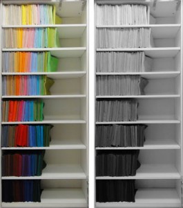
My palette of solid-colored fabric arranged by value
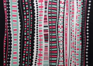
As part of my learning process, I spend quite a bit of time reading. I’ve read numerous books on color, both for the artist and for the quilter. They never really do a good job of explaining value and intensity/chroma . I was thrilled when I stumbled across the Munsell color theory. Visualizing color in three dimensions finally made everything understandable. I quickly purchased a copy of The New Munsell Student Color Set, Third Edition and worked through the various exercises with the companion color chips. However, working with colored paper is much different from working with fabric, so I spent a few days with my fabric, trying to create my own color charts with fabric swatches. It’s quite a challenge when you have a limited palette. I began sorting little 1” square swatches of fabric in plastic pocket sheets (the kind coin collectors use) so I could create my own fabric color tree. This taught me firsthand how easy it is to confuse minor variations in hue, value, and chroma.
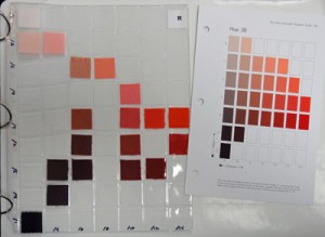
As a learning exercise, I replicated the color scales using fabric swatches
Next, I purchased a copy of Color Studies, Second Edition by Edith Anderson Feisner. Her book helped me understand the Munsell color theory more fully, and it gave me more ideas to try in my quilts. I started doing a series of experimental quilts, which I call “Push-Ups.” Briefly, in my Push-Up series I’ve given myself permission to exploring ideas without expecting to create masterpieces. Each quilt in this series involves a different principle found in those two books.
For my first experiment, I decided to work with just neutrals. I played with gradation of values while varying the weight of line. I was interested in seeing how the weight of line affected the figure-ground relationship.
Push-Up #1: Missed Connections by Maria Elkins
My second experiment, Push-Up 2, looks very different, but it is really a continuation of my interest in value progression. This time I specifically wanted to explore how different background values affect the changing values of the figure. I find it interesting to notice the places where the figure and background visually merge when their values are similar.
Push-Up #2: Growth by Maria Elkins
In Push-Up 3, I explored the idea of “disappearing boundaries” and “dissolving boundaries.” Basically, “disappearing boundaries” is the idea that when two analogous hues of the same value are placed next to each other, the colors visually appear to blend. “Dissolving boundaries” is a similar effect, but this principle involves a pure hue and a muted version of it.
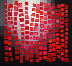
Push-Up #3: Requisite Red by Maria Elkins
Push-Up 4 was a simple exploration of Munsell complementary or “opposite” hues in a variety of values, along with the addition of neutral grays.
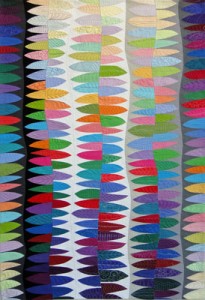
Push-Up #4: Reaching by Maria Elkins
In Push-Up 5, I explored Munsell complementary colors of two different intensities but this time I threw in some black and white polka dot prints.
Push-Up #5: Perseverance by Maria Elkins
It’s been interesting working in series with the express purpose of learning about color. From my study of the Munsell color theory, I have developed a long list of possible color principles that I can play with, and I expect I will develop a much better appreciation of the intricacies of color if I ever get to the end of my list.
About the Author
Maria Elkins
Maria Elkins is an award-winning fiber artist who specializes in creating original art quilts. She has spent nearly twenty years experimenting with various ways to depict people and portraits using the textile medium. She enjoys exploring a wide variety of techniques including drawing, painting, printmaking, and applique.
She has appeared on “Quilting Arts TV” and filmed a DVD workshop, “Making Faces,” on her favorite subject. She has had quilts and articles published in numerous magazines including Quilting Arts, American Quilter, Machine Quilting Unlimited, and Quilter’s Newsletter Magazine. She also maintains the Lost Quilt Come Home website, which is dedicated to displaying lost and stolen quilts and provides information on protecting quilts.
Maria studied Textile Arts, Sewing, and Pattern Drafting at San Diego State University (San Diego, California). In 2006, she graduated Summa Cum Laude from Wright State University (Dayton, Ohio), receiving a Bachelor of Fine Arts degree in printmaking.
Maria worked as a draftsman and secretary for seventeen years. She now works from home part-time for her church, and spends the rest of her time quilting. Maria and her husband live in Beavercreek, Ohio. Her daughters and their families are close-by.
Visit her website and blog at mariaelkins.com.

[…] Munsell has a color tree that’s a 3 dimensional representation of hue, value and chroma. They have a blog entry from Maria Elkins, a winner of quilt shows on the international level. After reading her blog entry, it is clear that Ms. Elkins has put a huge amount of effort into learning about color, creating striking modern quilt tops as studies in color. I’m in awe. I love that the quilts in this series show a side of quilting that isn’t about perfect points and matching seams but the art in quilting. Find the entry on Using Color Theory in Quiltmaking here. […]