I grew up in the textile industry in Germany and got my technical education there. After 7 years in Australia I landed in the USA in 1967 and retired almost 15 years ago from my position as VP of Corporate Technical Services at Tommy Hilfiger. I was responsible for quality control and was the technical liaison between New York and the manufacturers around the world. Before that I had a similar position with Liz Claiborne and further back I worked for various apparel and textile companies setting up knitting machines, repairing and servicing them as well as doing fabric design work.
After so much time away from the industry I feel a bit rusty but deep down I suspect that nothing much had changed in the way textile and especially apparel companies operate in respect to color management. Each season the designers create the perfect color palette and then the factories around the world match those colors and produce the merchandise. Apart from the technical knowledge required at the factory level, it all boils down to communication. Therein is the catch.
The “colorists” in New York and their equivalents in the mills generally were trained on the job and neither one had any understanding of how their counterparts worked, what terminology to use or what certain comments meant. Nor did they generally have any understanding of the fundamentals of color and color perception. Color perception especially is very tricky with textiles because of the variability of textures and surface variations and also because different garments are often worn under different lighting conditions (i.e. sports = daylight, evening wear = incandescent, etc.).

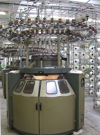
Image Courtesy of Wikipedia
Another major hurdle was the discrepancy between what the designers in New York wanted and what was technically possible. The color matching visual material available helped tremendously, but of course, it could not address the limitations of specific mills and manufacturing locations. Color matching and control was largely an individual creative undertaking.
Improving Process for Textile Engineers
The first prerequisite of anybody involved in the color matching process is of course that they can “see colors”; accurately, or rather as the average person sees it. As obvious as that may seem it isn’t very straight forward.
Color is a very personal and subjective matter. Like music or poetry, each person reacts differently to it and specifically sees or hears it differently. Color “perception” is a word often used for the way different people see a color. Most people deviate in their color perception only slightly from each other but others have more problems distinguishing colors. We all know about “color blindness” which is fairly rare and also pretty obvious. It usually entails the inability to distinguish between red and green or some other very distinct colors. Much less known and also much less obvious is the inability of some people to distinguish small differences in shades of colors and to discern what those differences are. It is precisely this ability that is essential to anybody that is involved in the color matching process.

Image Courtesty of Mekotex
Because people are generally unaware of their inability to discern small differences in colors, it is essential to test all personnel involved in color issues. Simple tests such as the Farnsworth-Munsell 100 Hue Test will quickly tell you how accurate your color perception is. This test is also available on-line (lots of fun) but because of differences in the color rendering of different computer monitors only actual physical test kits should be used for personnel decisions.
In addition, color measuring instruments such as spectrophotometers and set-up standards for acceptability of color matches, both, for initial lab matches and for production lots can be used to remove some of the variations between personnel. It was often the case that designers/colorists considered a spectrophotometer as an intrusion into their “creative freedom,” which was a pillar of their decision making power and job security. The factories on the other hand welcomed the use of a spectrophotometer for color ID and for acceptability standards as a way to avoid what they often considered “capricious rejections” by the designers/colorists. The technical personnel could also understand the numerical values better than the often obscure comments given by the colorists. Objectively, a spectrophotometer eliminates the visual variations of humans provided that all personnel are properly trained and it is used correctly. It should not be used as a replacement for visual evaluation but as a benchmark to aid in visual decision making.
Everybody sees colors a bit differently, so it is a good practice to evaluate color samples by a group of people in order to arrive at a consensus. This is also a good practice in order to include non-color considerations such as deadlines, types of garments planned, price points, etc. Even if we are fanatic about color matching, we can’t forget that we work for a commercial enterprise.
About the Author
 Werner Bonitz is a retired Textile Engineer (born and raised in Germany) and a largely self-taught photographer. You can see more of his work at http://wernerbonitz.com/.


Thank for posting such an interesting Apparel/ Textile Industry related post. Actually, you are correct people usually get attracted towards color matchings and designs. The blog is very much useful for textile manufacturers, suppliers because the blog gives the brief and standard explanation like how to use the equipments in the textile industry to maintain the unique standard.
Thank you for providing valuable information on color