‘The red and white and starry blue
Is freedom’s shield and hope.’
Stars and Stripes Forever, John Philip Sousa
Last year on the 4th of July a friend of mine posted red, white and blue on the Chromapost Social Network. I told her only half-jokingly that she’s not allowed to cheat.
Chromapost is about your very personal expression of feeling through color, not about a collective feeling of pride and patriotism. But can we draw a straight line between the two?
I suppose it depends on your sense of belonging to a particular culture, country, religion or ethnic group. Regardless of the awareness of one’s belonging, the influence of culture and its various color codes and symbology is overwhelming. We cannot help but feel strongly about the colors of our group.
Whose Flag Color is it?
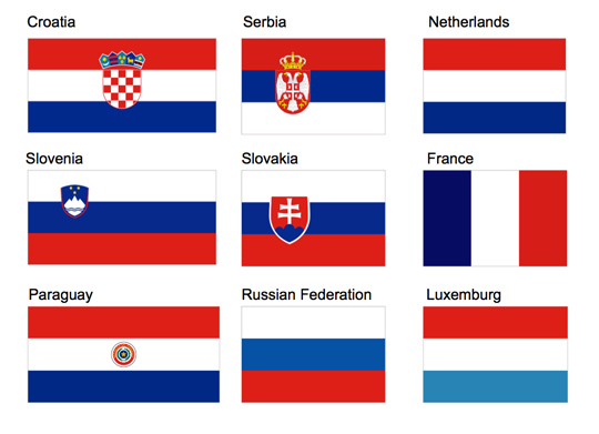
I have my own emotional response to blue, white and red (in that order) because they were on the flag of the country where I spent half of my life, Yugoslavia. During the Yugoslav wars in the 90s the flag first lost its star, then the blue/white/red stripes were shuffled and an elaborate coat of arms was added to my new flag. After 20 years of geopolitical turbulence I can still remember the colors, but I just cannot memorize the order of those colors in the flag of a newly formed country. I hold Serbian citizenship, but when someone asks me about the flag I have to look it up, because there were so many changes and red, blue and white stripes are very common in national flags. If you remove the stars and eagles and other add-ons from many flags, you could hardly tell which is which. Depending on the context and the culture, the difference between “my” color and the color of “others” disappears. When I was a child, I associated the color green with Hungarians. A bit later that shifted to Muslims and Italians. In the US, green is usually thought of as a very Irish color.

Media designer Shahee Ilyas made an elaborate data visualization of the percentage of color usage in every country’s flag. When he combined all the results it turned that we mainly use a very limited palette of blue, white, red, yellow and green. If aliens were to land in front of the row of flags by the United Nations, they might get an impression of great diversity with rather limited color choice. Many countries use the Munsell Color System to standardize their flag colors which is a country’s brand identity on the international market if you like. Therefore crystallizing layers of history and tradition in a fairly simple form doesn’t leave much room for avocado green, salmon pink or mauve.
Color Symbolism Changes
Apart from the officially adopted country colors there’s an intricate weaving of color symbology drawn from folklore and social rituals in every culture. A long time ago I was told that yellow is the color of jealousy, but without even noticing the change, jealousy has become green. In one part of the planet people mourn dressed in white, while somewhere else in black. Purple is often said to be the royal color, but at one time, so were blue and red (and many others), perhaps depending on what was the most expensive pigment at the time.
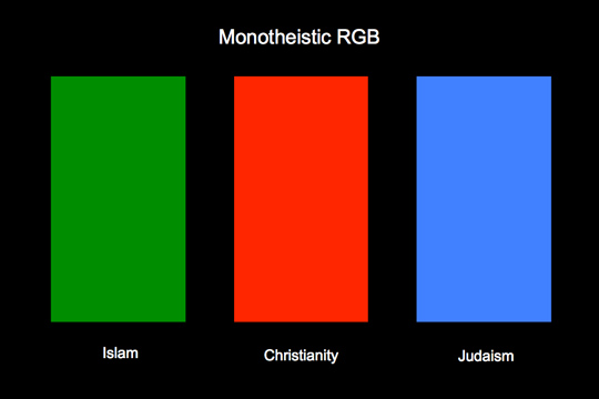
There have been many attempts to make an international dictionary of color meaning in various cultures, but I find that they confuse more than clarify. A handy cultural color coding wheel can be found on the ‘Information is Beautiful’ website. As we saw with language in my previous post, such simplicity and universality can be useful, but we also lose many fine shades in the local symbology of color. A convenient color map is not enough. You have to live within the culture to get closer to the meaning of local color messages.

Moving Towards Colorlessness
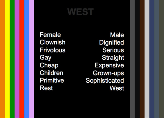
Beside having a tendency to systematize colors, Western cultures seem very much inclined toward muted colors, or some might say colorlessness. David Batchelor thoroughly dissects the issue in his book ‘Chromophobia’. There’s fear and loathing of color in the West, or to be precise, of strong and saturated colors. Color is something primitive, vulgar, feminine, queer, sinful, decadent, pathological (add your own bias) and it has to be controlled and tamed. A desired clear and orderly universe can be achieved only with white (the author here mainly refers to white interiors and architecture). As he writes, ‘there is a kind of white that repels everything that is inferior to it, and that is almost everything. There is a kind of white that is not created by bleach but that itself is a bleach. This white was aggressively white.’ That pure white (in every possible meaning of the word) is a Western problem. Color is often seen as both dangerous and trivial, and fear of it is usually linked to ethnic, racial and sexual phobias.
Aristotle referred to color as a drug (pharmakon) and Plato thinks of a painter as a ‘grinder and mixer of multi-color drugs’. Jump to the 1960s and we get both psychedelic colors and drugs. Even the Technicolor explosion of colors in movies often signals that it is all fake, a hallucination or a dream. After her walk in ruby slippers along the yellow brick road toward Emerald City, Dorothy wakes up in her monochromatic Kansas. The Angel in ‘Wings of Desire’ by Wim Wenders sees colors for the first time only when he falls to earth. His fall from a higher to lower plane is a fall into color. Color, Batchelor adds, is also makeup. It is dishonest, it conceals and it tricks. It covers a surface and is never essential.

Just remember those suits in group photos of the American Congress or EU leaders, or any glossy interior design magazine with beige and white rooms devoid of life. Bright color is excess and a statement, and it is not welcome if you want to be taken seriously. Public display of strong colors is reserved for well controlled and orchestrated parades and carnivals, for aggressive advertising, for kids and careless youth. As Batchelor concluded, ‘No longer intoxicating, narcotic or orgasmic, colour is learned, ordered, subordinated and tamed. Broken.’
Knowing how much we are color curbed by our own culture might at least show us direction toward a Dionysian color utopia where we could use the color freely as we like. Where we could loosen up and get in touch with our own feelings and the feelings of others. Where we could forget about codes, rules and classifications and just feel the color.
About the Author
 Aleksandar Macasev is a visual artist and graphic designer who lives and works in New York City. Everything about the Chromapost project can be found at www.chromapost.com. He invites you to join the Chromapost Social Network at www.chromapost.net, where users can post colors based on their emotions and create art out of it.


[…] Even today, in an era that could be described as ‘everything goes’, and despite our awareness and resistance to assigning colors to the sexes, you still encounter the glaring pink-blue split in almost every kid’s store. Korean artist JeongMee Yoon explored the extremities of gender color coding in her ongoing Pink & Blue Project. Her photos are both cute and very unsettling. Children seem imprisoned by color. As she says, “The differences between girls’ objects and boys’ objects are also divided and affect their thinking and behavioral patterns. Many toys and books for girls are pink, purple, or red, and are related to make up, dress up, cooking, and domestic affairs. However, most toys and books for boys are made from the different shades of blue and ‘?’ are related to robots, industry, science, dinosaurs, etc.” Fortunately we have little visionaries like the little girl Riley who vented her frustration with pink stuff for girls in an amazingly grown-up and succinct manner. “Why do all the girls get to buy pink stuff and boys get to buy different color stuff?” Why, indeed. When you look at Lego’s or Disney’s selection of colors girls have purples and pinks and boys have pretty much everything else. But the situation will change as soon as they grow up. Adult men get muted colors of a rather limited palette, while women can choose from every color ever manufactured. Both approaches seem to perpetuate deep cultural and gender stereotypes. In the first case girls should learn their limited place from the day they were born. While in the second case we have colorful/feminine and muted/masculine split we discussed in ‘Culture… Why That Color?’ […]