We continue with the 8th part in our series of excerpts from the 1921 book, “A Grammar of Color,” which explains and explores color theory. The chapter “A Practical Description of the Munsell Color System With Suggestions For Its Use”, written by T.M. Cleland, began in part 6, and in this part, the discussion continues with an explanation of Opposite or Complementary Colors.
In part 8, the Hue Circle is used as a way to visualize complementary colors. The simplicity and logic of the Munsell Color System is demonstrated by showing that a simple line drawn through two colors in the hue circle opposite from each other will designate which color is the most strongly contrasting color from the other.
Part 9 will continue this chapter with a section on how to determine Balance between colors to form a more harmonious color design.
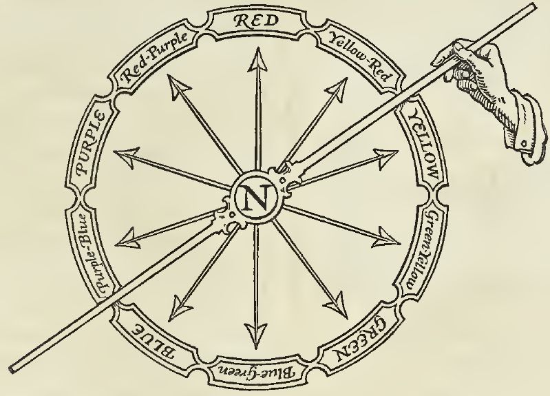
The above diagram, displaying a circle of the ten regular Hues arranged in the immutable order imposed by the spectrum, and reading clockwise, beginning with Red at the top, will serve, with but little explanation, to illustrate what is meant by “opposite,” or the possibly more familiar word “complementary,” colors. The term opposite is used preferably in the Munsell System because it is simple and is self-explanatory, as will be seen by reference to the above diagram, where each Hue on the circle will be found directly opposite to another Hue. Thus a straight line drawn from Red on the circle of Hues through the neutral pole will pass through Blue-Green, its opposite or complementary color. A line from Blue through the neutral pole will pass through Yellow-Red and so on throughout the whole circle. It should be noted that each of the simple Hues, Red, Purple, Blue, Green and Yellow falls opposite a compound Hue, Blue-Green, Green-Yellow, Yellow-Red, etc.
Now two colors which are thus opposite to one another are not only farthest apart upon the diagram, but are in actual use the most strongly contrasting. It does not matter at what point we draw the line, whether it is from one of the regular Hues or from a point between two Hues, if it passes through the center it will fall upon the Hue or intermediary Hue which is its strongest contrast. This maybe more readily visualized if we imagine the spindle indicated on the diagram as pivoted on the neutral pole and movable to any point on the circle.
The question may be asked as to how it is determined that these colors, which fall opposite to one another on the scale of Hue, are, in fact, the most strongly contrasting colors. The answer to this question two colors are truly opposite or at the point of strongest contrast, their admixture will produce a perfectly neutral gray. Though this may be accepted as axiomatic, it can be easily proven with scientific accuracy by arranging two opposite colors on a disc in proportions relative to the Chroma strength of each and revolving them with such rapidity that we cannot see them separately and they are mixed, when if they are truly opposite, they will unite in a perfect gray.* Therefore working back from this fact, the scale of Hue has been so composed that those colors which thus mixed with each other do actually make gray, are placed directly opposite on a line running through the neutral gray pole.
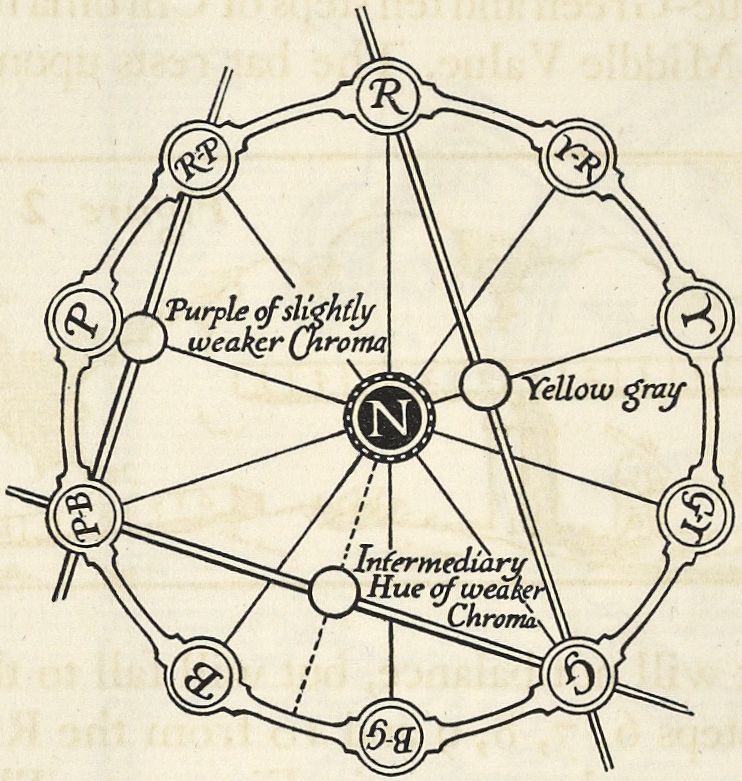
Another question which may arise is what will take place if we draw a straight line between two Hues which are not opposites; and what would be the result of the admixture of these. This can best be answered by the accompanying diagram, where three different lines have been drawn, no one of them through the neutral center. These lines, it will at once be seen, cross points which are not neutral, but nearer to one or another of the Hues lying between the ones from which the lines are drawn; and the result of the admixture obtained is noted on the diagram. This will be sufficient to further demonstrate the simplicity and logic of the System and to suggest to the reader other interesting examples of it.
* The same experiment may be tried with the actual admixture of pigments; but in this case the result is dependent upon the nature of the pigment, itself, that is upon properties other than those of its color, and is, therefore, not scientifically accurate.
Related Links:
- Part 1: Home Page
- Part 2: Preface, by the Strathmore Paper Company
- Part 3: Introduction to the Munsell Color System – The Color Sphere
- Part 4: Introduction to the Munsell Color System – Balance of Color
- Part 5: Introduction to the Munsell Color System – Unbalance of Color
- Part 6: A Practical Description of the Munsell Color System with Suggestions for Its Use – Section One: Hue, Value, Chroma
- Part 7: A Practical Description of the Munsell Color System with Suggestions for its Use: Color Chroma Scale
- Part 10: A Practical Description of the Munsell Color System with Suggestions for its Use: Color Combinations
- Part 11: Suggestions for Use & A Note on the Printing of this Book
- Part 12: Two Proofs of a Design by Miss Helen Dryden for Vogue
- Part 13: The Color Sheets – Frost Gray; The Three Dimensions of Color
- Part 14: The Color Sheets – Gray, Pyro Brown
- Part 15: The Color Sheets – Brown, Grouse Drab


Leave a Reply