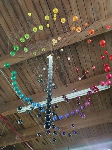
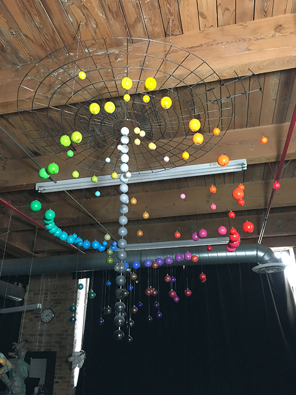
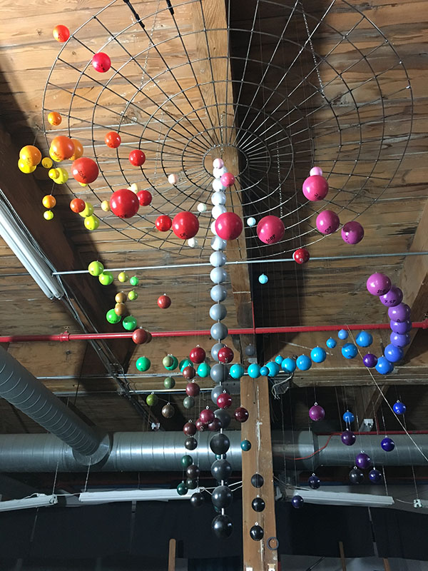
The concept of “color space” as presented in the Munsell system makes a lot of sense, but it can be difficult to describe. Making the concept easier to grasp requires a visual representation – if students are going to “get it” they need to see it. This is why I built a color space model at the studio representing the three dimensions of hue, value, and chroma in a suspended sculpture that we can walk around and immerse ourselves within.
Understanding Color Space to Take the Guesswork out of Mixing
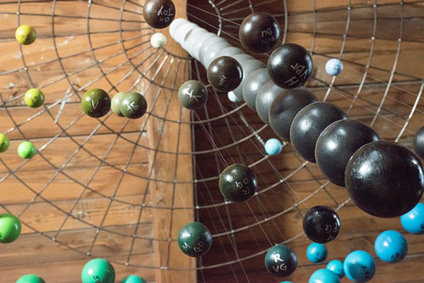
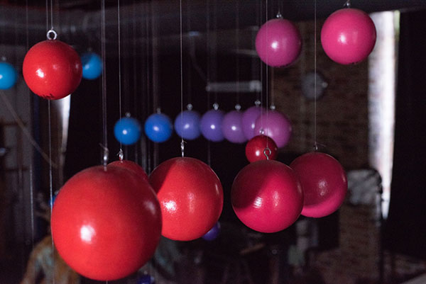
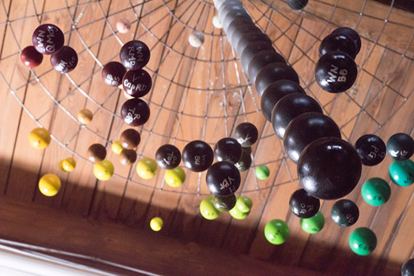
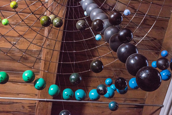
The purpose of this model is to help students of painting understand that color is 3-dimensional. The large spheres around the perimeter represent the different hues at maximum chroma, while the vertical axis denotes value, with dark at the bottom and light at the top. Chroma is represented on the horizontal plane, with weaker colors toward the center of the model, and stronger colors toward the outside. These three dimensions define a kind of volume – called “color space” – that contains every color we can mix with paint.
What’s so helpful about the concept of colorspace is that it allows us to think of mixing color as a kind of “navigation” – each color target we seek to mix has a particular location within color space, and through mixing, we’re trying to reach that location on the palette.
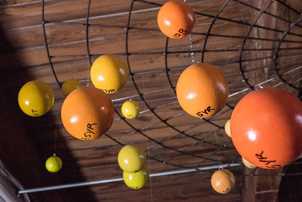
As an analogy, think about taking a road trip. To plan a route, we need to know where we are, where we’re going, and what roads will get us there. Navigating color space similarly requires us to know where our tube colors are located relative to the target, which is why the interior space on our model is populated with smaller spheres representing the position of commonly used tube colors. When students know the approximate “location” of their paints inside color space, they can make better decisions about what paints to use when trying to mix a particular color on the palette. This takes much of the guesswork out of painting, and ultimately makes the whole process more enjoyable.
Chroma+
Those with a keen eye may have noticed that there are a few spheres in my colorspace model that seem to sit beyond the maximum chroma perimeter. These are painted with fluorescent colors that a friend and colleague of mine, as a practical joke, added to my collection of painted spheres one day when I wasn’t around. But using a spectrophotometer, I was able to match them pretty closely to a Munsell chart we have in the studio.
Fluorescent paints are fun because they get their added chromatic intensity due to their ability to absorb and reflect back UV light. The extra light energy makes the chroma appear far greater than the traditional artists colors within my “Colorverse”. Under artificial light, they don’t have as great an impact, but in natural daylight they practically glow. Fluorescent yellow, for example, makes cadmium yellow look like yellow ochre!
Why Use a Color System?
Students are sometimes surprised by how analytical we are about color at the studio, but we believe using a system like Munsell makes color teachable in a way that’s difficult otherwise. Artists aren’t always logical about their process. Using a color framework like Munsell reminds us to think and ask specific questions about every color we mix:
- What’s the hue?
- What’s the value?
- What’s the chroma?
- What paints will I need to mix this?
Painting well requires some degree of analysis – of thinking clearly about what we seek to achieve, and how we can do it with our chosen materials. There’s nothing artists love more than getting a bagful of brand new art supplies and digging right into making art. But sitting down with them first and asking questions about what these products are made of, what they can do for our process, and how they react to other materials is an exciting part of learning to paint.
I had blast making this model. It’s a product of my own thirst for knowledge of the materials that I use, which in turn makes me a better artist and a better teacher. Plus, being a sculptor as well as a painter, it just made sense to do something that was 3D and “in your face.” I got some good practice in on my welding skills along the way, and it’s just really really cool to look at and to have hanging in the studio. I hope you like it too!
About the Author
 Melinda Whitmore received her MFA cum laude in painting from the New York Academy of Art and BA degrees in Art History and Studio Art from Indiana University. She held an assistant curatorial position in the Department of Prints and Drawings at the Art Institute of Chicago and sculpts anatomical models for many of the country’s top anatomical supply companies. Her work has been featured in American Art Collector, American Artist Drawing magazine, Poets&Artists, Art Renewal Center’s 2013 Salon, Manifest Gallery’s International Painting Annual 3, and numerous exhibitions from New York to Chicago. In 2008, Melinda won the top prize for The National Sculpture Society’s Figure Sculpture Competition and in 2010 was awarded the Agop Agopoff Memorial Prize for Classical Sculpture by the National Sculpture Society. In 2014, she was awarded a Purchase Prize by the Fort Wayne Museum of Art Contemporary Realism Biennial.
Melinda teaches anatomy at the School of the Art Institute of Chicago and in the medical humanities department at Northwestern University Feinburg School of Medicine. She is also co-founder and principle instructor of painting, sculpture, and anatomy at Vitruvian Fine Art Studio in Chicago. Connect with her on Facebook or Instagram.

This is terrific . I had my students construct a (Munsell like) color system from found materials after they established the attributes. I will present this teaching history at the FATE conference in Kansas City next year. As part of that I will reference your work.
Wonderful. This model helps students in improving their creativity.
study this at the Columbus College of Art and Design actually ran across the assignment syllabus yesturday.
Beautiful