In 1921 the book, “A Grammar of Color” was published by the Strathmore Paper Company to explain how the Munsell color system can be applied. This Preface was written by the Strathmore Paper Company. They point out how difficult and expensive it was to produce this book, as well as a note about Albert Munsell, his interest in producing this book, and his recent passing.
The Preface is presented here as part of series to make the entire contents of “A Grammar of Color” available online here in our Munsell Color Blog.

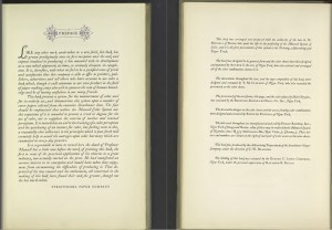
Like any other work undertaken in a new field, this book has grown prodigiously since its first inception and the task and expense involved in producing it has mounted with its development at a rate which appeared, at times, to seriously threaten its completion. It is, therefore, with what we feel to be a justified sense of pride and satisfaction that this company is able to offer to printers, publishers, advertisers and all others who have occasion to use color a book which, though it calls attention to our own product in the field of paper making, may also add its quota to the sum of human knowledge and be of lasting usefulness to our many friends.
This book presents a system for the measurement of color and for its orderly use, and demonstrates this system upon a number of cover papers selected from the extensive Strathmore lines. The fact should be emphasized that neither the Munsell Color System nor this exposition of it is intended to present a creed or dogma for the use of color, nor to supplant the exercise of instinct and trained perception. It is intended as an aid to the training of a color perception and the quickening of an instinct for color, but failing even in this, a reasonably close adherence to the principles which it puts forth will certainly help to avoid the outrages upon color harmony which are committed in every-day practice.
It is regrettable to have to record here the death of Professor Munsell but a little time before the work of printing this book, the first to treat of the practical application of his theories to a great industry, was actually started on the press. He had manifested an earnest interest in its conception and would have taken keen enjoyment from surmounting the difficulties of producing it. Thus deprived of his wise counsel and his enthusiasm, all concerned in the making of this book have found their task the greater, though not the less worth while.
STRATHMORE PAPER COMPANY
[ 5 ]
This book was arranged and prepared with the authority of the late A. H. Munsell of Boston, who spent his life in the perfecting of the Munsell System of Color, and it is the first presentation of this system to the Printing, Advertising and Paper Trade.
The book was designed in its general form and the color sheets have been designed and patented by Arthur S. Allen of New York, who also selected and arranged all of the color combinations shown in it.
The decorations throughout the text, and the type composition of this book, were designed and executed by T. M. Cleland of New York, who also executed the presswork on the color sheets.
The presswork of the text forms, title page, and the color plates by Helen Dryden, was executed by the Redfield-Kendrick-Odell Co. Inc., New York.
The decorative designs on the color sheets and the areas showing color combinations were designed and executed by Rudolph Ruzicka of New York.
The inks used throughout are manufactured and sold by Philip Ruxton, Inc., New York, Chicago and Boston. Any of these may be ordered by the Munsell System of Notation, thus: R5/5 which means Hue, Red; Value, 5; Chroma, 5. These letters and numbers are shown at the right of each pair of color areas on the color sheets.
This book was produced by the Advertising Department of the Strathmore Paper Company, under the direction of C. W. Dearden.
The binding of this book was executed by the Eugene C. Lewis Company, New York, under the personal supervision of Raymond E. Baylis.
[ 6 ]
“A Grammar of Color” Chapters:
- Part 1: Home Page
- Part 2: Preface, by the Strathmore Paper Company
- Part 3: Introduction to the Munsell Color System – The Color Sphere
- Part 4: Introduction to the Munsell Color System – Balance of Color
- Part 5: Introduction to the Munsell Color System – Unbalance of Color
- Part 6: A Practical Description of the Munsell Color System with Suggestions for Its Use – Section One: Hue, Value, Chroma
- Part 7: A Practical Description of the Munsell Color System with Suggestions for its Use: Color Chroma Scale
- Part 8: A Practical Description of the Munsell Color System with Suggestions for its Use: Opposite or Complementary Colors
- Part 9: A Practical Description of the Munsell Color System with Suggestions for its Use: Balance
- Part 10: A Practical Description of the Munsell Color System with Suggestions for its Use: Color Combinations
- Part 11: Suggestions for Use & A Note on the Printing of this Book
- Part 12: Two Proofs of a Design by Miss Helen Dryden for Vogue
- Part 13: The Color Sheets – Frost Gray; The Three Dimensions of Color
- Part 14: The Color Sheets – Gray, Pyro Brown


[…] A Grammar of Color – Part 2: Preface, by the Strathmore Paper Company […]