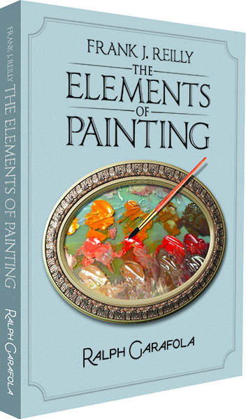
“To succeed in the realm of graphic arts, like dancing and music, one must acquire knowledge. By practicing and applying that knowledge, one becomes skillful. It was Reilly’s logical application which was the basis for developing my craft. After 65 successful years I have never found reason to change the drawing or painting methodology Reilly taught to me. I owe him my sincere gratitude. Now through this book I share it with you.”
– Ralph Garafola, Artist/Author/Educator
Tell us about “The Elements of Painting” and how you came to write it.
I studied with Frank J. Reilly for seven years. He was a fantastic teacher, probably the best teacher in the country while he was alive. This man was incredible! He taught art like a science; he didn’t teach the style of painting, he taught what you should know, so you could paint in your own style. He planned to write books (he had enough information to write several books) but it didn’t come about because he wanted to use his own illustrations. When most people would write books, they use other people’s artwork to explain it, and because he didn’t want to do that, consequently he never wrote any of the books.
Studying with him for that long, he became like a godfather… I observed everything he said and kept detailed records of it. I decided that this information was so important for other artists to learn and that’s how I came to write the book, and I tried to do it exactly as he would have.
Does Reilly have any existing family members?
He was married but had no children. His students were like his children; we practically worshiped the man. I studied with him in the late 1950’s – 1960’s and I feel the same way now as I did then. That is how strong the bond was he had to his students. He had a tremendous amount of students, all successful, and that is why he was such a great teacher. What he taught was, I don’t know how to put it… how to be successful. There was no other way. If you studied with him, that was it. Many artists study with four or five different instructors; Frank Reilly students only studied with Frank Reilly. There was no need to study with anyone else. I never studied with anybody else, except Reilly, and I would challenge anybody as far as knowledge, as to how you should be painting, how to compose and all the other things that are involved with creating a piece of art.
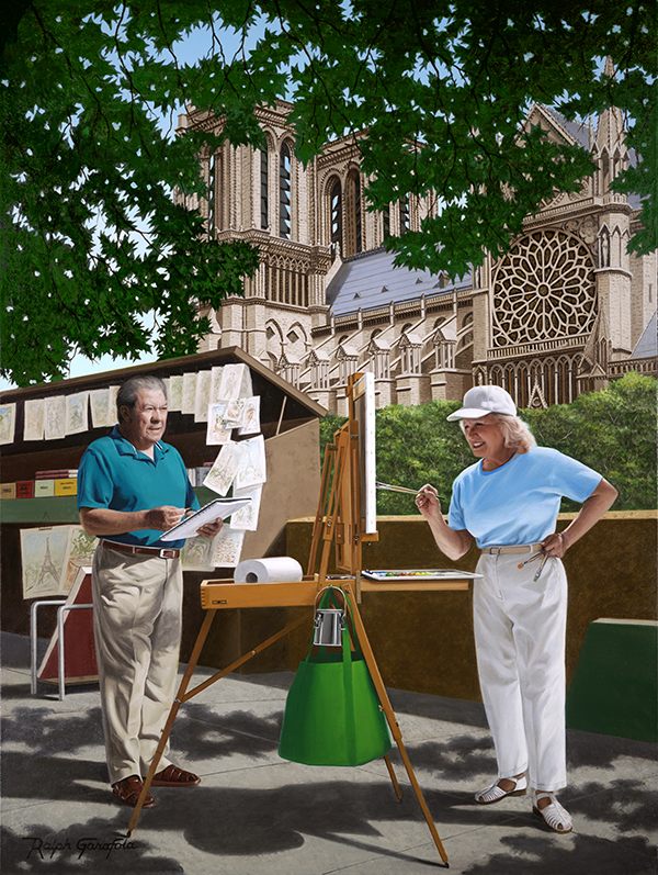
Painting on the Left Bank, 48″ x 36″
Did you talk to any former students when you were writing the book?
Oh yes. I sent a copy of the book to several of them and one person commented, “If Frank wrote a book, this would be it.” And that it is true because, word for word, all of it was from Reilly, none of it was from me. I just quoted, all throughout the book.
What is amazing is that with the over a thousand students he taught, none of them paint the same way. Some are impressionist, some paint realism, and so on. In fact, when I was a monitor of Reilly’s drawing class, there was a young man in class that learned from Reilly who went off on his own way… Peter Max. Max knew how to draw a figure, but he got involved with composition and color. Color was an incredibly important aspect of Reilly’s teachings. That is where Max wound up being a tremendous success – his knowledge of color.
Reilly would never comment on the way anyone was painting, he only provided information about what you should know to be able to paint. Light and shade, how to treat edges, color theory, composition, etc.
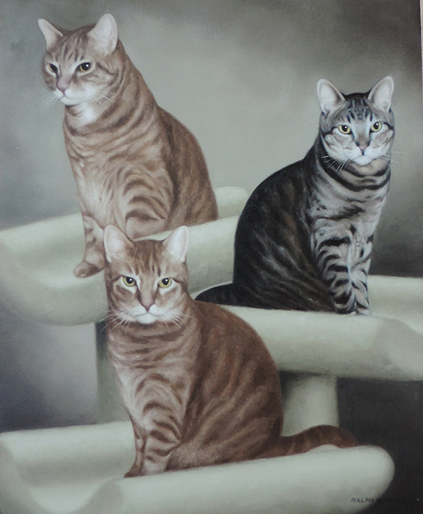
Ginger, Pepper and Nutmeg, 24″x20″
Can you talk about why it is important to distinguish between visual and pigment color?
We look and we see color. When we look at color objects our eyes vibrate the color of what they are, but when we paint, we don’t paint visually, we paint with chemicals, so it’s different. The most common color theory tells us that you neutralize a color by mixing it with its complement. But this is really inaccurate. The way you show that to students visually is by mixing colors and seeing for yourself. If you took yellow and you want to neutralize it, you use, according to this theory, its complement, which is blue. In other words, if I took half yellow and half blue, and spun it around, visually it becomes neutral gray. Now if we did the same thing with chemicals (paint) and I pick a yellow paint color and added the complement of yellow with blue, you will wind up with green, not grey. What also changes, is that, the yellow is light, and the blue is dark, so you are not only changing the yellow to green, but you’re also making the yellow darker than it was. You are changing two things but you did not want that, you wanted it to stay yellow. So this is the difference between visual color and chemistry.
If you add any color into pure color, you’re going to start to neutralize it, which makes it weaker; you are just contaminating the pure color. To neutralize any color, you have to use neutral grey. Neutral gray does not change the color.
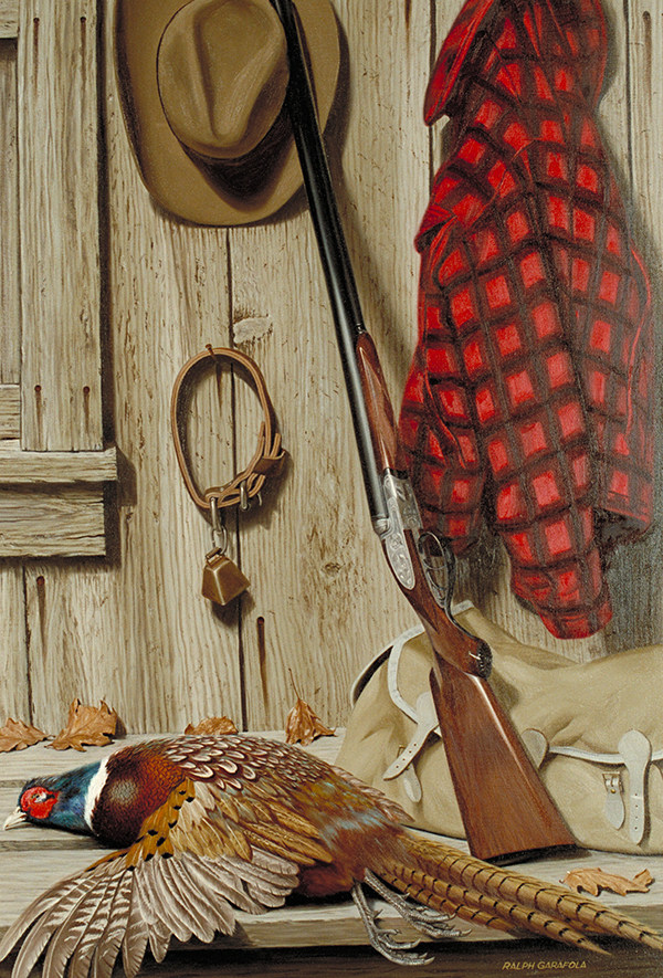
Ring-Necked Pheasant, 34″ x 24″
You say understanding the difference between value and chroma is difficult for students. Can you talk about why that is?
Every color is known as having three dimensions: hue, value and chroma. Hue is whether it’s red, blue, green, and so on – the color of the pigment. The value is how light or dark the pigment is. And the chroma is how weak or strong that pigment is. This is where students at the beginning get confused between value and chroma. Value is how light or dark the color is and the chroma is how weak or strong or intense the color is. Once you know that, it’s simple. I tell students, for every piece of paint you mix, there can only be two things wrong with it, it’s either too light or too dark or too weak or too strong. It’s amazing how simple it is once you understand it.
This color theory came from a man called Munsell who, as you know, was fascinated with color all his life. By 1913 he had created the Color Atlas and by 1915, the Munsell system had become the international standard. If I took a piece a paper and wrote down that I wanted a red, in this value, with this chroma and I sent it to some manufacturer in Germany, that is the red I’m going to get, exactly. This was thanks to the Munsell system. Even though this was the standard… artists are too busy creating, but they don’t use the system. Some do, but many don’t. So this is what is fascinating about the color theory that I teach and it’s amazing to see the response you get from that. This theory about neutralizing color with its complement, that came from Monet and the Impressionists. What they did was they tried to paint the way we look at things, the way our eyes vibrate color. When they painted, they put colors next to one another, and you look at it and vibrates, and it becomes something else. That is how that theory started, but when you’re mixing paint, it just doesn’t work.
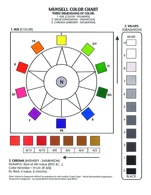
An excerpt from Elements of Painting by Ralph Garafola – Page 12: Munsell Color Chart & the Three Dimensions of Color – Hue, Value and Chroma
Are there exercises that you utilize to help students understand that notion between value and chroma?
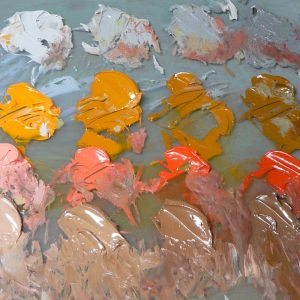
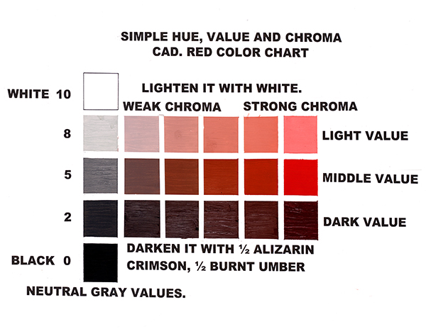
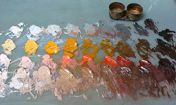
Yes! When I studied with Reilly, we made complete color charts… these things were complicated. But what I do with students, I give them three simple charts. Each chart has a light row, a middle row and a dark row. Starting from neutral, no color, to the strongest color, with about 6 or 7 steps. For example, they take yellow (which is a light color) and mix a neutral grey the same value as that yellow, which would be the ninth value. You start to add the neutral gray into the yellow, and it gets weaker and weaker and weaker, until it becomes, just neutral. Then you darken the yellow and you start to do it with the middle value grey, and then the darkest yellow, with the darkest grey. You are darkening the color, because it’s a light color, so you’re changing it from light to dark, you are changing the value of that color, but you’re also making it weaker in each step. Once they create these simple value and chroma charts, there’s no way they won’t know exactly what’s going on. I do the exercise with three colors: yellow (a light color), cadmium red light (in the middle) and ultramarine blue (a dark color). There are nine equidistant steps between white and black.
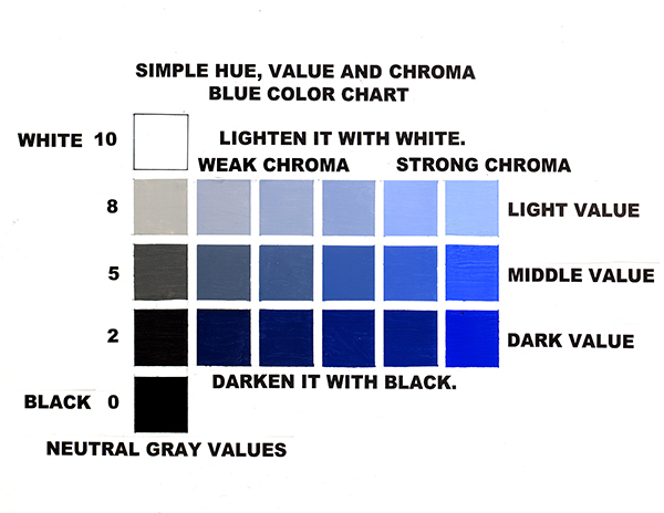
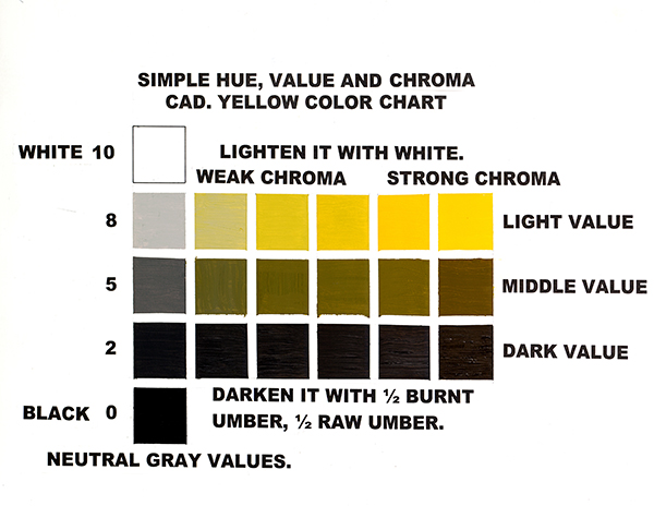
With chroma, it is more complicated because there’s a lot of steps. For instance, cadmium red light is the strongest color paint, there’s nothing stronger than that as far as intensity goes. So from neutral gray, to the cadmium red paint, out of the tube, it is divided into 14 equal steps from the strong color to neutral gray. That’s the strongest color we have. Most other colors go out 10 and 12 steps from the strongest color to the neutral gray. The weakest color we have is viridian green. It only has 8 steps from its strongest color to the neutral. So in other words, every color as it comes out of the tube is the strongest that color could be; you can’t make it stronger, but you can weaken it. You’ll weaken it, but still maintain the color, if you use neutral grey – it does not change the color.
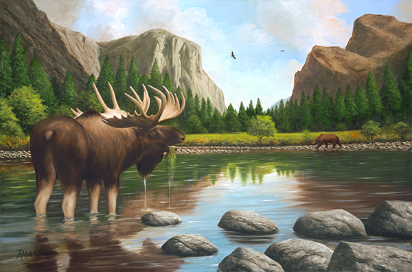
Moose in Yosemite, 24″ x 36″
The other mistake students make when they try to mix color is they use black to darken a color. Black has blue in it. There are three warm colors: yellow, orange and red. Fortunately, those three colors, you can darken it with its own color. For instance, cadmium yellow light comes out of the tube as a ninth value, just slightly darker than white paint, and to darken it, you mix it with half raw umber and half burnt umber, half and half which would be yellow at the first value, right next to black. If you add the umbers to the yellow, you’re darkening the yellow, but it’s always yellow. But if you use black, there’s blue in black so it would start to become green. The same thing is true with cadmium red light – it’s in the middle of the value chart, the fifth value. If you mix burnt umber and alizarin crimson half and half, that’s cadmium red light, at the first value, so you can darken it with its own color. Cadmium yellow orange comes out of the tube at the seventh value, which is pretty light. If you use burnt umber, burnt umber is yellow orange at the first value right next to black. So you’re not changing your yellow orange, you’re just making it darker. All the other cool colors, you darken with black, because they’re cool colors and it doesn’t affect their color. That’s color mixing in a nutshell. Once you understand it, you can do anything you want with color. When you are using black, use ivory black and not lamp black because lamp black has lot of blue in it.
In Part 2 of the series, we will talk about Frank J. Reilly’s contribution to the Munsell system, the three things that can’t be painted, what colors painters should us, the importance of value, advice for young artists and more.
About the Author
 Ralph Garafola; born in Brooklyn, NY has made a living as a commercial illustrator and fine artist for more than 65 years and brings his style of contemporary realism to his oil and watercolor paintings of portraits, landscapes, seascapes, still life and animals/pets. “All my paintings are portraits. Whether my subject is a person, landscape, seascape, still life or pet, my approach is to realistically portray my subject in its natural environment. It puts the viewer inside the painting”.
Garafola studied at the Art Students League for seven years with Frank J. Reilly, Instructor and Commissioner of Art for New York City. He travels throughout the Southern United States, Italy, England and France in search of new subjects and locations for future paintings while studying the works of the Old Masters. Garafola teaches in Florida at the Art Center Sarasota and Art by the Bay Sarasota. Garafola is also available for private lessons and workshops.
You can see his artwork and learn more about him at ralphgarafola.com.
All of the images are Copyright protected by Ralph Garafola. Reproduction is prohibited.

I find it interesting that this article it states that in order to neutralize a color with its compliment. He then goes on to give the example of blue being the compliment of yellow. That is not accurate as far as I know. According to complimentary color chart, purple is the compliment of yellow. Just thought it was odd.
It is a litte bit complicated. Each color model, like Munsell, has its opposite colors. Sometimes they are also named “complements” to imdicate that they is some way do complement each other.
If you look at how wavelengths of light mix, Y and B are the “actual” complimentaries. Check out the CIE xy diagram that specifies how colors are mixed in our “neurological-perceptual system” according to how wavelengths are mixed. Drawing a line from Y to B you pass through the part of the diagram that we percieve as white.
You also have this in the RGB mixing model where B (although here B is a very violet blue) and Y (R+G) mixes to white.
We are often taught the “Ittens Color Wheel” in school. I don’t find it a good model. It causes a lot of problem beacuse it is a “mixture” 🙂 of all kind of ideas in one model (Psychological complementaries, Visual complementaries, Mixing complementaries, and so on). In this model Y and P are complementary, As are B and O. And that Y and B makes G. Y and P, and B and O are complementaries in different ways (darkest-lightest at maximum chroma, and cold-warm) and to some extent they mix (pigments) close to neutral colors—but not really that good (it also depends on what B and Y pigments are used). To know why Y and B pigments mixes to (dull) G, one have to look at the spectra of wavelengths that pigments reflect, and that actual (and theoretically possible) B and Y pigments all reflect green wavelengths.
On the Munsell wheel Y and BP are opposites. And B and RY. The Munsell wheel was to some extent constructed with the help of a “Maxwell Wheel”. And you can sometimes finds information that using opposite hues on a Maxwell Wheel you get perceptual greys/white. Although I doubt this is accurate with all opposite hues. It may also depend on the spectral components of the Y and BP (and the B and RY) pigments used on the Maxwell Wheel.
Also know that the exact hues of B and Y often are different in different color and color mixing models.
So: Y and B are visual complementaries, but they aren’t paint mixing complementaries.
Oops! Sorry, while reading my previous post I noticed I didn’t finish my first sentence. It should have read that in order to neutralize a color you are to mix its compliment.
I believe the color palette is the best system to achieve the correct color and density of the picture. I also believe that the right time will determine the way a photography will reflect the color to it true hue.
Well Elizabeth, the blue violet is the actual complementary to neutralise the yellow in paint. Adding violet to yellow gives you a brown. Brown is not grey . If you use a cyan yellow magenta colour wheel you will discover this for yourself. Try to use transparent,semi transparent complémentaries to get a dark -as -possible “black “, then add white. Your colour mixing will become easier. Cheers