Technically, drawing in colored pencil is simply layering semitransparent colors on paper to create vivid paintings. Every color has three qualities: temperature, intensity and value. The combination of these three qualities gives paintings an illusion of depth and form, but the most important component in drawing all forms realistically is value.
Choosing the Hues
Hue means color, such as green, red, blue, etc. In the Munsell system every color has a color designation: Y=yellow, P=purple, YG=yellow-green and so on. When I plan out my drawing, I choose the overall color scheme for my artwork to create a specific mood and atmosphere. Is it going to be warm red, cool blue, or neutral browns?
In this drawing I use the analogous colors (blue-greens)-the colors of the ocean to create an atmosphere of sea life in my artwork.
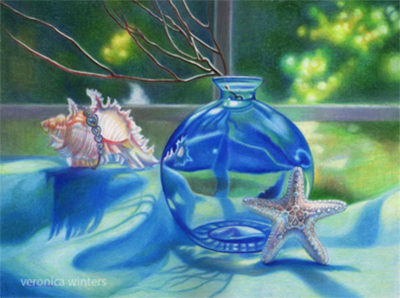
Still life with a blue vase and seashells, 9×12”, colored pencil on paper.
Value in Drawings
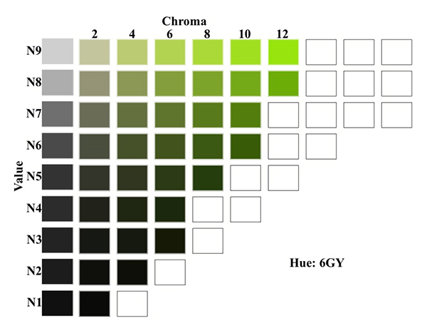
Value is the lightness or darkness of a color. On the Munsell scale it ranges from 0 (pitch black) to 10 (the whitest white).
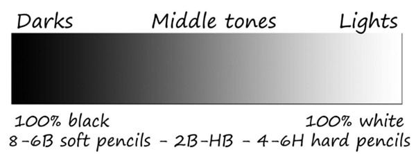
This image shows the value scale with graphite pencils’ designation, but the value scale concept applies to any painting and drawing.
Every color has a specific value range, meaning that not all colors have the identical 0-10 value range. For example, even the deepest yellows can’t get as dark as ultramarine.
Successful drawing has at least 5 values. The correct values give the illusion of volume in my objects. The more precise I am in finding the right value for each section in my drawing, the more 3-dimensional it looks.
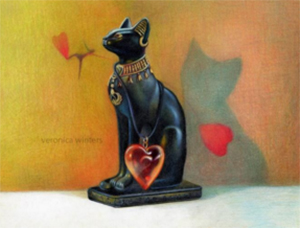
Egyptian cat, 9×12, colored pencil on paper
In this drawing, the dark values of the cat create contrast with the middle toned background.
Chroma and Layering
Chroma means the highest saturation or brilliance of a color. In a Munsell scale chroma ranges from 0 to 16, where 0 is a neutral gray and 16 is the most pure, saturated color.
Colored pencil drawing is much easier than painting, because you don’t have to mix colors that much to find a hue of a particular value and color temperature, it’s already in your box. You can play with the colors deepening values through subsequent layering. In painting, you must mix the right color of the right value and color intensity at once.
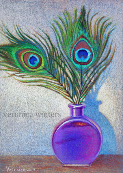
Two peacock feathers, 5×7, colored pencil on pastelbord
Here I use high-chroma violets in the vase and blue-greens in the peacock feathers. I gray down the background some to create visual contrast.
Drawing Exercise
When you crosshatch two, high-intensity (bright) colors, you reduce the intensity of both hues. If you juxtapose the intense colors instead of crosshatching them, you create a different visual impact. Also, a mix of two, low-intensity colors looks as complex as a mix of several high-intensity colors.
When you blend or burnish the surface, colored pencils become much brighter (the mineral spirits melt the wax in pencils, darkening and smoothing the surface).
Use of Grays
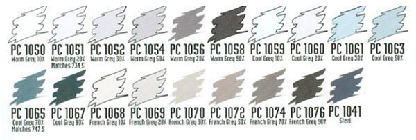
Unlike other mediums like watercolors, pastels or oils, colored pencils do not mix to gray. Therefore, it’s impossible to produce dull, wishy-washy grays and browns. Because of this reason, manufacturers of colored pencils make a range of grays with various percentages of both cool and warm color. A few grays are already included in large box sets, and a variety of grays is available as open stock as well. For instance, the Prismacolor Premier colored pencils have a wide range of values: Warm Grey 10%, Warm Grey 20%, Warm Grey 30%, Warm Grey 50%, Warm Grey 70% and Warm Grey 90%; Cool Grey 10%, Cool Grey 20%, Cool Grey 30%, Cool Grey 50%, Cool Grey 70% and Cool Grey 90%; French Grey 10%, French Grey 20%, French Grey 30%, French Grey 50%, French Grey 70%, French Grey 90%.
Creating Depth
Why do you need grays? First, you can reduce the color intensity of a particular color or an area such as in a background, by applying the grays over your original color. Such intentional graying down of distant mountains or supporting elements moves them back, and brings the center of interest forward. Use it.
Increasing Intensity
Second, when grays are juxtaposed with high-chroma colors like red or blue, these already intense colors become even more powerful.
The Reality of Intensity
Third, we rarely see objects, landscapes or what have you in high-chroma situations. In fact, it’s quite rare. So by learning to control your color intensity with the grays (or with the complements), you can produce realistic, true to life images.
Drawing Exercise
Juxtapose cooler grays with warmer reds and yellows to see the result. Beautiful drawings show balance between the intense and subdued hues.
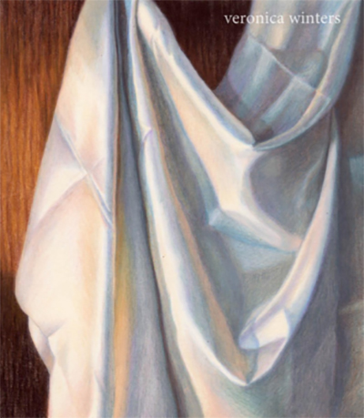
White fabric, 9×12, colored pencil on paper
In this drawing I use a range of warm and cool grays, layering them over the colors (blues and yellows).
Color Mixing Basics: Warm and Cool Colors & Designing Around a Color
Color Temperature
Like in painting, colored pencils also can be broken down to cool and warm colors. Blues, greens, yellows, and reds-all have both cool and warm counterparts. For example, ultramarine is a cool blue (leans towards violet) and cerulean blue is a warm blue (leans toward yellow). Crimson red is a dark, cool red (leans towards blue) and poppy red is a warm one (leans towards yellow).
Get to know your color temperature by making color charts. Also, mix them with their complements and any other colors you think will be useful to have at a glance. Make a grid of overlapping horizontal and vertical strips of color to record these color combinations.
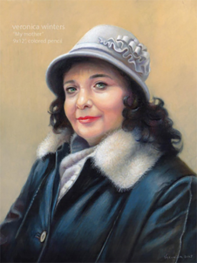
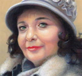
My mother, 9×12, colored pencil on uart paper
Here warm skin tones, the fur and the background contrast the cooler coat and hair.
Color Palette
Local Color
The natural color of an object as it appears in normal light (red of the tomato, or green of the grass). Beginners often see only local colors in objects, flowers, etc. rather than the color combinations. Look at a variety of color chips in the Munsell book to get ideas on a range of possible hues.
Apply local colors over the complementary hues to create rich surfaces. For instance, the complement of red is green. Apply a bit of green under the red in your object and see what difference in color it makes.
Drawing Exercise
To make your drawings sophisticated, mix at least two colors in any given area, rather than shading with a single pencil.
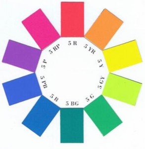
Artists rely on both personal “palettes” and a color wheel to make color choices. You can design your drawings and set the mood for the pictures using monochromatic, complementary, or analogous color schemes. You can rely on either the Munsell color chips or the color wheel to make your choice.
Monochromatic Color Palette
One color such as red that changes in chroma and value.
Complementary Colors
Colors that are across from each other on the color wheel, like yellow-violet, green-red and blue-orange. Use complementary colors to neutralize some colors that don’t describe the center of interest. The saturation or intensity of a very bright drawing can be easily controlled by applying a small amount of complementary color over its pure hue.
Analogous Color Palette
Colors adjacent to one another on the color wheel. For instance, Red, Red- purple and Purple.
Have fun drawing!
About the Author
Russian-American artist, Veronica Winters paints full-time in Naples, Florida. Her articles and artwork have been published in many magazines. Her realist paintings exhibit a pursuit of beauty, harmony and quietness. To contact the artist, use one of the links below:
- www.VeronicasArt.com
- YouTube: youtube.com/veronicasart
- FB: facebook.com/veronicasart
- Blog: https://veronicawintersartblog.wordpress.com
Pinterest: https://www.pinterest.com/veronica_winter/

Thanks for posting this article and especially the examples. This makes it simpler to follow. I find just reading the theory is just too difficult. I will definitely try to implement it instead of just mixing in a hit and miss fashion.
¡Hola!, ¿Cómo están?. Yo tengo una duda referente a los diferentes tipos de grises que hay, los grises pardos, los grises frios y grises francés. En la antigua nomenclatura o carta de colores de los lápices de creyones Berol Prismacolor (en español) ellos dividían al gris en 2 grupos: (a.) Grises azulados y (b.) Grises pardos; cada uno de estos dos grupos estaba constituido por 4 lápices de colores en cada grupo: Gris pálido, gris claro, gris medio y gris oscuro. Pero en la actual rótulación de los lápices de colores Berol Prismacolor estos nombres de colores no existen sí no que los grises cálidos y grises frios están divididos en numeros de porcentajes, por ejemplo, 10%, 20%, 30%, 40%, etc. Además ellos han añadido una nueva categoría, los grises franceses (French Greys). Mi pregunta es: Lo que conocemos como GRIS PARDO o GRIS CÁLIDO (Warm Grey) tiene dentro de él 5% de color AMARILLO y lo que conocemos como GRIS FRIO (Cool Grey) tiene dentro de él 5% de color azul (por eso también se les llama Gris Azulado) entonces… ¿Qué es un GRIS FRANCÉS?, ¿Un gris con una pequeña cantidad de rojo o rosado dentro de él?. ¡Gracias!.