International Colour Day is March 21st, and to celebrate, Inter-Society Color Council (ISCC) is hosting a webinar with painter and teacher David Briggs, who will be presenting at the Munsell Centennial Color Symposium in June.
What sets David apart from other experts in the field of colour, is his ability to make the science of colour accessible and useful to artists. We had a chance to chat about his work in the field and the upcoming webinar.
How did you learn about colour?
In terms of theoretical knowledge most of it has come through preparing for and presenting courses. I’ve been lucky to have the opportunity to teach a very long-running five-day colour theory workshop at the Julian Ashton Art School and also an undergraduate lecture course on the history of colour theory and practice at our National Art School. In addition I’ve taught many practical painting classes at both schools that forced me to really understand and communicate what I’m doing with colour when I’m painting.
When did you start your website, which combines the art and science of colour?
I started The Dimensions of Colour when I was teaching drawing at a graphic design school. A brilliant multimedia lecturer named Dave Agius directed his class to create websites for other staff members as class projects, so I threw together the little I knew at the time, and “The Dimensions of Colour” was launched in November 2007.
What inspired you to create your website?
A great deal of colour education for artists was and is in the form of “traditional” (red-yellow-blue) colour theory, which encapsulates the understanding we had of colour in the first half of the nineteenth century. At the other extreme, there was Bruce MacEvoy’s encyclopaedic treatment of colour science, which is an astonishing achievement, but which I felt did not emphasize enough the most useful aspects of colour science. Notably, the Munsell framework, some relationships pointed out by Arthur Pope in the 1920s (especially the importance of lines of uniform saturation as shading series), the very different mixing behaviours of paints near the additive and subtractive primary hues respectively, and the different colour spaces used in digital painting. So these were the main things I focused on when I first launched the site.
Your ISCC webinar for International Colour Day – “The New Anatomy of Color” – is about expanding from Munsell’s Hue, Value and Chroma to include 7 attributes of color. Of all the topics about color, why did you decide to focus this webinar on these seven attributes?
I’d like to clarify I’ll be mostly talking about the six standard attributes of perceived colour of CIE terminology, which have been stable for several decades, but which are still new, in my teaching experience, to almost everyone except colour scientists. My only addition is the attribute of brilliance/blackness, which has long been used outside the CIE system.
After trying virtually every sequence of topics possible I’m now convinced that the best starting point for a colour course is a close look at these attributes of perceived colour, beginning of course with hue, lightness and chroma, followed by the four attributes of brightness, colourfulness, saturation and brilliance. Unfortunately colour scientists have not had much success in communicating this terminology without misunderstandings to other specializations like neuroscience and philosophy, let alone to painters, and I hope I can contribute something is this regard.
Do you have illustrations that graphically compare each colour attribute?
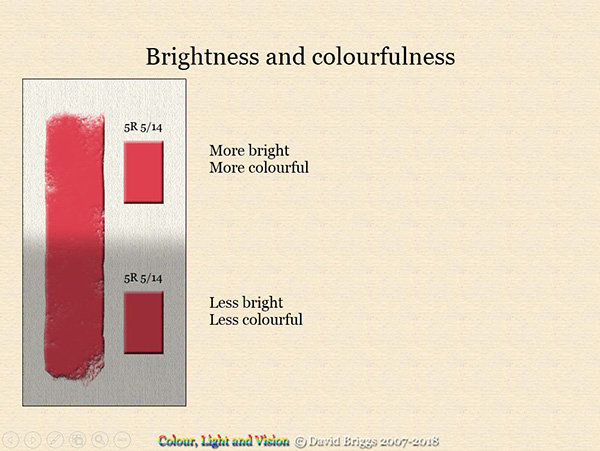
I have LOTS of diagrams. Here’s just one to show the simple yet astonishing distinction between lightness and chroma on the one hand, and brightness and colourfulness on the other. Without having to think about it, we see this stripe of paint as having the same object colour, that is the same hue, lightness and chroma, over its length. We would not be surprised to discover that the stripe matches the same Munsell chip placed beside it in the shadow and in the light. Nevertheless, the area of the stripe in the light appears brighter and more colourful than the area in the shadow. Brightness and colourfulness are attributes of the appearance of the light coming from different areas of the stripe. So really, you simultaneously have two colour perceptions, the hue, lightness and chroma seen as belonging to the stripe itself, and the hue, brightness, and colourfulness of the light reaching your eye from different areas of the stripe. We only perceive objects as having lightness and chroma, instead of merely constantly changing brightness and colourfulness, because of the remarkable ability of our visual system to instantly, unconsciously and seemingly effortlessly, parse the visual field into object colours and illumination.

Colour is already complex enough with just Munsell’s three attributes of Hue, Value (lightness) and Chroma. As an artist, why should I learn about four more attributes? Why should I care?
We don’t get to choose the number of attributes we have to deal with, so the alternative to having more attribute names is to use the same name for different attributes – which really does make things complex. There’s a very widely used and useful digital colour space known variously as HSB (“B” for “brightness”) or HSV (“V” for “value”). “S” is a simple predictor of relative saturation in the strict sense (i.e. NOT chroma, which is commonly called saturation) and “B” or “V” is neither brightness nor lightness, but a predictor of relative brilliance (“relative” in each case meaning relative to the maximum possible for an RGB colour of that hue angle H). Artists who lack the concepts of saturation and brilliance commonly resort to explanations in terms of what they call, “colour temperature” to describe the colours of illuminated objects. For example, highlights are “cool” (because “white is a cool”), full-lights are “warm” but half-lights are “cool” (because “grey is a cool”) and so on. This is not only clumsy and inadequate, but also exasperating for students who find their teachers are all using these terms differently.
What is the importance of each of these attributes for you personally as a painter and for student painters?
Of the three most familiar attributes of colour, hue attracts the most attention from beginner painters, very often to the detriment of the other two. Representationally and compositionally, lightness is the most important attribute of colour, and the first one that every beginning painter must master. While of less pressing importance than lightness, careful attention to chroma provides the refinement lacking in many beginners’ paintings. One advantage experienced by painters using the Munsell “big book” is they become used to making precise decisions in relation to the Munsell chroma scales.
Painters translate the brightness and colourfulness of a real or imagined scene into the lightness and chroma of their paints. Indeed, painters can have difficulty grasping the concepts of brightness and colourfulness because they automatically think of the visual field in terms of the lightness and chroma of the paints they would use. Painters soon discover their casual impressions of relative brightness can be very different from the results of careful comparison, for example by comparing with a Munsell chip or greyscale step held at a fixed angle, or by ‘squinting”.

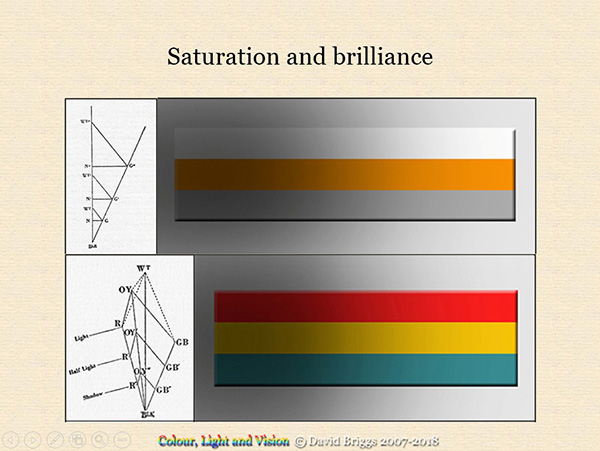
Saturation and brilliance are, for a start, very useful concepts for anyone painting objects under varying levels of illumination. A single object colour will be depicted using a series of image colours with the same saturation, and objects of different colours will be depicted by image colours that maintain the same relative brilliance as the objects pass from shadow to light. Getting these relationships right creates a convincing effect of objects in light, as these digital realizations of some of Arthur Pope’s diagrams from 1922 show, which brings us back to one of my main interests in creating my site ten years ago.
To learn more from David, register for The New Anatomy of Colour Webinar.
Visit the Munsell Centennial Color Symposium site to learn more about the upcoming event.
About the Author

David Briggs is a painter and teacher at the Julian Ashton Art School and the National Art School in Sydney, Australia. He has been teaching classes on colour for painters for nearly twenty years, including a long-running intensive five-day workshop, Colour, Light and Vision, and an undergraduate lecture course on the history of artistic colour theory and practice, Theories of Colour. David is the Chairperson of the New South Wales Division of the Colour Society of Australia and has contributed to publications including a chapter on colour spaces in the forthcoming Routledge Handbook of Philosophy of Colour. Some of his efforts to present current scientific understanding of colour in ways that are accessible and useful to painters can be seen on his website, The Dimensions of Colour.


The video of the webinar is now available at the link below. You’ll need to register with your email and name. The GotoWebinar system will then send you a link to watch the recording
https://attendee.gotowebinar.com/register/7440182269094639874