Dr. David Briggs is the author of the website The Dimensions of Colour, and has taught classes in color for artists and designers for fifteen years at institutions including the Julian Ashton Art School and the National Art School, Sydney. In the first of this two part series, he presents his personal view of the importance of the Munsell system in artistic color theory and practice.
Color training in the arts today is deeply divided between modern and “traditional” color theory. Modern color theory characteristically emphasizes concepts of color space, especially the framework of hue, value and chroma devised by the artist and art teacher Albert Munsell. Additionally, modern color theory incorporates the discoveries by which Helmholtz, Maxwell and Hering revolutionized our fundamental understanding of the nature of color as radically as Darwin transformed our understanding of biology at the same time. In contrast, traditional color theory anachronistically maintains conceptions of color that prevailed before these late 19th-early 20th century revolutions, and its relationship (or lack of relationship) to modern color theory is in some ways like that of so-called “Creation Science” to modern biology.
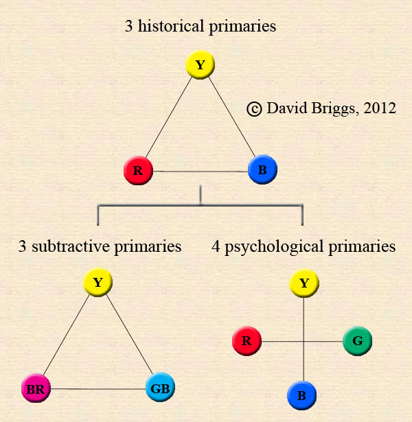
A defining characteristic of traditional color theory is its adherence to the three historical primary colors, yellow, red and blue, which Albert Munsell railed against a century ago in his book, A Color Notation. In contrast, modern color theory recognizes that there are different primary colors (and different complementary relationships) in different contexts, for example additive primaries, subtractive primaries, and psychological primaries. As I have argued elsewhere, the historical primaries appear to be an unconscious conflation of the four psychological primaries – yellow (Y), blue (B), red (R) and green (G) – and the three subtractive primaries, yellow (Y), magenta (BR) and cyan (GB). By this view, yellow, red and blue are the three names that we applied to our best colorant-mixing primary hues when we first discovered them, before it occurred to us that the optimal hues for colorant mixing might not be the same as the hues we mentally experience as pure and primary. In a sense, the historical primaries are the ancestors of both the modern subtractive primaries and the modern psychological primaries.

Implicit in much traditional color theory is a pre-Newtonian view of color mixing that I have called the intermixture theory. This view rests on the “commonsense” assumptions that colors are physical properties residing in materials, and that these properties themselves mix when we mix paints, so that, for example, the color green is considered to “contain” yellow and blue. In many minds this view exists in quarantine alongside knowledge of Newton and the spectrum, without any apparent awareness of the inconsistency, as it does for example in Johannes Itten’s (1961) The Art of Color. Other versions of traditional color theory adhere to the later (but still obsolete) idea that color mixing depends on shared “impurities” or “biases” in the yellow, red and blue primaries. This 19th century idea has lately been reanimated as the rationale for a “split primary” palette system consisting of warm and cool versions of the three historical primaries. In modern color theory, color mixing in paints is understood to involve a combination of subtractive and additive-averaging processes that result in broadly predictable mixing paths through hue-value-chroma space. For example, mixing paths of yellow and blue paints tend to curve through low chroma greens, not because green “contains” yellow and blue, but because subtractive mixing exposes the substantial green-wavelength reflectance that is an essential component of the color of both yellow and blue paints.
Stay tuned for Part 2 of Modern and “Traditional” Color Theory by David Briggs.


[…] external influence as possible. And by influence I mean all the things I was taught in school about color theories and harmonies, color trends and palettes, color coded visual communication, and culture in general. […]
Dear Dr. Briggs,
My name is Ng Woon Lam. I am currently teaching Drawing and Painting in Nanyang Technological University, Singapore (NTU). I am also doing my phd research. The research is a pedagogical study of my practical color theory. My research is being carried out at another school with NTU. The school of is National Institute of Education (NIE). They are searching for a Professor / Lecturer with a Doctoral degree, who is also any expert in color used in art field.
My short paper related to my color theory is here for your reference.
https://www.dropbox.com/s/o89soohxc1zycxa/ICCI%202015_NgWoonLam_PracticalColorTheory_Revision_10July2015_1.pdf?dl=0
May I ask if you would like to be considered as an external examiner? If you agree, I would like to have your contact details. And I will forward your details to NIE, NTU.
Once NIE contacts you, the formal procedures and possible remuneration will be discussed.
Thanks for your time and attention
Best regards,
Ng Woon Lam
Assistant Professor
Email: ngwoonlam@ntu.edu.sg
TEL: +65-8163-6853
Art Room 2-10, 81 Nanyang Drive, Singapore 637458
Nanyang Technological University
I’m not an artist. I’m a landscape designer for a botanical garden who is responsible for large, outdoor annual bedding plant displays. In fact, this year’s theme is “Primary Colors”. Over 10,000 plants in 11 different display beds. Color choices are as critical to me as to a painter. I read every publication I can find on color theory. There is no formal instruction available locally. I would gladly pay for such instruction and study materials. Any guidance on this would be greatly appreciated.
Mary, if you’ve already read my website “The Dimensions of Colour” linked to above and want to go deeper then the recent “Handbook of Color Psychology” (2015) has detailed technical chapters on everything from rods and cones to all aspects of colour perception. https://www.amazon.com/Handbook-Color-Psychology-Cambridge-Handbooks/dp/1107043239
Otherwise all of the books by Rolf Kuehni are excellent and have been the best introductions to colour science and classification for the last couple of decades. For the history of colour in art, John Gage’s “Colour and Culture” is phenomenal.