Paul Foxton is a self taught artist who believes that anyone can learn to draw. He helps people learn to draw and paint better by sharing effective practice methods on his website Learning to See.” In this two-part series, he talks about how utilizing the three dimensions of colour resulted in mixing a better painting palette.
How Red Is An Apple?
Why is colour mixing with oils so hard?
Well, Let’s say we want to match the colour of an apple, a red apple. We might start with a tube colour of cadmium red – a bright, middle value red.
Let’s also say that cadmium red is too light for the colour of this particular apple. We need to darken it a bit, to lower the value in Munsell terms.
What do we add? Well, we could try black. That would certainly darken it. But black oil paint is actually a very low chroma, very dark blue in pigment terms, although that’s not obvious to the unaided eye. But it means that as well as darkening the red, we’ll be changing its hue.
And because black is really blue, we’ll be pulling our nice clean red towards purple. I don’t know about you, but I don’t eat too many purple apples.
The black will also make the colour much less intense, much closer to grey – lower chroma in Munsell terms. So whilst we’re trying to change one of Munsell’s three dimensions of colour – the value – we’ll also be unintentionally changing the hue and the chroma at the same time.
We’ll be quickly approaching that mud I was talking about earlier.
OK, so let’s try darkening our cadmium red with a colour closer to it. Let’s try burnt umber. That might be a better choice. But the hue will still change because burnt umber is really a dark orange (Yellow/Red in Munsell terms). So we’ll pull our red towards yellow.
Now what? We have the right value, but again the wrong hue and the chroma has dropped again too. If we start to change the hue or the chroma to try to regain what we’ve lost there, like as not we’ll affect the value too and the whole process starts again.
You can see the problem.
Without a framework to help us identify how this colour needs to change to get closer to our target, we’ll struggle. In fact, by this point, we’ll probably be so frustrated with trying to match the colour that we’ll either give up entirely or settle for whatever we’ve ended up with hoping it’s close enough.
We can always tell ourselves that we saw the colour that way. Lots of beginning artists do. It’s a hard position to argue with, but it doesn’t do us any favours and – most importantly – it doesn’t help us to get any better at mixing colours.
Let’s Try Color Matching Again with Munsell
In the real world, objects – particularly natural ones – are rarely of a uniform colour. But they do usually have a general colour, or perhaps a couple of general colours. Getting closer to matching hose colours can help us as artists.
Since I’ve begun by talking about the colour of apples here, let’s see what happens when we try to find and match the colours of a real one.
The apple I’ve chosen for this demonstration has two general colours, one a red and one a green.

An Apple: Paul Foxton’s Color Mixing Example
But which red and green? And how can I best combine my tube colours to match them?
That’s just where Munsell can help.
Finding the Colour to Match
I’m going to be using colour chips from the glossy version of the Munsell Book of Colour to help me here.
By holding chips from the book against the apple, I can quickly and easily find out where in the Munsell colour space the particular red and green I’m looking for sit.
That will also show me where they are in the range of my oil paints, which correspond very closely to the range of the Munsell book, as it happens. When I know that, I’ll be able to make some more informed decisions about which of my tube colours will help me achieve the colours I want.
The most effective way I’ve found to do this is to use a colour isolator. Sounds impressive doesn’t it? Actually it’s just a small square of black card with a hole cut in the middle.

Laying the Munsell color matching chip against the apple
In the photo above, I’ve used the colour isolator to isolate a small area of the surface of the apple. Seeing the colour in isolation from its surroundings like this makes it much easier to judge. Throwing your eyes out of focus also helps, so you’re not distracted by details.
I reckon I’ve found the closest chip to the average red of this apple. The specific red I’ve got here is 7.5R 4/16 in Munsell terms. There’s those numbers again. In human-speak it’s an orangey-red of mid value and quite high brightness.

Matching green Munsell color chip against the apple
Doing the same for the green, I get a 10Y 8/8, or a yellow of a light value and a fairly high brightness. Notice that according to Munsell, this colour is a yellow and not a green at all.

Green and Red Munsell Color swatches with the Apple
So now I want to mix these colours with oil paint. This is where the Munsell colour space and the big glossy book of chips really come into their own.
Matching the Colours with Oil Paint

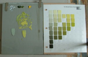
Paul Foxton uses Munsell Book of Colors chips
Here’s my target green chip and the page from the Munsell Book of Colour it came from, the 10Y page. You can see that this page is organised according to two of the three dimensions of colour in the Munsell space: Value (from dark at the bottom of the page to light at the top) and chroma (from grey at the left to intense colour on the right).
That’s my palette to the left of the page from the Munsell book. I know it doesn’t look much like a traditional artist’s palette, but it’s actually very useful. It’s a sheet of glass clipped to a board with a sheet of grey paper underneath. The neutral background makes it much easier to judge the colours I’m mixing.
Speaking of mixing, let’s get started trying to match that green. Or should I say yellow.

Mixing oil paint colors, Paul Foxton references full Munsell Color Chart
On the top of the palette here you can see the tube colours I’ve chosen as my starting point: white, sap green (a dark olive green) and cadmium yellow, a high chroma middle yellow.
The first step I’ve taken is to lighten some of the sap green with white, so that I can bring it up to the value of my target colour. It’s generally best to start with something near the hue of the target colour and them change it to match the value we’re aiming for. In oil paint, that usually means lightening it quite a bit with white.
You can see the result of that first mix on the palette above the target chip. It’s not looking too great at this point.
Two things are wrong with it: Firstly, the hue is too far towards the blue side of green. Secondly, it’s too far towards grey. The chroma is too low.
I can find the chip that corresponds to the colour I’ve mixed in the Munsell book, and that tells me exactly how far away I am from the colour I’m trying to match. In Munsell terms I have a 7.5GY/8/4 as my first attempt. I need to change the 7.5GY to a 10Y by moving the hue round towards yellow and I need to raise the /4 chroma to a /8.
What colour will do all those things for me? As it happens, the cadmium yellow I already have on my palette. Significantly, that yellow shouldn’t drop the value too much either, since it looks to be about the same value as my first mix, so I can mix it into my colour without affecting the part I already have right too much.

Perfect oil paint mixture using Munsell Color Charts
In the image above you can see the results of this second mixture. I’m much, much closer now – in fact it’s almost bang on. Certainly close enough to be usable in a painting. The chip to the left is the colour I got from my first mix of sap green with white – much too green, much too grey.

Close up: oil paint mix with Munsell color swatches
Here’s a close up of the chips. The chip on the right is the target chip. You can see I’ve been putting dabs of the colours I’ve mixed along the way directly onto the chip in order to make a more accurate comparison. The first colour I got with sap green and white is on the top right of the chip.
When I mixed in the cadmium yellow, the value did drop a little. That’s the dab on the top left of the chip. After lightening with a little more white, and then adding more cadmium yellow back in to bring up the chroma again, I’ve got the dab of the final colour, the third dab you can just see below the other two on the left of the chip.
So it’s taken me a few goes to get this close to my target colour. But I’ve still made it there much faster than I would have if I’d have just steamed and started throwing colours together.
After following the same procedure with the red, I’ll have both the main colours of this apple mixed on my palette. Not only that, I’ll also know what pigments I need to use to get to them by the shortest possible route. That’s what using Munsell has really showed me.
I’ll now be able to match all the various colours of this apple by making slight adjustments to the two colours I’ve got here.
Mixing Science into Art
All this has much to teach us by firstly showing us what the colours we’re trying to match really are, and then giving us a practical way to mix them from a starting point of our rather romantically but unhelpfully titled tube paints.
This approach unlocked my palette. If you’re a learning painter, I believe it can unlock yours too.
Expressing something objectively doesn’t take away its usefulness to the artist. Nor does it remove the human element. That first example of a colour I gave, 5YR/6/4, is the around the average colour of Caucasian skin. It’s my average skin colour. My wife is of Afro-Caribbean descent, and the average colour of her skin is 5YR/4/4. Almost the same, just a slightly lower value. Our beautiful son’s average skin colour is about 5YR/5/4, kind of makes sense that he’d be between us when you think about it. But it’s interesting to note that the hue and chroma is the same for all of us.
So that first Munsell notation I gave you is a dry scientific expression of a very human thing, one version of skin colour. That Munsell allows us to see colours much more objectively also shows me that within our family, the apparently wide range of our skin colours is actually much closer than we might think, and that’s a nice thought.
Munsell gives us all this and more. But you don’t have to have the Munsell Book of Colour in order to benefit from this. You can use a colour isolator and make your own chips.
If you bear in mind the three dimensions of colour in the Munsell framework – hue, value and chroma – you’ll already have a more practical grasp of colour and how to use it effectively.

that is a great description! I took a color class and they did different wheels and did suggest the Munsell as the best but i had a difficult time understanding the 3 levals of color Hue , Value and chroma, and the fact that its proximity color can change how it looks. My problem is in acrylics,which i use, dry darker. Always a challenge.
Very interesting! Sure wish I could afford that book!
good
Paul, thankyou so much for this post. I am trying to understand Munsell on my own and altho’ it’s like a new language, I’m finding that the time I take to make a few of these Hue, Value, Chroma charts is really helping me to understand the pigments on my palette. Would you have any tips on how to work without the Munsell Book of Colour? Isolating the colour still requires ‘something’ to compare it to so the target you need to reach can be seen doesn’t it? I have the student book and basic charts and then a big wall chart with itsybitsy tiny colour squares but it has even been a life saver at times. Would be great to know any tips as buying the big book of colour is costly for amateurs like me 🙂 Hope you’ll do more posts like this in the future.
That is a great way to start to learn how to get the color you want. You have unlocked my palette too! Where do you get those color chips? I imagine if you start playing around mixing and recording this in the form of your own book of chips, one would learn how to mix and more importantly reproduce those color chips. Thank you for sharing this immensely important tool.
Great post you make complex things so simple Thanks
Thank-you so much for showing us how to use Munsell as we work to mix the colour we really want. Your work is very appreciated. Blessings always, C-Marie
Great article. Very helpful. Does this method work with acrylics as well?
Also, is it correct to try and reach a matt color according to glossy color chip? Any tips?
Thanks
Hi,
If the hue and value were correct, but not the chroma because the chroma was too dark, how would you lighten the chroma without affecting the hue and the value ?
Conversely, if the chroma was too light how would you darken it without affecting the hue and value ?
Ron.
Hi Ron,
I think you may be confusing chroma and value. Value is how light or dark a colour is, from black to white (0 – 10 in Munsell). Chroma is best thought of as how bright the colour is, from grey to full saturation.
If your colour was too grey, and you wanted to raise the chroma without changing hue of value, you would mix another colour of the same value and hue but as high chroma as you can manage. Then you would mix between the two until you had the level of chroma you wanted.
It’s much easier to reduce chroma than to add it, though. so it’s better to err on the side of higher chroma to begin with when mixing a colour. You can then bring down the chroma with a neutral of the same value. In practice the neutral will slightly pull the hue too (usually towards yellow) so you need to adjust for that. The hue shift is pretty slight.
Totally endorse buying Paul’s Secret Treasure streaming video lesson from his website. I found it an EXCELLENT visual guide to using the system and how to mix the colours to match. He also asks for what you can afford to pay rather than a $ value. THANK YOU PAUL!
http://www.learning-to-see.co.uk/videos