This text is an insert from the first volume of the Munsell Book of Color Pocket Edition from 1942, and outlines the use of the color charts. A pocket-sized adaptation of the original Book of Color, it was intended to be used in the field for color designers and other color experts, who needed to be able to identify and communicate color on the spot.
The Munsell Book of Color provides an orderly arrangement of standard papers which serve as guides for the measurement and notation of all colors. These standards represent equally spaced divisions of the three attributes of color known in the Munsell System of Color Notation as HUE, VALUE and CHROMA.
The HUE notation of a color indicates its relation to Red, Yellow, Green, Blue and Purple; the VALUE notation indicates its lightness; and the CHROMA notation indicates its strength (or departure from Neutral). (Fig. 1.)
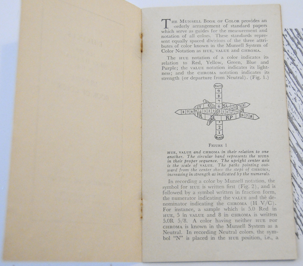
FIGURE 1: HUE, VALUE and CHROMA in their relation to one another. The circular band represents the HUES in their proper sequence. The upright center axis is the scale of VALUE. The paths pointing outward from the center show the steps of CHROMA, increasing in strength as indicated by the numerals.
In recording a color by Munsell notation, the symbol for HUE is written first (Fig. 2), and is followed by a symbol written in fraction form, the numerator indicating the VALUE and the denominator indicating the CHROMA (H V/C). For instance, a sample which is 5.0 Red in HUE, 5 in VALUE and 8 in CHROMA is written 5.0R. A color having neither HUE nor CHROMA is known in the Munsell System as a Neutral. In recording Neutral colors, the symbol “N” is placed in the HUE position, i.e., a Neutral sample which is 5 in VALUE is written N 5/0.
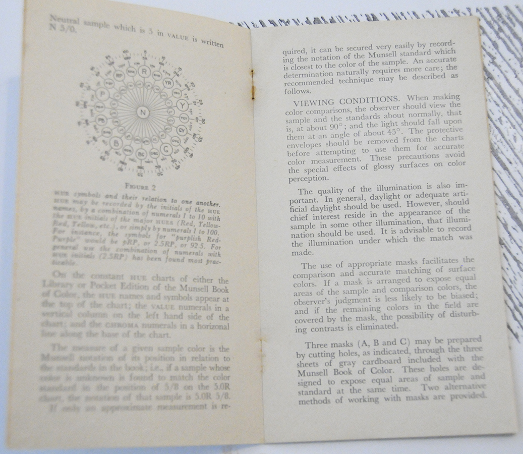
FIGURE 2: HUE symbols and their relation to one another. HUE may be recorded by the initials of the HUE names, by a combination of numeral 1 to 10 with Red, Yellow, etc.), or simply by numerals 1 to 100. For instance, the symbols for “purplish Red-Purple” would be pRP, or 2.5RP, or 92.5. For general use, the combination of numerals with HUE initials (2.5RP) has been found most practicable.
On the constant HUE charts of either the Library or Pocket Edition of the Munsell Book of Color, the HUE names and symbols appear at the top of the chart; the VALUE numerals in a vertical column on the left hand side of the chart; and the CHROMA numerals in a horizontal line along the base of the chart.
The measure of a given sample color is the Munsell notation of its position in relation to the standards in the book; i.e., if a sample whose color is unknown is found to match the color standard in the position of, on the 5.0R chart, the position of that sample is 5.0R. If only the approximate measurement is required, it can be secured very easily by recording the notation of the Munsell standard which is closest to the color of the sample. An accurate determination naturally requires more care; the recommended technique may be described as follows.
Viewing Conditions
When making color comparisons, the observer should view the sample and the standards about normally, that is, at about 90°; and the light should fall upon them at an angle of about 45°. The protective envelopes should be removed from the charts before attempting to use them for accurate color measurement. These precautions avoid the special effects of glossy surfaces on color perception.
The quality of the illumination is also important. In general, daylight or adequate artificial daylight should be used. However, should chief interest reside in the appearance of the sample in some other illumination, that illumination should be used. It is advisable to record the illumination under which the match was made.
The use of appropriate masks facilitates the comparison and accurate matching of surface colors. If a mast is arranged to expose equal areas of the sample and comparison colors, the observer’s judgment is less likely to be biased; and if the remaining colors in the field are covered by the mask, the possibility of disturbing contrasts is eliminated.
Three masks (A, B and C) may be prepared by cutting holes, as indicated, through the three sheets of gray cardboard included with the Munsell Book of Color pocket edition. These holes are designed to expose equal areas of sample and standard at the same time. Two alternative methods of working with masks are provided.
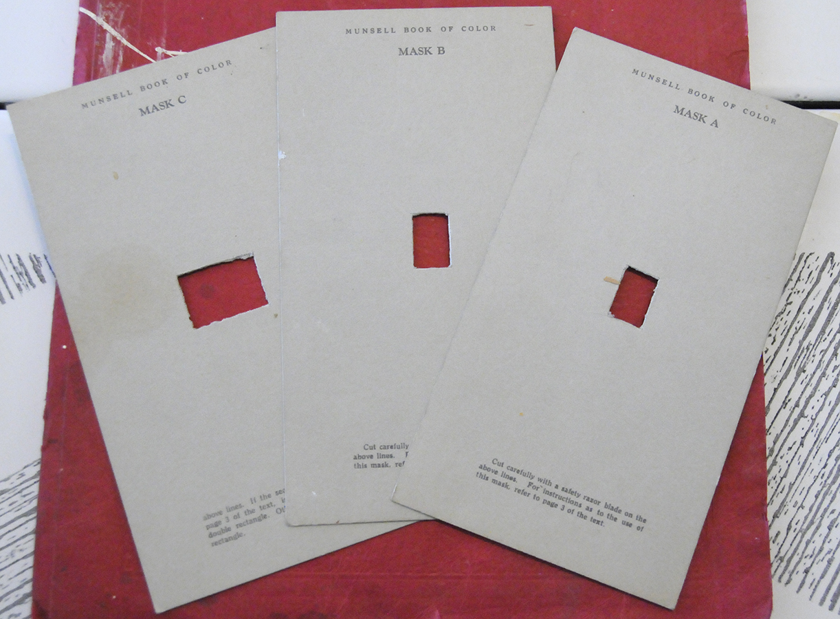
In one case mask B is used to cover the sample so that an area equal in size to the color rectangles is visible through the hole. By placing mask A successively over the colors on the chart, the color most nearly matching the sample may be located.
In the second case the sample is placed behind the mask C so that it occupies one-half of the hole. The mask is then moved over the color chart so that the other half of the hole is occupied successively by the charted color chips until most nearly matching color is located. In this way sample and standard are directly adjacent to each other.
If the HUE of a sample is between two charts, a mask is placed over each chart and a third mask of the sample.
Matching Procedure
If a given sample matches satisfactorily in all three attributes some one of the Munsell standards, there is no further problem and its notation can be recorded at once. Often, however, a sample does not match any one of the charted colors, but falls somewhere between them; the problem becomes that of comparing the sample with neighboring Munsell colors in order to establish HUE, VALUE and CHROMA, and the procedure is as follows.
Turn to the HUE chart displaying the standard which most nearly match the sample. If the HUE of the sample does not match exactly the HUE of the comparison standard, but lies between it and a standard on a neighboring chart, detach the two charts, lay them side by side, and estimate the HUE position of the sample in relation to the two standards. Since neighboring HUE charts are a known number of HUE steps apart (2.5 or 5 steps, depending upon which edition is in use), the result may be recorded in terms of HUE steps.
If the VALUE of the sample does not match the VALUE of the comparison standard, but instead falls between it and one of its neighbors, estimate the VALUE position of the sample in relation to the two neighboring standards. If the sample is lighter or darker than the comparison standard and there is no neighboring standard in the direction necessary for a further guide, use the appropriate standards on the Neutral Value Scale as guides for determining the VALUE of the sample. Should the sample be lighter or darker than any standard appearing on the Neutral chart, use the VALUE difference between the end standard and its neighbor as a basis for estimating the position of the sample in relation to the end standard. Neighboring VALUE standards on the HUE charts are known to be one VALUE step apart. If we assume a scale of ten visual differences within a VALUE step, the result may be recorded in terms of tenths of a VALUE step.
If the CHROMA of a sample does not match the CHROMA of the comparison standard, but instead falls between it and one of its neighbors, estimate the CHROMA position of the sample in relation to the two neighboring standards. If the sample is stronger than the comparison standard and there is no stronger neighboring standard to serve as a further guide, use the CHROMA difference between the comparison standard and its weaker neighbor as a basis for determining the position of the sample in relation to the comparison standard. If the sample is weaker than the comparison standard and there is no weaker neighboring standard to serve as a further guide, use the CHROMA difference between the comparison standard and the Neutral standard of the same VALUE as a basis for estimating the position of the sample in relation to the comparison standard. Neighboring CHROMA standards are known to be two CHROMA steps apart. If we assume a scale of twenty visual differences within these two CHROMA steps, the result may be recorded in terms of tenth of a CHROMA step.
Example
Let us assume that 5.0R 5/8 is the standard in the book which most nearly matches the color of our sample.
The sample is slightly yellower than 5.0R 5/8. It lies one HUE step away from 5.0R 5/8 toward the neighboring standard 7.5R 5/8 (or 10.0R 5/8 if the edition displaying only twenty HUES is used). Adding 1.0 to 5.0R, the HUE of the sample is recorded as 6.0R.
The sample is slightly lighter than 5.0R 5/8. It lies two-tenths of a VALUE step away from 5.0R 5/8 toward 5.0R 6/8. Adding 0.2 to 5.0, the VALUE of the sample is recorded as 5.2/.
The sample is slightly stronger than 5.0R 5/8. It lies eight-tenths of a CHROMA step away from 5.0R 5/8 toward 5.0R 5/10. Adding 0.8 to 8.0, the CHROMA of the sample is recorded as /8.8.
Combining the HUE, VALUE and CHROMA determinations, the complete notation of the illustrative sample is 6.0R 5.2/8.8.
Color Harmony
The Munsell Book of Color by its very arrangement of colors in their relation to each other suggests a variety of harmonious combinations. Dogmatic rules for color harmony tend to suppress originality and are therefore avoided by most artists. However, the beginner in the field of color design often feels the need of fundamental guides by which he may develop and judge his color selection. It is for the beginner that the following suggestions are offered.
- Avoid the use of more than two or three HUES. Several colors from a single HUE chart are very effective when properly used. If two or more HUES are used, choose either closely neighboring HUES in sequence or HUES that are opposite on the HUE circle (Fig. 2).
- Balance dark colors with light colors. Small areas of high VALUE will balance much larger areas of low VALUE.
- Avoid the overuse of strong colors. Small areas of strong CHROMA will balance large areas of weak CHROMA.
A good deal of literature has been published on the application of the Munsell System and its representative standards to color arrangement. One of the most outstanding and extensive publications of recent years is “The Art of Color and Design,” by Maitland Graves. Earlier and more elementary publications which have proved most popular are “A Practical Description of the Munsell System,” by T.M. Cleland, and “A Color Notation,” by A.H. Munsell.

Scientific Publications Pertinent to the Munsell Color System
Spectrophotometric measurements have been made of all Munsell Color Standards. The colors of twenty charts (principal and first and second intermediates) were measured by J.J. Glenn and J.T. Killian in 1935, and the I.C.I. tristimulus values, trilinear coordinates, dominant wavelengths and purity for I.C.I. illuminant C were published in the December, 1940, Journal of the Optical Society.
Measurements of these same standards were made at the National Bureau of Standards, and data for illuminants, C.A. Macbeth 7500° K, and clear blue sky appear in the paper “Tristimulus Specifications of the Munsell Book of Color from Spectrophotometric Measurements,” by K.L. Kelly, K.S. Gibson and D. Nickerson, published in the July, 1943, J.O.S.A.
Measurements of the third intermediate HUES very made by cooperation between the laboratories of the Interchemical Corporation and the Agricultural Marketing Administration. These data appear in the paper “Trichromatic Specifications for Intermediate and Special Colors of the Munsell System,” by W.C. Granville, D. Nickerson and C.E. Foss, published in the July, 1943, J.O.S.A.
Other interesting features appearing in the July, 1943, J.O.S.A. are the “Final Report of the O.S.A. Subcommittee on the Spacing of the Munsell Colors,” by S.M. Newhall, D. Nickerson and D.B. Judd, and “A Psychological Color Solid,” by D. Nickerson and S.M. Newhall.
An Inter-Society Color Council Symposium on “Color in Art Education” was published in the December, 1942, J.O.S.A. This symposium includes “Color Order Systems: Munsell and Ostwald,” by M.E. Bond and D. Nickerson, in addition to other papers of interest in the art education field.

Ive been studing color for years..I find this as an approach to broaden a students color theory knowledge. I use Kandinsky, Klee, Keipers and more in my lesson formats. Im interested in where I can purchase this Munsell color theory book.
Require permission to use some pictures for my thesis