In Part 3 of our interview with The Color Revolution author, Regina Lee Blaszczyk, we talk about the early color swatch books, color standards and the influence of color.
How important were color swatch books for salesmen as a marketing tool? They seem like beautiful works of art when we look at them today. Have you seen any of the originals?
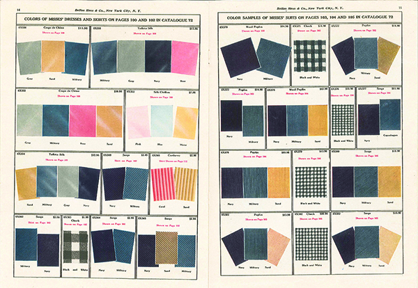
Yes, I have a couple of originals that I carry around with me when I give talks. I have one of the original color cards from the Textile Color Card Association of the United States, one from World War II that is a large fold-out book (always fun to pass it around the room like it’s a big snake). I use them to discuss the techniques used to communicate color.
One reason why I became interested in this topic was the proliferation of color cards and color handbooks. Many American museums with textile and clothing collections have collections of color cards and color handbooks. I had never really seen an interpretation of what these color cards were used for, who used them, who created them, how they were used, etc. I became curious about this. There are three chapters in The Color Revolution devoted to this question. The color cards seem rather primitive to us in the electronic age, because many materials are available digitally. Back then, these were important marketing tools.
Color cards have always existed in some way, shape or form in the industrial era, but the modern color card was introduced in the 1870’s by French dye houses who were trying to sell their services to textile mills in places like Lyon. Eventually some aspiring French entrepreneurs figured out that they could purchase these color cards and sell them overseas to British and American textile mills. Designers in these mills would then use them–not so much to slavishly copy the French colors–but as design guides. If you were a designer in the art department of a textile mill in Manchester, England, or in Lawrence, Massachusetts, you would have a library of reference materials at your side, and that library would include these imported French color cards.
As mentioned earlier, World War I cut off supplies of German dyes; it also cut off supplies of French color cards. During this period, the Textile Color Card Association of the United States (TCCA) was establish to create an American color card, or set of standards. The TCCA also set out to forecast or predict, fashion colors for the American fashion market each season. Here, you see the birth of American color cards, modeled after the French. These types of color cards, consisting of swatches of fabrics or died ribbons pasted into books, were used from the 1870’s up to the digital age. They have been in use for a very long time.

A 1944 recruiting poster for the women’s branches of the armed services showing the new uniforms. Armed Forces History Division, National Museum of American History, Smithsonian Institution.
Assistant Secretary of Commerce, Julius Klein said, “Color is a symbol of our new standard of life. It is here to stay.” Can you explain what he meant by that?
Klein, who wrote that comment around 1930, was reflecting on the color scene at around the same time that Fortune magazine editors had noted “the color revolution.” The US Department of Commerce held a conference to discuss how color was having an impact on American industry and trade. This national conference of influential people in government and business demonstrates how important color was at this particular moment.
Klein was talking about color being representative of the higher standard of living that had emerged in the United States during the 1920’s. In the 1920’s, America emerged as a full-blown consumer society. More people, although not everybody, could step through the portal of consumer society, having access to credit, steady jobs, and higher wages that allowed them to purchase goods that we consider today to be part of the middle-class ensemble. What do I mean by that? The middle-class ensemble includes the single-family home, a car, presentable clothing, and personal entertainment devices such as radios and Victrola record players. For the first time, many Americans could own these types of goods, or at least aspire to own them.
The standard of living in the United States was increasing at a much more rapid pace than it was elsewhere. The other industrial powers in the world–Germany, France, England, and Italy–had been devastated by World War I. The US economy grew by leaps and bounds in the 1920’s by virtue of emerging relatively unscathed from the war. Although American men and women lost their lives, compared to the European powers, the devastation was minimal for the US. The economy expanded in the decade after the war, and the standard of living improved for more people. All of the new consumer products that were available in color were symbols of this dramatic change that had taken place over the course of the 1920’s. That’s what Klein was referring to in his comments.

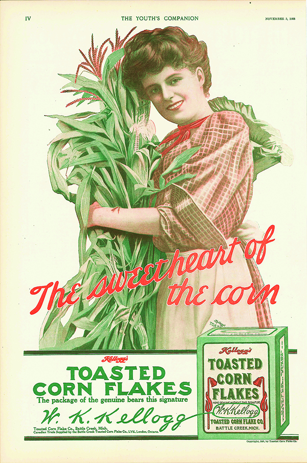
This Kellogg’s Corn Flakes advertisement in Youth’s Companion (November 5, 1908) used the subtle tones that Munsell favored.
Historically did artists, fashion designers, etc. influence colorists or vice versa? Is it a chicken and egg situation?
I think it’s a chicken and egg situation. It would be tempting to say fine artists first adopted new colors and color combinations and that their choices trickled down to fashion, which trickled down to home furnishings. If you think about what was happening in color in the 1920’s. The technological changes that were taking place in the chemical industry were so dramatic. New materials, new hues, new pigments were being used by manufactures and artists at the same time. In some respects, I might go out on a limb and say that in the second and third quarter of the 20th century, the changes in industry were so dramatic that industry maybe had more of an influence on culture and on visual culture than had fine art.
If you think about artists like Andy Warhol, who comes much later, he was creating a new genre that was celebrating and commenting on the proliferation of commercial culture in the US. Pop artists like Warhol were acknowledging that commercial innovation was the driving force of American visual culture. So I think we could say that, yes, there is a chicken and egg relationship, but I would say that maybe commerce is pushing the envelope a bit more in this period.
Historian David Edgerton said it is, “Seemingly unglamorous innovations that often have the greatest effects on human experience and comfort.” Color can be pretty glamorous, but color standards not so much.
Edgerton has examined unglamorous technologies within the history of technology and within business history. When it comes to technology, there is often a tendency to focus on the heavy hitters, the new and the super glamorous. For example, there has been a lot of research done on the automotive industry in the 1920’s, and on famous inventors and innovators like Thomas Edison, Nikola Tesla, Steve Jobs, etc. What Edgerton argues is that, yes, objects like the iPhone and the automobile of the 1920’s had an impact on everyday life, but a greater impact on everyday life is made by the persistent technologies.
One thing I love to do when I’m in the classroom with students is to turn off the lights so students are sitting in the dark. Technologies like electricity were once highly visible and highly publicized inventions, but they have become so commonplace that they’ve become invisible. Edgerton’s point is that the technologies we don’t talk about anymore are the technologies that have had the greatest impact.
The horse is a technology that had an enormous effect on everyday life. Until the mid-20th century, the horse was ubiquitous in cities across the Western world. With the advent of the automobile, the horse started to disappear, and it disappeared rather rapidly. Today, the horse is a novelty. You see them at the racetrack, and you see them pulling tourist carriages around Central Park. Only recently has the importance of the horse been studied. Color is the same. Color is something that we are so accustomed to seeing that we don’t stop to think about the why or how. That is what Edgerton is talking about, the small things forgotten and their great impact. Color is absolutely one of these invisible technologies.

Color standards make us safer too.
I discussed the standardization of safety signals for the railroads and the highways but I only did a small vignette on these topics in the book. The history of color standards in the engineering world and in the public sphere is an important area that someone needs to research; it would be great to see this discussed by another scholar.
I also couldn’t cover the print media, color TV, and computers, which had a huge impact. As a researcher, you have to make choices, or the project gets out of control. You can’t write about everything. I decided very early on that I was going to focus on architecture, appliances, clothing, and consumer products. Otherwise, as Munsell learned, color is all encompassing. It relates to everything, it touches every aspect of life; sciences, art, consumer products, fashion. You’ve got to limit your omnivorous appetite for color knowledge somehow.
In Part 4 of our series, we talk about the importance of color theory, color trends and what Munsell would think of our color world today.
About the Author

Regina Lee Blaszczyk is the Leadership Chair in the History of Business and Society at the University of Leeds. Her career has included jobs as a cultural history curator at the Smithsonian National Museum of American History in Washington, DC; as an American studies professor at Boston University; and as program director at the Chemical Heritage Foundation in Philadelphia. She is an associate editor at the Journal of Design History, the top design history journal for the humanities. She also serves on the editorial boards of Enterprise and Society and History of Retailing and Consumption. She has written many books and articles on the cultural history of business with reference to design, fashion, color, retailing and advertising, including The Color Revolution.


Leave a Reply