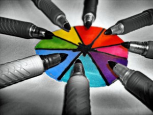
It’s no secret that here at Munsell, we love color and know that color has many uses! Of course, we love the recent surge in popularity that informational graphics have brought to the internet. Infographics are a visual way to take in informational data through charts and images. Since they are visual, they often incorporate lots of colors.
What we like even better, are cool colorful infographics about color, so we have scoured the net to find you some of our favorites!
Infographic #1: Color and Gender
Go beyond pink for girls and blue for boys. This informational graphic by KISSmetrics, takes studies conducted over the past seven decades that draw some generalizations including the surprising like results that both genders prefer blue and dislike brown the most. It’s also amusing to see that when it comes to naming and identifying colors, men are from Mars and Women are from Venus, or at least a planet with more subtle color differences. While men see purple, women see lavender, eggplants and plums!
")
Infographics #2, #3 and #4: Color and Branding
It’s no secret that using color communication is used in branding and marketing, but what does your brands color say about your products?
The visual data prepared in What Colors Say About Your Brand reminds us that consumers are very aware if a brands colors really connect and how color is the first item noticed when people look at your logos.

Another info graphic we found seems to support this. Infochimps applied color use of Twitter users to find out what color Twitter really is. Not surprising, the results show that twitter initial branded color, the turquoise Bird, influences users.

Not sure if color really matters and affects actual purchases? Another visual graphic by KISSmetrics, shows us how colors do affect buying and what colors are better for certain kinds of purchases. Did you know that navy blue and teal are more attractive to shoppers on a budget?

Infographic #5: Color and the Impressionists Painters
Art and color go hand and hand, so we have to have a color infographic about that! Over the course of 1895 to 1905, the favored colors of 10 different Impressionist artists show that change from the more naturalistic colors to the bright shades and hues of later works.

Infographic #6: Quick Visual Data and Color Theroy Grapichs
Created by Paperleaf, The Color Theory Quick Reference Poster for Designers provides quick references for any beginners to basic color. Available by download for larger poster sized printing, it would also be handy to hang in art class rooms or studio space. Even if you know your color theory well, it’s a lovely design that call can enjoy.

Color affects so much and this is only the tip of the iceberg when it comes to infographics about color. If you have a favorite or even if you created a visual graph about color, let us know. We know we’ll be sharing more color graphs and charts with you all soon!

Leave a Reply