Here at Munsell, we’re obsessed with color. Luminosity, saturation, tone: we specialize in all elements of color. Our brain chemistry ensures that we as humans interact on a deep level with color, which is part of the reason we take it so seriously. You may remember from a previous blog entry that we love infographics for color and about color. Check out some of our new favorites!
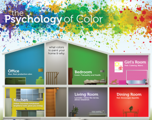
Infograph #1: The Psychology of Color
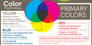
Complex and simple at the same time, The Psychology of Color helps break down why and how our brains operate in regard to color. They lay out rooms like a dollhouse to explain paint choices, outline common associations with primary, secondary, and tertiary colors, and even explore the way color and color perception are used in advertising. Did you know that Red not only makes you hungry, but pushes you to fail at tests?
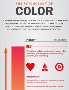
Infograph #1.5: The Psychology of Color for Web Design
The Psychology of Color for Web Design helps highlight the ways designers can utilize color in graphic media and website creation. It also dabbles in corporate color psychology, by breaking down some of the top sites’ color schemes and condensing each into a smudge of colors. According to the image, orange is inviting and green is balanced.
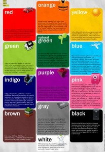
Infograph #1.75: What Your Web Design Says About You
Here, we see a combination of the previous two color infographs. What Your Web Design Says about You details what design choices say about their designers by looking at color science and font choice. This can help you to pair font and color choices, but the graphic has more fun tidbits of trivia. For example: the favorite color among Westerners younger than eighteen is green, but for those older than fifty, green preferences have been absorbed by purple.
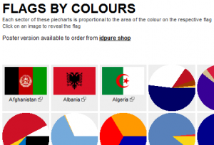
Infograph #2: Flags by Colors
Though not technically and infograph, Flags by Colors, works similarly, but with some more interactive elements. An array of pie charts holds the secrets to the flags of the world. Over two hundred flags were analyzed and their color proportions extrapolated to create this JavaScript marvel. What does it say about global color psychology that red and white are so prominent?
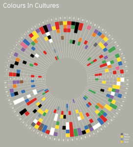
Infograph #3: Colors in Culture
Another multi-cultural color infographic, Colors in Culture examines the ways in which different ethnic, religious, or geographical cultures relate to color. Cross-listing eighty-four characteristics, ten cultures, and twelve colors, this graphic lets you easily compare and contrast color psychologies. While “evil” is represented by the color black across cultures, it also represents authority and style. Happiness could be red, white, green, or yellow, depending on where you are and who you’re talking to.
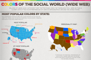
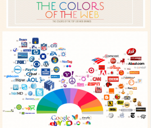
Infograph #4, #4.5: the Colors of the [Social] Web
Colourlovers.com serves up a double dose of color infographic mania. The first, Colors of the Social World (Wide Web), takes a look at which colors predominate specifically within the realm of social media. From logos to customized themes, sky blue is the clear favorite.
The sequel, The Colors of the Web, looked at color online in a broader sense. Instead of limiting their research to social media, it looks at the brand colors of the top one hundred sites in the world. These infographics looks at color distribution by state, industry, and gender, too, as well as the colors associated with keywords and popular personalities or celebrities.
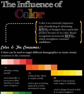
Infograph #5: the Influence of Color
The Influence of Color inspects some of the practical hows and whys in color. 85% of consumers base their purchases on color and recognize their favorite brands through color. Thus, businesses shift their color schemes to target different demographics and elicit different emotions.
We did promise to share more of these so we hope you enjoy them as much as we do. If you have any color infographics that are your favorites, send them our way.



Leave a Reply