We continue our series on color websites, websites about color and really cool websites that use color in fascinating ways. Don’t forget to check out Color Website Inspiration Part 1.
Cool Website with Color and Movement
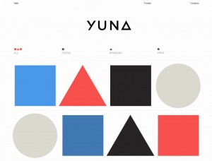
Using color and movement can be a tricky feat, but Yuna Kim’s website pulls it off. Specializing in print and digital branding, the site opens with pure blocks of color shapes that revel different projects. Everything is incredibly clean, very modern and quite simple, yet very effective.
With Clients such as the American Museum of natural History and Other Press under their belt, the same clean design of the website is carried over to the individual projects.
A Cool Color Website in 3D
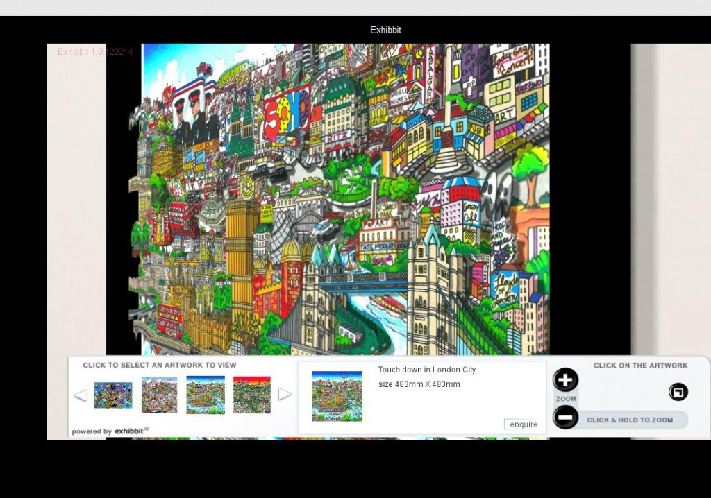
The website of pop artist Charles Fazzino is both colorful and whimsical, but what really sets it apart from other artist’s sites is the Fazzino 3-D Art Gallery. This unique interactive virtual gallery was designed by EXHIBBIT and it lets you get up close and personal to the artwork. You begin by standing in the gallery space, just like you would at a real art show. Then, you zoom in and out at various angles as if you are moving about the space inspecting the work.
A Color Website with Deep Insights
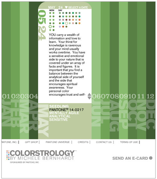
Marry astrology with color design and you have Colorstrology. With a similar feel to Color in Motion, this color website opens up with a very calming and colorful flash page that talks about color and its effects on humans. Based on the idea that each of us has a certain color that reflects upon our inner most self, the color website then allows one to find their color based on their birthday. Even if you don’t believe in such things like fate and a dynastic allegiance to a certain color, some of the personality insights can be quite eye opening.
A Beer Website with Great Color Design: Not Caramel!
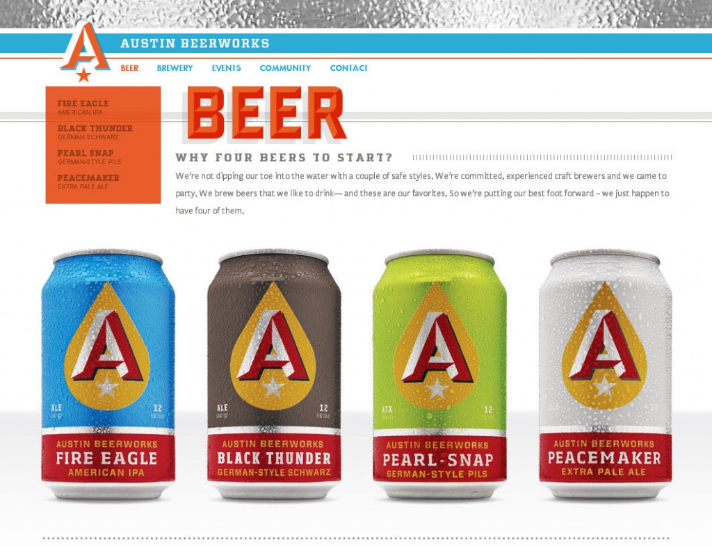
The use of color as a branding tool has been a foundation of advertising since the very earliest of days. Expanding that branding from product deign to print to interactive medium is essential. Austin Beer Works has this down pat. Bright, clean, easy to navigate and fun, the main branding colors are further broken down to represent each beer. Yes, the requisite caramel color is there, but the bright blues, crisp whites and bold reddish orange create excitement along with the big text and fun vintage feel. Maybe it’s the cold metal band of silver that is consistent throughout the site, but we feel frosty just looking at it. And somehow Happy Hour seems all too far away.
Colorful Cars, Colorful Art, and a Colorful Way of Creating Car Art
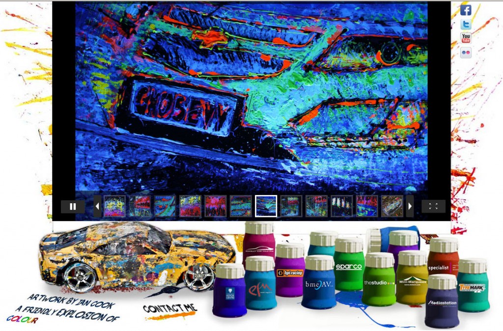
Pop Bang Colour has got to be seen to be believed and it fits all the criteria, it’s a colorful website with great design that shows off really unique colorful art.
UK artist Ian Cook paints pictures of cars with remote controlled cars, toy car wheel and other bits of real cars. What might sound like a quirky gimmick results in really incredibly beautiful paintings of various automobiles with movement and texture. There’s a bit of Warhol’s pop art, a bit of Fazzino’s whimsy and an underlying feel of Jackson Pollock. If you really want to be impressed, check out Pop Bang Colour’s videos that show Ian Cook painting in action.
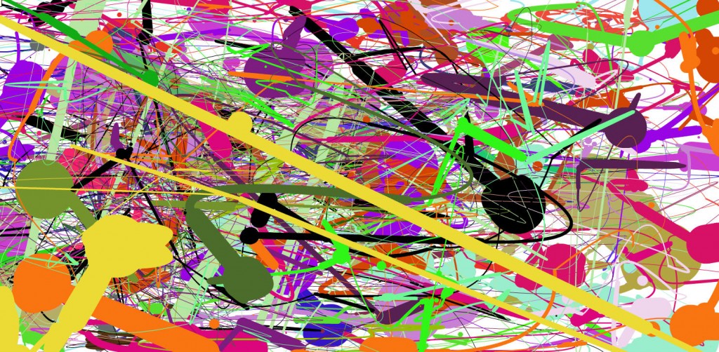
Speaking of Pollock, have you gone over to Jackson Pollock? Not much information on the great artist, but with a few minutes of downtime, you can make your very own art.
Colorful Website Bonus Design: Cool Times Two
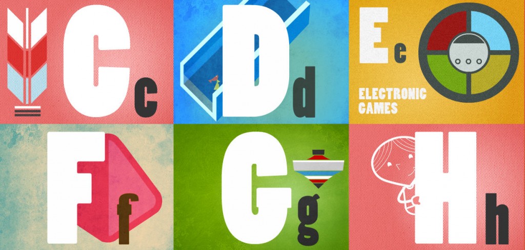
Simple, yet eye catching, Games We Played is a virtual walk down memory lane and one of the many initiatives under the Singapore Memory Project. With a playful A to Z index, each “game” opens up to an interactive screen with more information about the game and the invitation to users to share their childhood memories.
What’s the added bonus? Scroll to the bottom and make sure to click on the unobtrusive link to Plate. Plate is the interactive web design agency that sports a fun and creative opening graphic which is super amusing.
Stay tuned, we promise to give you more as we find them. And remember, if you have a cool color website or have gotten lost for hours exploring one you have found, please share.


Very nice colorful arts….