
Turn on the TV. Go to movies. Check out the print ads. In the past few years we have been subjected to an expanded population of roving ZOMBIES! They all got out somehow and seemed to permeate into everything. They bite off whatever they could chew and the increased numbers went on to be more and more creepy. And now it’s Halloween and certainly the season to be ghoulish. Why not take this moment to make the definitive Zombie statement! Walk the (Zombie) walk along with the parallel universe of the Walking Dead. Do your diligent part in sustaining all the distorted-face-stiff-gait endearing qualities ported over from some other dimension by getting the right color palette.
When pulling together your make-up palette, you want to make sure you are ‘dead on’ when it comes to which colors you select. A little bit of color theory knowledge can go a long way in making sure your make-up looks real enough to scare everyone whose path you cross. When they see you, they will never be the same again!
Zombie Make-Up
The color palettes that are being created for theater, film and television, are all about the realism. When something is dead, what colors does it turn? How does the skin change? How do the wounds look?
These color palettes tend to have names like cadaver and decay. They contain muted, washed out tones in shades of greys, greens and tans along with darker, slightly brighter variations for layering effects and of course the blood reds. Palettes should be limited and carefully selected. Rather than looking at complimentary color and color harmonies, like you would for glamour, runway and beauty make-up, we want to look at colors that occur naturally and don’t necessarily relate to one another.
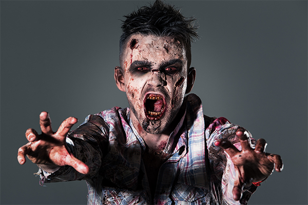
Before we plummet any further into our make-up palettes, you may want to ask yourself these questions:
How did I become a zombie?
Did you get bitten (well that of course is the best way)? Where did you get bitten? The neck, the face, the arms? Choose a prosthetic that makes sense for the limb or body part of choice and the way in which you were attacked. Make sure your wounds match your story.
How long have I been dead?
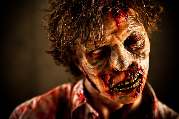
Are you a freshly made zombie? If so, your color palette may be more subtle, perhaps you can still see some of the undertones of your skin or your eyes aren’t as deep and dark set. Think about the color someone turns when the blood drains from their face – it goes from pale grey to ashen. For the wounds, you may want to choose a brighter red to indicate that the wound is fresh.
If you have been around awhile, you will probably be decaying further. Your color palette should reflect that, your wounds should be deeper and darker red. Start with a brighter, higher chroma red color (fresh wound) and then match to a lower intensity, slightly deeper color (coagulated, dried up old wound).
Mixing the two colors can give the effect of a wound that is in-between the fresh and old stage with the darker red set in the back of the wound and the brighter red up top.
How starving am I?
If you haven’t been fed in a while, chances are you are not looking so good. You skin would probably be more pale, ashen and pasty. Look for greys that are very muted and on the low chroma side of the scale. Your eyes would be deeper set, so grab the blackest black.
Additional Color Tips
Play with darks and lights to intensify the contours of the face. Dark colors, particularly blues and blue purples will recede. Think about what your eyes look like after a rough night – purple and deep blue colors where the blood is pooling. If you want to look really sullen, go with a deep, rich black around the eyes. Use dark blues or greens under the cheekbones for that sunken cheekbone look. If you want to make the top of the cheekbones pop (or any other parts of the face you want to highlight like the brow or chin), mix up a lighter, shade of the main skin color and apply to those areas – this will help accentuate all the darker areas on the face and make them sink even deeper.
Texture can play an important role in the realism. Layering the make-up by splattering it on the skin (check out Freakmo who uses this technique often and very effectively: https://www.youtube.com/user/kianabjones), particularly under the eyes, can help create an illusion of greater depth. Again playing around with darker shades in the background and slightly lighter shades in the foreground.
Make decisions about what to enhance and what to tone down. Don’t be afraid to go back in and layer another color until you achieve the effect you are going for.
Good quality zombie make-up is going to be thick, heavily pigmented and highly opaque which means you won’t necessarily need to understand skin tones and how they interact with the colors, which can further complicate color choices and application.
Remember, zombie make-up is all about trial and error. Getting good at selecting and applying color palettes is an acquired skill that is based on experience and learning. To learn more, check out tutorials on zombie make-up such as these:
- Kryolan Step-by-Step Zombie: https://us.kryolan.com/tutorials/stepbystep/zombie
- Freakmo Walking Dead Inspired (and many others): https://www.youtube.com/watch?v=97VK7VI4X-M
Zombie Notation
And here is the moment you have been waiting for, the color palettes:
Zombie Palette
For a traditional zombie look, consider these colors…
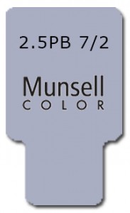
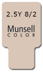
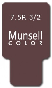

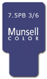
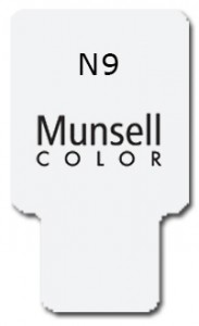
Check out: https://us.kryolan.com/product/cream-color-circle#Zombie
Death Palette
If you prefer to just look really dead, use these…
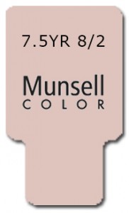
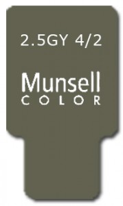
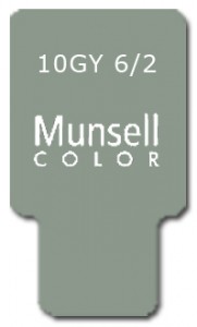
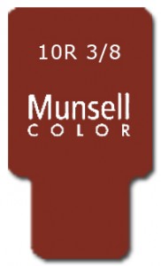
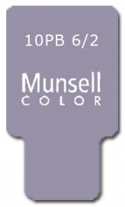

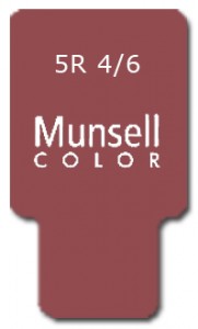
Recognize the color above? It’s the Color of the Year: Marsala!
Check out: https://us.kryolan.com/product/cream-color-circle#Death
Freakmo Palette
If you want to recreate this horrific look, use these…
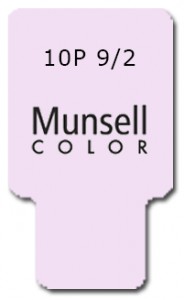
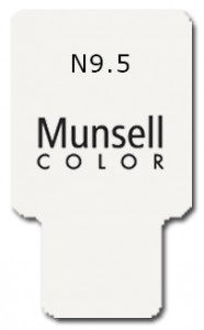
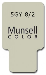
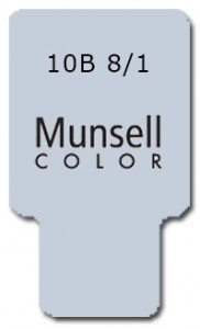

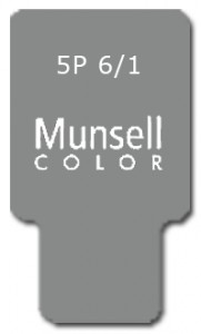
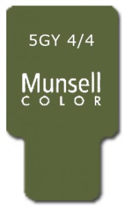
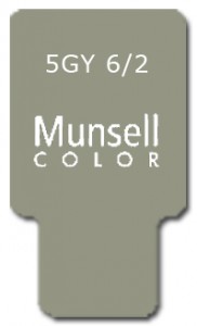
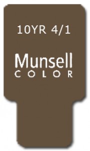
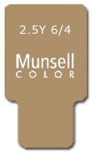
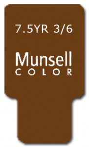
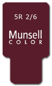
Check it out here: http://www.fxwarehouse.info/mm5/merchant.mvc?Screen=PROD&Store_Code=FW&Product_Code=TPXZKit&Category_Code=Zombie
Do you love to get zombified at Halloween? What is your favorite zombie color palette? We would love to hear about it in the comments below.


Leave a Reply