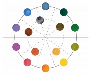
The first time I learned about the Munsell Color System was from a 2D color wheel presented in artist Harley Brown’s instructional book. [1] The most significant information I obtained from that color wheel was its inclusion of brown and black. This truly improve my learning and understanding of colors as a beginner learning colors by myself.
Understanding Transitional Colors
How the browns, grays and black are related to their respective pure hue is important, as these colors are what I call transitional colors between any two purer hues at different sides of the color space. Here, I refer to a more comprehensive and accurate color space like a Munsell Color Space. These transitional colors allow us to design different color rhythms together, with any number of pure hues acting as rhythmic pass-through paths. For example, if I use pure cadmium orange in my painting, orange ochre serve as a less pure counter path to my cadmium orange. At times, I want some difference between my orange and other hues, but I don’t want too much hue difference, so I choose orange ochre. For that, I have enough difference in hue, but the pairing doesn’t shout too loudly.
Since we know from the 2D Munsell Color Wheel that black is nearer to blue, it carries more blue hue than red hue and yellow hue. Or, I can say, black is a tertiary blue color. Similarly, yellow ochre and burnt sienna (minor difference depending on brands, some are more orange in hue) are our tertiary yellow and red. Therefore, we know that mixing black with yellow ochre will give a tertiary green color. Raw umber can be mixed like this as well. One interesting result is mixing black with burnt sienna. Since we know mixing blue with red gives us purple, so mixing tertiary blue and red, or black and burnt sienna, should give us a tertiary purple; and that is a dark brown. Therefore, a dark brown is a tertiary purple color. Knowing this is important because in many images, I see a lot of over-contrast of purple hue that actually can be resolved easily. All we need to do is to introduce some dark brown to act as a transitional color to buffer the difference.
Generally, a good understanding of how browns and grays are related to their parent pure hues allows us to create more complex color design with sophisticated subtlety.

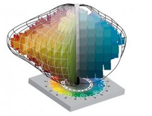
Figure 2. The Munsell Color Space
The Asymmetrical Nature of Color
Another important fact is the asymmetrical character of Munsell Color Space. Many symmetrical color wheels out there including those reference color wheels sold in art stores could be rather misleading for beginners. The symmetrical color wheels make beginners think each hue is practically similar. However, each hue as shown in Figure 1, occupies different sizes of color space and locates itself at a different position, forming an asymmetrical practical color space based on their three attributes, namely tone, hue and chroma. Therefore, color wheels that assumes symmetrical performance, which further assumes different pairing of colors like complementary pairings performs similarly, are misleading.
One very good practical example will fully illustrate this problem. We all know for a green color, we can find many different hues and their respective transitional brownish greens, to paint natural landscape paintings. However, if we were to paint a yellowish autumn scene filled with yellow hues, we face the trouble of finding a wide range of yellow hues and transitional brownish yellows. The asymmetrical Munsell Color Space explains the difference clearly. Green hues occupy a much larger color space than yellow hues. For teaching of practical color theory, I even tell student this, “Please DO NOT treat green as one single hue. Green should practically be thought of as three different hues, namely, yellowish green, ‘greenish’ green and blueish green. You can easily contrast green hues within itself, but you can’t do the same with yellow hues. This explains green is practically not a single hue.”
Friend-Enemy Color System
To help students, I came up with a simplified version of the 2D color wheel, based on the Munsell Color System. Below is from my book, ‘Practical Application of Color Theory and Design Concepts’[2].

Figure 1. (above left) A Simplified Two-Dimensional Munsell Color Wheel from Three-Dimensional Munsell Color System.
To this end, I have developed a different system built upon the well-constructed theories of the Munsell Color System. This system, which I like to call the Friend–Enemy Color System, attempts to address two core concerns:
- Demonstrate that each hue occupies a different proportion of the color space.
- Simplify the complex color space system, since beginners may find it difficult to visualize the intermediate colors in a three-dimensional space.

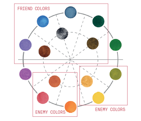
Figure 3. Friend-Enemy Color System (Woon Lam’s Practical Color System built upon the Munsell Color Wheel)
The Friend–Enemy Color System, shown in Fig 3 above, groups colors on the Munsell Color Wheel into two categories – friend and enemy colors.
Friend Colors
Friend colors refer to the colors close to each other on the color wheel. For instance, yellow ochre is considered a friend of pure yellow by virtue of their proximity to each other on the color wheel. Since yellow ochre carries yellow hues as its major component, it has similar characteristics as yellow. Similarly, an orange that carries more yellow hues will also be a friend of pure yellow. Thus, yellow ochre, yellow, and orange are friend colors on the color wheel. In fact, any color close to each other on the color wheel will form a group of friend colors, as they possess a significant amount of similar hue components. Friends colors are similar to analogous colors, but I need to differentiate them because the former has their counterparts, enemy colors, which introduces a new concept of color grouping, instead of just pairing colors on a color wheel.
Enemy Colors
On the contrary, any color further away from pure yellow will be less friendly. It is called an enemy color of yellow in this case. Since colors such as blue, dark brown, and purple are on the opposite end of the color wheel, they present a large hue contrast to any colors carrying yellow hues. Therefore, these colors are enemy colors to all the friend colors of yellow. The strength of an enemy color is also relative to its distance from the group of friend colors. If it is closer to a friend color on the color wheel, it is a weaker enemy color as compared to another color that is further away.
Based on the Friend–Enemy Color System, we can make several practical design decisions:
- Friend colors from the same region in the color wheel will undoubtedly be in perfect harmony since all of them carry a predominantly similar hue component.
- Complementary color pairs are not necessarily made up of colors on opposite ends of the color wheel. An enemy color can be selected from any part of the color wheel as long as it is not too close to the region where the group of friend colors reside.
- Transition colors can easily be identified in the color wheel. These colors bridge the gap between the two zones of friend and enemy colors so they can coexist harmoniously on the same image.
- Design rhythm can be achieved easily by using more friend colors and fewer enemy colors.
- Color schemes with more friend colors and a few enemy colors create interesting variations in hue through complementary results, and is generally easier to arrive at color harmony. On the other hand, a great deal of design effort is required to achieve color harmony on a picture plane filled mostly with enemy colors. The latter is recommended only for more advanced artists who already possess a high level of sensitivity for the design of visual tension. Since visual tension is attributed not only to color, but a combination of various visual elements, balancing an image demands sensitivity to transition colors and visual tension of size, shape and color on a picture plane. Nonetheless, the Friend–Enemy Color System provides a comprehensive practical approach for artists.
Philosophy Behind the Friend-Enemy Color System
“Life is better with more friends. However, if we only have friends and no enemies, life will be boring without any challenge. On the contrary, life with too many enemies will be too arduous, although that does not stop us from surviving if we are truly strong.”
References
- Brown, H., Harley Brown’s Eternal Truths for Every Artist. 1st ed. 2001: International Artist. 144.
- Ng, W.L., Practical Applications of Color Theory and Design Concepts. 1st ed. Vol. 1. 2016, Singapore: Ng Woon Lam. 160.
About the Author

Ng Woon Lam is a member of both the National Watercolor Society and American Watercolor Society, and an exhibiting artist in their annual shows. His work is influenced by the masters he studied with, including Singapore Watercolor Society founder, Gog Sing Hooi. Constanstly striving for balance and harmony in his work, his process is derived from the Taiji philosophy. He is currently a professor at the Nanyang Technological University’s School of Art, Design and Media. You can see his artwork and learn more about Woon Lam here: http://ngwoonlam.com/home.htm. His book can be found here: Practical Application of Color Theory and Design Concepts.


All colors are the friends of their neighbors and the lovers of their opposites. -Marc Chagall
It’s a thin line between love and hate. -The Persuaders
Nice quote. Working both with love and hate requires a lot skills. Similarly, working with a lot of intensive colors requires good command of design skill. Marc Chagall is a master of his dream like colors.