Andrew Werth lives in West Windsor, New Jersey. He exhibits at Artists’ Gallery in Lambertville, NJ, and can be found online at www.andrewwerth.com. He talks about color theory and the import role it plays in the development of his artwork.
Hooked on Color Theory
From the very first assignment in my Color Theory class more than ten years ago – sorting out the color chips by hue, value, and chroma in The New Munsell Student Color Set – I was hooked on color. The following year I attended a conference called, “Seeing Red,” where speakers included John Gage on color in art history, artist Sanford Wurmfeld on his methodical explorations of color in art-making, and psychologist David Brainard on how scientists conduct experiments on color perception.
Color continues to be a subject of ongoing study as it is one of the most important facets of my artwork. Last summer I attended the three-day “Industrial Short Course” at the Munsell Color Science Laboratory at Rochester Institute of Technology. While the course is geared primarily towards those in design and manufacturing who need a scientific and instrumental understanding of color – for instance, how to know whether the color of your product matches the specifications – an artist comfortable with math, science, and technical explanations can learn a lot. I am particularly interested in color appearance models and how to control colors on the computer as well as in paint, so the sessions on color spaces, colorimetry, and perception were particularly enlightening. I left, wishing I could stay another two weeks, with binders full of notes, a textbook on color, and a head swirling with ideas for experiments to try.
Computer Colors as a Guide
I use the computer to conduct experiments, to help design my paintings, and as a tool to learn about color. Photoshop lets me try out many different color combinations quickly without wasting paint, while my ColorMunki Design lets me measure my paints to make sure the colors I choose in Photoshop can actually be painted.
I combine my interest in color with my ongoing study of the philosophy of mind to generate the ideas for my artwork. My abstract acrylic paintings are filled with thousands of hand-painted curves of color. By carefully designing interactions between the layers, the paintings take on a sense of depth and self-illumination.

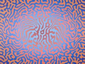
“The I in Disguise”, acrylic on canvas, 30×40 inches, 2011
For instance, the background of a piece might transition from a medium value naphthol red (2.5R 5/14) to a deep quinacridone crimson (5R 2/8). On top of that, my maze-like marks might move in the opposite direction from a dark phthalo blue out of the tube (5PB 3/12) to a tinted but still chromatic version of the same paint (10B 6/10). As these colors interact, various perceptual mechanisms kick in and many people will perceive some portions of the painting as receding deep into the surface even though the painting is nearly completely flat.
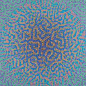
My paintings change their appearance depending upon where you stand. The eyes optically mix the colors from a distance or at an angle, but up close one sees the individual marks and their interactions with the underpainting. Color assimilation and simultaneous contrast might push colors in different ways in different parts of the painting. Because shorter wavelengths focus closer than longer ones, our brains can use color as one of many depth cues. A gradual value change in the marks of the painting may be interpreted as a falloff in light, another signal to help inform the how the mind should piece things together.

“Seeing It Through”, acrylic on canvas, 30×30 inches, 2012
Creating one of my paintings is a little bit like trying to design and then solve a three dimensional puzzle. Pulling all of these techniques and color interactions together into something that is paintable and aesthetically pleasing is the big challenge and also what makes painting fun!


Leave a Reply