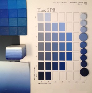
No matter your medium, color flow studies are a great way to get a better understanding of the three properties of color. Over the years, I’ve taught color flow exercises in paint, dyes, inks, and, my personal favorite, polymer clay. An ideal medium for color flow exercises, polymer clay comes in many colors, can be accurately measured, is easy to clean up, and, best of all, it is color you can hold in your hand.
Artists have mixed colors in pigments for millennia, but it’s only been in the last ten years or so that we’ve had the widespread ability to play with mixing color in light. Now that there are computers that you can also hold in your hand, I am starting to integrate studies in light into my workshops.
Three Directions of Color Flow
Munsell clearly ordered colors in relationship to each other as they flow from one to the next.
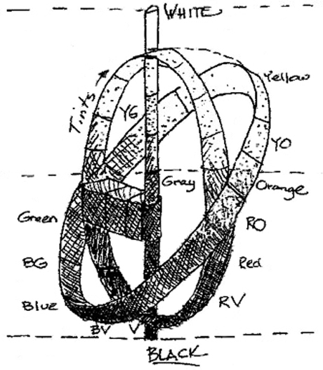
This is a pencil sketch I made when I started teaching color workshops twenty years ago. It was based on what I learned from the Munsell system in college. I call it the Tilted Equator.
In many three-dimensional color spaces, the hue circle is shown running horizontally around the middle of a sphere as if it were an equator. This positioning implies that all the hues on the circle are in the same middle value position between black and white.

In the Tilted Equator diagram, the hue circle is positioned on a diagonal to show how each hue changes in value as it flows along the circle. Blues are closer to black and yellows are closer to white. This diagram also shows how colors can be shifted in three dimensions by tinting, by shading, and by moving “underground” below the surface of the sphere toward the center axis.
Types of Color Flow Exercises
There are many different directions to go in exploring color flows.
- Value Flows: Color to White/Light, Color to Black/Dark
- Hue Flows: Primary Color to Primary Color
- Saturation/Chroma Flows: Color to Complement, Color to Neutral
Regardless of the medium, all colors have specific attributes that affect how they mix with other colors. The two most important characteristics are tinting strength and hue bias.
Tinting strength is used in the subtractive system to define the pigment power in relation to the amount of paint, dye, ink or polymer. Some colors are bullies and some are wimps. It’s useful to know the tinting strength so that you can figure out the comparative proportions to use when mixing.
Since there is no such thing as a pure primary color, hue bias defines a color’s relationship to one side or the other of a theoretical pure primary on the hue circle; some yellows lean more toward green and some more toward orange. This is important information since the hue bias determines whether or not a third primary is present in a mix. It’s helpful to know the hue bias of colors since the presence of a third primary adds “mud” in the subtractive system, and adds light in the additive system.
The best way to learn color mixing is to practice with color flows. In the process of exploring color flows, you naturally learn about the tinting strength and hue bias of each color you test.
Four Color Flow Exercises
Here are four different exercises that give students hands-on experience in mixing the first type of color flow: a value flow that runs from a pure color to white. Three of the exercises use polymer clay and one uses the computer.
1. Color Scales
The most common way to study color flow is through color scales. Color scales run in a step-by-step sequence from one color to another. The exercise of making color scales is similar to warming up by playing music scales. The principles of color mixing are internalized during the process of routine practice.
Color scales can be mixed in many different directions. Below is an example of a tinting scale from white to ultramarine blue.

Although you can mix the color flows intuitively, the steps in color scales are usually measured and documented. There are two different ways to do color scales—arithmetically and geometrically. I prefer to use the geometric method because the process allows you to mix colors in smaller and smaller proportions until the mixed colors are close to the colors at the ends of the scale.
2. Step Blends
The colors in a step blend are mixed separately and then combined to create the illusion of a color flow. Faster than color scales, the formulas for each mix do not need to be accurately measured. Below, I’ve shown a quick way to determine the proportions for each step.

3. Skinner Blends
Invented by Judith Skinner in the early 1990s, the Skinner blend is a way to mix a color flow that blends seamlessly from one color to another. The easiest way to make a Skinner blend is to use a pasta machine but you can also make a blend using a rolling pin or brayer to sheet the clay.
Start by sheeting a triangle of white and one of blue. Arrange them in a square as shown below. Fold the square in half keeping the white on one side and the blue on the other side. Run this double thick sheet through the pasta machine – or flatten with a roller – to make it a single thickness again. Keep folding the sheet in half and rolling it thin until the colors merge into a smooth blend.

4. Computer Scales
Exploring how color works on the computer is helpful even if you are not doing digital designs. If you have access to Illustrator or Photoshop programs, then you can create a color scale very easily. If you don’t, then you can use a word processing program.
Open a word processing document and create a row of six text boxes. Fill one of the end boxes with your first color, and the other end box with your second color; do this by using the custom color picker in whichever program you are using. Then play with the hex codes to find the colors that go in between.

The six-place hex code is divided into three parts—two spots each for red, green, and blue. There are sixteen possible identifiers that can go in each spot—the numbers from 0 to 9, followed by the letters A to F. The highest code in RGB is FFFFFF, which equals white. The lowest code is 000000, which equals zero light in red, zero in green, and zero in blue. Zero light equals black.
Label the boxes with the corresponding hex code to learn the ordering concept behind the numbers and letters. Be sure to print the results. The colors on the screen and the colors that are printed are often not the same. But that’s a whole different post!
Summary
The color flows that result from mixing colors in pigment and light follow pathways laid out by Munsell over one hundred years ago. A word of warning: Mixing color flows can be addictive. Once you start seeing all the variations of color you can create, you may find yourself mixing more colors rather than working. But don’t worry. I have found that the process of exploring how colors flow gives you hands-on experience that can help take your work to a whole new level.
This is the first in a series of posts about exploring colors flows. The next article will compare the color flows of the partitive Munsell system with color flows in the subtractive and additive system.
About the Author
Maggie Maggio uses polymer clay to teach “Smashing Color” workshops around the world. The polymer exercises above can be found in her book, co-authored with Lindly Haunani, Polymer Clay Color Inspirations, published by Watson-Guptill/Random House in 2009.


[…] to learn more about value with some polymer centric exercises, take a look at this great little article written by Maggie Maggio, co-author of Polymer Clay Color Inspirations, which also has a lot of value-related information […]
Hello Maggie!
This is a great post.
I have been working on your color scales but don’t know how long or far to go with them, as I am also trying your triangles.
I had heard and read that you had developed a color mixing app.
However, I cannot find the source.
Can someone send me the name of this app please?
Marilyn
Mfl.sbcc@gmail.com