Now that you understand the basics from Part 1 of Let’s Make Mud, let’s dive further into understanding complementary colors and take it to the next level of complexity.
What is Color Bias?
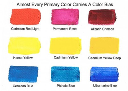
Take a moment to look at ALL of your primary colors – just at your reds, yellows and blues. If you have painted a swatch of each of them, which I highly recommend, you see that nearly every one of them carries a color bias. In other words, few of them are a pure red, yellow or blue.
What is color bias? I am referring to the hue that has an influence on the primary color. For example, a red-blue, a green-yellow, orange-red, etc. It is the adjective we artists and non-artists use to further describe a color. For example we might say, “He just bought a new green-blue car.” Or, “I want to find a blue-red sweater.”
To keep your colors clean, it is important to know the color bias of each of your favorite primary colors. Why? Because if you mix two colors that carry a color bias representing a pair of complementary colors, then you will mix a color that is muddier than you intended

Mixing Green
Mixing green is a perfect example to explain. If I mix a yellow with a red bias, with a blue with a red bias, what will the result be? It will be a dull green because those two primary colors carry the biases of red, which is the opposite of green. The resulting green is dull and a yummy olive green as seen below.

Whereas, if I mix a yellow with a green bias, with a blue that carries a green bias, what will the result be? A bright spring green is mixed as seen here because neither the green or blue carry a red bias. Fun, eh?

In both of these situations a yellow and blue is used to mix a green, yet the results are quite different because of the role of complementary colors.
Mixing Purple
Mixing purple is often a challenge for painters. I frequently hear, “I can’t mix purple or I can’t get a bright purple.” Given what I stated above, what color bias do you think your primary colors of red and blue need to carry to mix a clean purple?
You are correct! You need a red with a blue bias and a blue that carries a red bias. Color tip: there are very few red-blues available on the market. Most blues carry a green or yellow bias. Your most common red-blue is ultramarine or French ultramarine blue. You know that you do not want to use a green-blue to mix your purple because of the yellow it carries, which is the opposite of purple.
The next challenge in mixing purple is that many artists have alizarin crimson on their palette as their blue-red. Unfortunately, alizarin is slightly de-saturated and does not mix well to create a clean bright purple. Personally, I have never liked alizarin crimson and do not have it in my paint box, yet I know many artists love it. More on this can be read in my blog post, “Could You Toss Your Alizarin Crimson?” You will have much better results with blue-reds, such as: magenta, permanent rose, and pyrrole crimson. The names of blue-reds will vary depending on your medium and the brands you use.
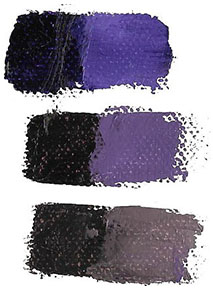
Painters will try to dab some of their cadmium red with a blue to make purple, and what is the result? All of that yellow in cadmium red is not going to allow you to mix a clean purple. It may be purple, but it will be quite dull. Below is an example of bright versus dull purples.

Are you beginning to see how knowing the power of your complementary colors is important in mixing clean colors? In a way, they are lurking there in and amongst our paints. We need to beware of them because they reside in almost all of our primary colors. Get to know your favorite reds, yellows and blues. Paint a swatch of each of them so that you can SEE the color bias they carry.
Get Ready to Mix Colors
Color mixing will become a whole lot easier and enjoyable once you identify the color bias of your favorite primary colors and apply the rules of complementary colors. I guarantee it!
Color charts are a wonderful way to explore and discover the world of color. Can’t you just hear Albert Munsell cheering you on? During all of my years of teaching color, students tend to groan when I mention creating color charts. Then when they start discovering the color mixtures they can create, particularly complementary colors, smiles are evident across the board.
Color charts will help you become a more efficient painter because you will become much more intimate with your colors. Translating what they see in your mind’s eye will become easier and those muddy colors will disappear.
Let’s make mud! And let’s make it when we want it. Explore the possibilities with the colors you have and release the potential of your tubes of paint by mixing up a few chromatic scales.
About the Author

Fine artist, Carol McIntyre, is passionate about color and loves to teach artists the magic and logic of color both online and in live workshops. Through her unique approach to color mixing, painters experience more success translating what is in their mind’s eye onto canvas or paper.
McIntyre is an award winning artist in several media. She was President of the Minnesota Watercolor Society and cover artist of a national arts magazine. Her paintings fuse realism with abstraction while transporting you to another time and place.
Her paintings can be viewed at: http://carolamcintyre.com


Thanks… Thanks… Thanks!!! – Perfect!! Excellent!!! God bless you forever.
Thank you for your wonderful article! I’m new to oils. Acrylics are so different, but these rules above apply. You’ve inspired me to make a color chart.
Maria and Teresa, you are very welcome! Do glad to hear and thanks for letting me know.