
We continue our conversation with the world’s first tetrachromat artist, Concetta Antico, to find out how she uses her gift to teach, what it was like learning color theory, why she and Albert Munsell would have gotten along and some of her favorite color tricks.
How do you think this gift has affected your artwork?
I once said to Dr. Kimberly Jameson, “Maybe I should donate my eyes to the Smithsonian.” and she said, “No, it’s your brain, it’s what your brain has done with your gift.” I’m able to paint and mix color faster than a computer. I can see up to hundreds of thousands of shades of color in any one given moment and mix and paint them very rapidly.
How do you use your gift to teach your students?
Color is a learned process. The average vision can see up to the potential of one million colors; that’s a lot of color. Most people live their lives never reaching that potential unless they are serious about color or they work intimately with color. The more you exercise that part of the brain, the stronger it gets.
With my students they tell me they see so much more color because I’m pointing it out. You can train people to see up to their potential. Sure they can’t see up to 100 million colors like I can, but they can be trained to increase their color range.
As an oil paint instructor, I’m teaching the techniques of that craft, that medium. Color is integral to this; it’s about a third of the process. Oil painting is a process, of shape, color and value, where value and color are interwoven. Value being the shade of a color, so there is a lot of emphasis on color. I teach some other things as well, how to hold a paintbrush, how to actually do the process, etc.
What do you think about Munsell’s preference for subtle colors?
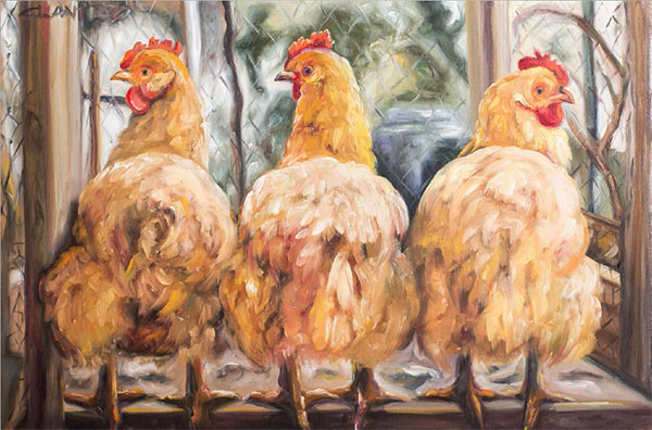
Colors don’t have to be bright to be beautiful. The colors in nature are not necessarily garish at all, there are many, many greys. I often say that bright tube colors in oil painting are “crap” colors, colors that aren’t real. I can often tell when a person who is not a savvy artist by how experienced they are at color mixing. How many subtle greys can they make?
McDonald’s, for example, uses very garish colors, colors that are not in our natural world. The colors I have chosen to have in my home are soft and light, greys, violets, and greens. These colors are very beautiful to me.
Someone asked me once, “What is the most beautiful thing you have seen recently?” It was when I was in Australia. I purchased a farm there on 12 acres, up in the Hinterlands. I was visiting the Marbeck Oley Museum and was sitting on the patio. The Australian landscape is world renowned for its beauty. It had just rained. All the colors are so emphasized after the rain. I was sitting overlooking this beautiful valley and I said, “This is the most beautiful thing I have ever seen.” I was looking at thousands of greens, blue greens, and greys, the clouds, all the little dotted landscapes. It was spectacular. This feeling happens to me every time I see a sunset, every time I look out into the night sky after a full moon, it is extraordinary to me. We live on a beautiful planet and color is everything. I live it, I breath it, I love it and I’ve lived my life by it.
What was it like learning color theory?
When it comes down to color theory, I have to create colors I need which is sometimes difficult. Often I cannot find them when I’m trying to research color chips. Typically, I am able to mix to find the right color, hue, or value, to make it look just right. I have studied a lot of color theory and I use what’s available. I’m very aware of the different systems out there.
In order to overcome the happenstance of color, I’ve created a color value palette system, a methodology that I use. It’s unique to my classes and probably the reason I’ve been in business for 25 years. I’ve had a great deal of success with my students and their color mixing; they’re able to find color on a dime by using my system. Its value and color based. I’ve developed my own solutions in order to make finding color easier.
I know that the Munsell system has a greater range than I have typically seen with other systems; the colors are more subtle and can help people better understand the importance of greys. It makes a lot of sense to me that Albert Munsell was an artist. Artists understand subtle mixes and it is not something that can be practiced by someone who is not an artist. When you are an artist, the opportunity is there to be intimate with this process. In many cases an untrained eye will look at these charts and not see much variation. I think for many people it all looks the same, they can’t really see unless you point out what the differences are.
Do you see more colors in certain chromas or values?
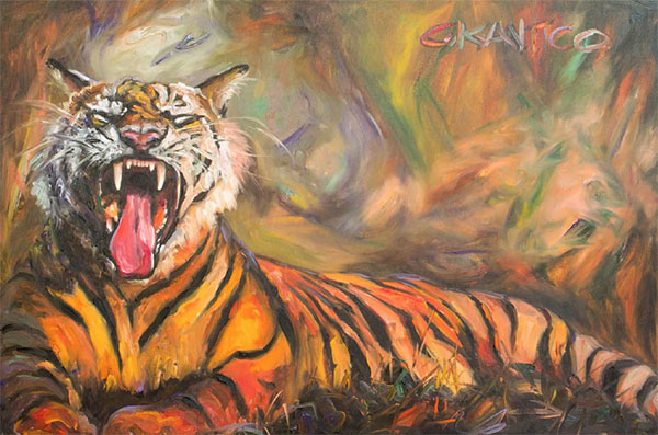
No, I actually see the same amount of colors in everything. I just happen to surround myself with more subtle colors because they are more soothing to me. Colors are distinct even if they are bright. As colors get darker, there tends to be less variety. Although, now that I think about it, that’s very tricky though, even when I look at dark colors, I see thousands of black. I guess I would say in general, it is possible that there are more variations as the color value gets lighter.
Thinking about when I mix color and where I tend to get the most range, I have a six-value palette system I work with and I think the most variation I get visually is between the 3-4 ranges. So I think intensity definitely presents a lot of differentiations.
Most artists have to mix color value on the fly, and given their limited vision compared to what I am able to see, it’s a little more haphazard. They may not be getting the exact color value that they really wanted and they’re not able to color match it as effectively. By breaking things down by value, as well as by color, it gives my students an opportunity to find and revisit a color more easily.
How much time do you devote to the greys?
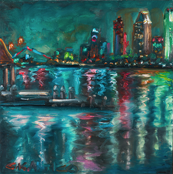
A ton! I have a 5-week color mixing plan that pertains to oil mixing that is mandatory for my students to take. I’ve created many one-day lectures. I utilize it all the time, in every lesson and every class. I cover topics including: What color are we using? How are we using it? How is it created? What does it look like? What does it look like relative to other colors?
Color is made up of 3 main sectors: color, value and form. I tell the students that the most important and most difficult is value. It is one thing to say it’s red, but what shade of red is it… we spend a great deal of time on that.
What are some of your favorite color tricks?
I probably perform color tricks all of the time, but have never really thought of them as being color tricks. Utilizing complementary colors for effect, I would say is a trick. Using it to lose or find edges in my work, to fade things out, to apply more color into something, that is a certain value or to create a certain effect.
Do you have a favorite painter?
I absolutely adore Berthe Morisot. She was a women impressionist painter and in my mind the premier painter of the impressionist period. She was friends with Monet and was a great entertainer. Monet painted water lilies on her dining room wall. She was intimate with the impressionist and was by far the best painter, but because she was a women, she died without having the title artist on her death certificate. When I first discovered her I couldn’t find a textbook on her, now there are several. I feel like I am somewhat of an expert on her life. I sometimes feel like there is a part of her that seeps into me. She was so underplayed and ignored in her career. Her color work is extraordinary, her brushstroke is amazing.
I often see the work of other artists and focus on their color use and style. There are other women I have been able to identify as possibly being tertrachromats. I can see it in their work and their use of color. I’m considering creating a book on that, like a coffee table piece.
What do you want your legacy to be?
I had an amazing email yesterday from a Facebook fan who said, “I found your painting online, The Heaven, and I loved it when I saw it. I was staring at it, then all of a sudden, I started seeing all of the colors in it.” This was a painting I produced after the Sandy Hook tragedy. I was compelled to paint something as a tribute to those who lost their lives, so I painted these beautiful clouds going up into the blue sky. It was a large piece, 24 x 36. I wanted to portray all of these beautiful young souls that were going to heaven. This fan said, “I was looking at it and then I welled up. At first I only could see white clouds, then I saw all the beautiful colors you used in the painting and it was so moving.”
I hear this often, how color can surprise. I think there is more to color then we often realize, the ways it influences people emotionally. My whole goal in life has been to influence people with their own personal creativity, to see the joy of color and how much it can move people. It’s really wonderful when I get a response like that. My painting changed their life. If I can do more and more of that, if I can influence people using color, then I am a happy woman.
I also want to help shed light on the fact that color deficiencies are not given enough attention and focus in our world. Is there a way to better help these people? Color is a great influencer, it has power. I‘ve changed thousands of lives already. I am intimate with color, I understand it completely, especially now that I know I see so much more. That really cements for me that I have the right life purpose.
People would be so changed for the better if they could realize the impact that color has on their world. My house is a happy house; that is what the entire neighborhood calls it. It is yellow, green, violet and white. I have over 26 wisteria plants all the way around the six foot fence. So in about another week or so, my house will be a plethora of complementary color, with this beautiful banana sunshine yellow, pale colored green, and pale violet trim, with mountains of wisteria growing around it. It’s right on the corner of the streets in a rather prominent neighborhood so it is the star of the show. You can’t miss it. People would walk by, because it’s so extraordinary, some of them would be shocked because it is not your typical beige. Now I see other people incorporating it and using my colors. People say, “I love it when I get to your corner, it makes me so happy.”

Having quite an impact on the media and the social media at the moment is pretty exciting. I can’t help but be me. People follow me and they love it. When you’re so inspired to do what you do, you feel compelled to not waste any time. I’ve only got so much time and I want to make the most of it. That’s my story.


Leave a Reply