Two of my recent projects show well, how I have been using the Munsell system of colour notation over the last 25 years. Both of these jobs required me to identify colours and then to specify them. The jobs themselves could not have been more different.
Determing Paint Colors
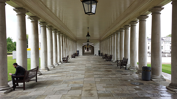
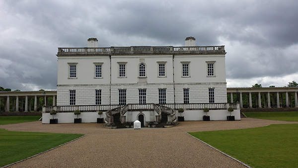
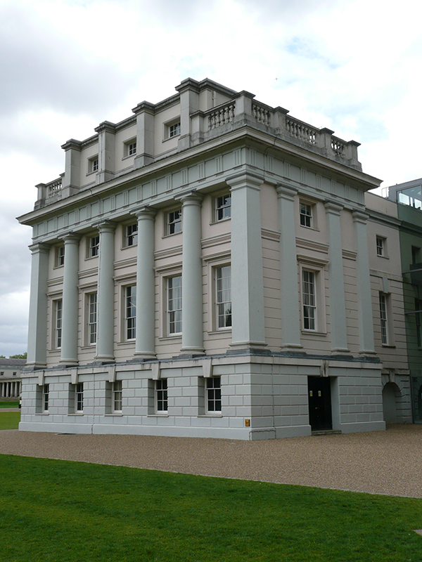
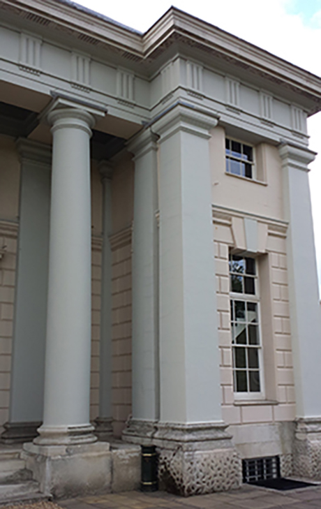
The Queen’s House, at Greenwich on the outskirts of London, is one of the most important buildings in British architectural history. It was built by Inigo Jones between 1616–1619 for Anne of Denmark, the queen of King James I of England and later altered by him for Henrietta Maria, queen of King Charles I. However it soon passed into other use and by 1806 the House itself was the centre of what became the Royal Hospital School for the sons of seamen. This necessitated new accommodation wings, and a flanking pair to east and west were added and connected to the House by colonnades.

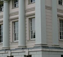
While working on the Queen’s House, I had noticed that the paint on the exterior of the west block seemed to be a slightly different colour to that on the east block. In order to see if this might be merely a trick of the light, measurements of the paint were taken using a portable spectrophotometer. I also took the opportunity of measuring the paint on the Queen’s House itself and of the unpainted Portland stone columns of the colonnades.
Sure enough there was a difference, which can be seen when one looks at the Munsell references of the west and east blocks in the table below. Although much the same depth, the west block was noticeably more pink:

I have used the Munsell reference as a record of the colours found because it is the system of colour notation most widely known and understood by my clients.
I have also indicated the closest proprietary paint colours (in this case the Dulux brand) should the client wish to select ready-formulated paints for any redecoration. In the interests of transparency, I have also identified the nearest colours from the (much smaller) British Standard colour range, which is available from most major manufacturers. The difference of the colours to the closest in the two ranges has been expressed in terms of AlphaE (or Delta E) units.1
My client now has several options – they can a) paint the three buildings in the colour of the Portland stone columns, b) paint the three buildings as the Queen’s House or c) ensure that the two flanking blocks are at least the same colour and that the (central) Queen’s House maintains its difference.
Notes
1 Colour difference is recorded in terms of the combined difference of lightness and chromaticity and is expressed in AlphaE units. This records the degree of colour difference, but not the direction. Normally a difference of less than .70 AlphaE units is regarded as minimal, and therefore a reasonable match.
In Part 2 of this series, Patrick will discuss uniforms colors and using colorimeter data.

About the Author
Patrick Baty is interested in the decoration of historic buildings. His work covers research, paint analysis, colour & technical advice and colour surveys. Projects have ranged from Royal Palaces to social housing, from bridges to cathedrals. He also works in the USA.
In the early 1980s Patrick produced a range of researched historical paint colours that started a trend. In 2007 his company was granted a Royal Warrant of Appointment to Her Majesty The Queen for his work with colour.
Patrick teaches, lectures and writes on paint and colour. He has just completed his first book which is due to be published by Little Brown in April 2015. He also contributes to, and has revised many other books on the subject. He is an active blogger at www.patrickbaty.co.uk


Leave a Reply