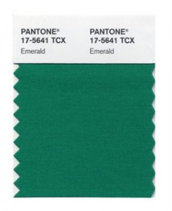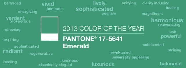
It’s the color emerald. Remember that trip down the yellow brick road in ruby slippers that led to Emerald City? Well, the Pantone 2013 Color of the Year is emerald.
So instead of getting a brain, courage, heart and home; the color Emerald brings, elegance, balance, renewal, and dramatic eye color… for any color eyes. Now that’s worth a trip to Emerald City!
The actual Pantone reference is PANTONE® 17-5641 Emerald. The folks at our sister company, Pantone, note that the color emerald in many cultures represents renewal and prosperity. They suggest that emerald works equally as well in fashion as in home interiors and cosmetics.
“Green is the most abundant hue in nature – the human eye sees more green than any other color in the spectrum,” said Leatrice Eiseman, executive director of the Pantone Color Institute®.
Scientifically speaking, green is represented on the electromagnetic spectrum at a wavelength of approximately 520-570 nanometers. Green is one of the five principle hues in the Munsell hue circle and also one of the three additive primaries, which create color by mixing colored light sources. The other two additive primaries are blue and red.

So how will you be using the Color of the Year? Let us you know your plans for integrating this unique color.


Leave a Reply