Greg Feltham is New Media Directory at Rhapsody, specialists in pre media content production and catalogue production. He joins us at Munsell Color to discuss the importance of colour matching and reproduction in print production.
Setting the Standards for Color from Start to Finish
In any kind of printing, good colour matching and reproduction is important, but none more so than in catalogue production. The most important thing is that products appear in the catalogue exactly as they appear when they arrive through the door, as otherwise products could be returned by disappointed customers. A catalogue is a shop window of sorts, and if products don’t look the same in person as they look displayed in the catalogue, it could even be seen as false advertising.
Colour Subjectivity & Relativity
Colour is a subjective thing. What you see is not necessarily what other people see, as perception and environmental factors play an instrumental role in the way that we see colour. Lighting impacts the way a colour is perceived, with the same colour appearing very differently in different light environments.
Relativity can also be an important issue, as the way an individual sees colours on a page will be influenced by the other colours on that page. Colours interact with each other. Look at the image below and see how the red and green squares appear to be different shades depending on their relation to the blue and yellow columns. They are actually the same shades.

So if light and colour relativity play such a large role in the way we see colour, it’s no surprise that people often disagree about the colour of things. Blues, greens and greys are a particular problem area when you apply color vision testing. So how can you solve disputes about colour matching?
Colour Viewing Environments
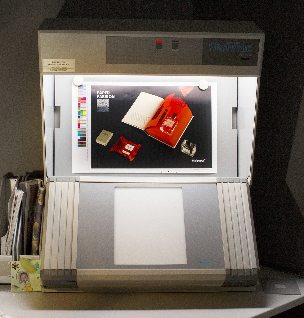
For the purposes of accurately matching colour standards, viewing environments have been devised to offer consistency. These environments are created using lighting booths or viewing stations designed to approximate a particular type of light using florescent bulbs.
D50 is a standard viewing environment for print colour. D50 refers to the frequency of light, and viewing environments offer stable, controlled lighting environments for viewing and matching colours. Having a consistent viewing environment will allow several individuals to view the print in the same conditions.
At this point individuals can have a conversation about colour matching and catalogue production, safe in the knowledge that everyone is viewing the image in a consistent lighting environment, and that they’re not having a conversation about colour with someone who is viewing the designs by candlelight or in blazing sunshine.

Getting it Right for the End User
Colour is a crucial element of any design, but especially for any advertising or marketing material, as customers will place orders based on the images provided. A lot of retouching can take place during the catalogue production process, so it’s important to ensure that any images represent the products accurately so that consumers aren’t taken by surprise when products arrive.


Leave a Reply