We got a chance to speak with Jennifer Cohlman Bracchi, Reference Librarian at Cooper Hewitt, Smithsonian Design Museum in New York City, to talk about a new color exhibit, Saturated: The Allure and Science of Color.
The show, “explores the elusive, complex phenomenon of color perception and how it has captivated artists, designers, scientists and philosophers.” Featuring over 190 color objects, this exhibit, proves how vast and fascinating the world of color is.
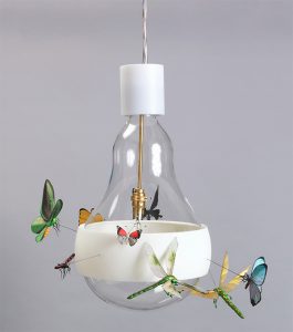
Featured Image (left): J.B. Schmetterling (Butterfly) Hanging Lamp, 2011; Designed by Ingo Maurer and Axel Schmid; Germany; mouth-blown glass, 3d-printed (flexible free-formed) plastic, machined brass, halogen light source; H x diam.: 46 x 32 cm (18 1/8 x 12 9/16 in.); Gift of Ingo Maurer GmbH and Graham Owen; 2014-7-1-a/c; Cooper Hewitt, Smithsonian Design Museum. Photo: Matt Flynn © Smithsonian Institution. COPYRIGHT:Image may not be reproduced without authorization of the Cooper-Hewitt, National Design Museum, Smithsonian Institution
Last time we talked, it was about the Color in a New Light exhibit. Does this installation pick up where it left off, or is it different?
A little bit of both. It’s greatly expanded, that is probably the biggest difference. In the museum space, we are taking up much of the second floor, which is dedicated “collections” space usually. It does include a number of books, roughly 45 total, which is the largest number of library books we have ever put on display in one single exhibition for the museum.
The idea for the show came about because my co-curator, Susan Brown, Curator of Textiles at Cooper Hewitt, saw Color in a New Light in D.C. We were talking about it over lunch one day, and I was very enthusiastically telling her how much more I had learned that we weren’t able to show in that first exhibit (because there wasn’t enough room in the two modest cases that were on display in the Natural History Museum). We talked more, she started pitching the idea to the museum, and they green lighted it. When we started planning it out, we realized there were enough books to fill the first gallery on the second floor, with additional books sprinkled throughout the other larger gallery, which is primarily devoted to the museums collection.
Tell us about the themes or sections in this show
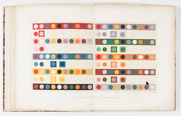
Some of the themes in this show are similar to the four themes in the original show. The way we have broken it down at the museum is the first gallery, which features mainly books, is called Capturing Color. We include some of the books on display in the first show like Newton’s Opticks: or, A Treatise of the Reflexions, Refractions, Inflexions and Colours of Light, Goethe’s Theory of Colours, and LeBlon’s Coloritto.
Once we knew the show was going to happen, we were able to include newly acquired books, including Chevreul’s hemisphere of color model book, Des Couleurs, featuring 72 different hues, which uses a beautiful mezzotint color printing technique. This piece is a great jumping off point for discussing what goes into the making of a three-dimensional model. In addition to hue, which is what we think of as color, we talk about saturation, or the purity of a color, and we also talk about brightness, which is the edition of white or black.
Another recent acquisition in the Capturing Color section is Johannes Itten’s 1921, Color Star, which is a twelve pointed star he developed as a tool, when he was teaching at the Bauhaus. There are also some big names of the color world like Ostwald and Moses Harris.
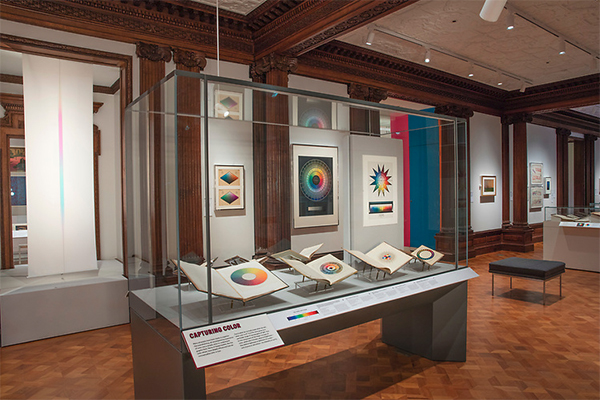
Photo: Matt Flynn © Smithsonian Institution
COPYRIGHT: Cooper Hewitt
How did you decide on the seven sections that were chosen?
Since we were bringing Cooper Hewitt’s amazing design collection into this show, where you have a quarter of a million objects to choose from, we knew there were some objects that had to be included, because they were just so connected or so relevant to the topic. But we also used some of the previous categories from the first exhibit to guide our choices as well.
When you enter the other part of the show, you encounter a section on Color Optics, where we talk about structured color… things like iridescents, or dichroic film. What’s so great about combining this with the museum’s collection is that things that can be hard to address in books, you can really understand better by looking at a physical object. So we have a beautiful fan made out of peacock feathers, there is an embroidered textile using beetle wings, for fluorescents, there is a poster using dayglo or fluorescent ink, which just glows before your eyes, along with a table runner that looks electrified, but really it’s just using light energy to express what comes from the ultraviolet gamut of the spectrum. We talk about simultaneous contrast, having Chevreul in there again, paired with wallpaper showing complementary reds and greens, which seems to vibrate before your eyes. Also, included are some great psychedelic posters from the 60’s. There is a plate from Josef Albers, along with posters created by students of Albers.
The section on Creating Color is similar to what was called Making Color in the previous exhibition. We have a Mexican garment called a wheapeil, featuring the purple dye that is created by poking sea snails to get them to secrete their ink, paired with a scarf using synthetic dyes. In addition to these two examples, which talk nicely about natural dyes versus synthetic dyes, we have many examples of natural dyes that are made up of all sorts of materials – resins to create lacquers, digital prints using natural dyes, along with a book with over 2,500 natural dye samples. Then we have technology driven examples using synthetic dyes or inventions like anodized aluminum, a brilliantly colored flatware set created by setting the metal in an electrical bath, where the dye, along with the electrical charge, creates the color effect. We have a plastic chair showing what it looks like when nylon gets injected with dye when it is in liquid form, and a 3D printed vase. In other words, a wide variety of different approaches to coloring various materials.
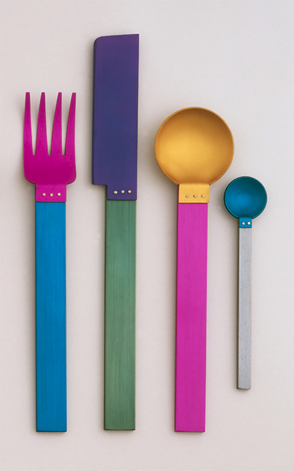
Signature Collection: Picnic Flatware Place Setting (New York, New York, USA), 1986; Designed by David Tisdale (American, b. 1956); Anodized aluminum; Knife: 20.5 x 2.4 x 0.5 cm (8 1/16 x 15/16 x 3/16 in.); Museum purchase from Eleanor G. Hewitt Fund, 1986-94-1/3,10
Photo: © Smithsonian Institution COPYRIGHT: Cooper Hewitt
The next section is on Navigating Color which features color as a useful tool for visual organization, such as infographics. In the library we have an 1870 U.S. Census, which has a beautifully colored section showing the religious affiliations of populations by State. A book that teaches Euclid’s geometry from the mid-1800’s, where they used color as the main teaching tool, rather than abc’s, and they look like little Mondrian paintings.
My favorite in the section is the 1974, Massimo Vignelli, New York subway map, where he applies color to the subway lines for the first time, which seems like a no-brainer, but it was a hugely helpful tool for helping navigate our subway world.
Moving on from that section, you step into Color Collaboration, which displays the tools designers use to communicate color. It includes a book by Édouard Guichard, Die Harmonie der Farben [The Harmony of Colors], which suggests tasteful color combinations paired with porcelain sample plates, which manufacturers would use to express all the different colors they could achieve with the porcelain. We have what is called a color blanket. It’s expensive to set a loom to do a weave, so they set six different vertical colors and then cross those horizontally with different colored threads, creating a patchwork of all the variations using those different color combinations, allowing the designer or manufacturer to choose which one they want to put into production.
A more recent addition for this section is the Pantone Skintone Guide. We figure our audience is familiar with the Pantone standard deck, so we wanted to feature something they weren’t as familiar with. This was developed in the last few years using a spectrophotometer that captures skin tones that exist in the world, and translates them into a fan deck form. This of course, gets a lot of use in the cosmetics industry.
In Consumer Choice, we touched on this a bit in the first show with the Fiesta pitcher and trade catalogues showing samples of objects featured in various colors. In this exhibit we get to show many objects, from Henry Dreyfuss’ 1956 princess pink telephone, marketed at that time towards teenage girls, to Apple’s iMac computer from the late 90’s in the candy color palette. I don’t know how old you are, but I remember when those came out, and they certainly broke the mold in terms of the colors we typically associated with a desktop – normally beige, grey, or black – Apple took a unique approach to making the personal computer “more personal”. We have a Dyson vacuum cleaner in a bold yellow and grey, which is not your typical vacuum color. The section emphasizes how color can be used to sell products.
In Color and Form, we have mostly two-dimensional works which look three-dimensional, emphasizing how color is key in understanding how we see our three-dimensional world through subtle variations in shading, shadow and light. This includes very bold graphic posters which use color to make them appear three-dimensional.
What will we see from Munsell this time around?
Munsell is featured in the Capturing Color section. There are three main cases filled with books. The third case is devoted to color measurement. In that case we feature Milton Bradley, Robert Ridgeway, who was the Smithsonian’s first Ornithologist, along with the Munsell, Atlas of the Munsell Color System. We talk about spectrophotometers in that case as well, and how that is another tool used to measure color.
Although we featured the Atlas in the last exhibit, this time we are showcasing a horizontal cross-section of the color tree, rather than a vertical one. This helps us emphasize about Munsell, how his approach was different than any of the other colorists featured – that is, his non-geometric form view of color space. Because he was using spinning disks for the model, it allowed for a much more organic shape that wasn’t constricted into being a perfect sphere or a double cone. We also mention how Munsell’s system really bridged into the CIE lab and paved the way for the development of color standards. It can be difficult for a typical visitor to understand all these concepts. It is hard to make the leap from the world of what our eyes perceive, into the world of what scientific instruments can detect, but the Munsell system was key in helping to make this transition.
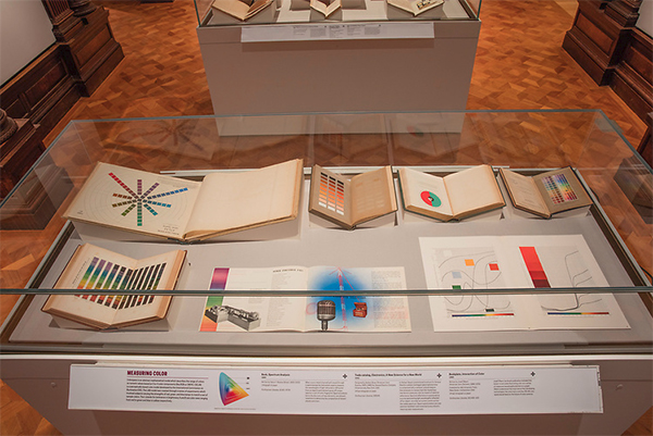
Photo: Matt Flynn © Smithsonian Institution
COPYRIGHT: Cooper Hewitt
Is the intention for visitors to walk through this exhibit in any particular order?
Not really. When you go up the staircase, you hit Capturing Color first, it is in this long hall that is darker and wood paneled. That is where most of the books are, along with flat works against the wall. But for the other sections I described, there are actually three entry points to the gallery that houses them. So it is not linear by any means, you can jump in at any point. It is nice to hit Capturing Color first because it teaches you some of the fundamental principles of how color works and if you know this going into the next sections, it can only help you better understand what you are looking at. But it doesn’t have to happen in a specific sequence. Within the sections, it is not in any order either. Objects are grouped together in large aquarium type tanks that follow a natural tendency to read left to right, but again, they don’t have to be in any special order.
What is your favorite section and why?
I am partial to books, so Capturing Color is what my heart is close to, but being able to co-create with someone who knows the museum’s collection has been a tremendous learning experience for me. That is because the approach is different when curating objects then when you are just working with books. I don’t think I could pick just one, but there are two objects that I love. They both feature light, which is always a challenge for museum display. What is so special about these two pieces is they are displaying dichroic film or multichroic techniques where there is no pigment involved, it is all the refraction of light. One is a table called Shimmer Table, by Patricia Urquiola. It literally reflects a brilliant pink, transfers a bright green color, and as you walk around it, it has all the colors of the rainbow in it. It’s closely connected to the neon pieces in the Color Optics section, even though it’s not paired with those. It’s just a stunning piece to experience. Similar to that is a lamp by Formafantasma that also features dichroic film. It is placed against a wall where it’s reflecting this glowing spectrum along a scrim. When you walk around the other side of the gallery, you get to see what is creating this immense spectrum, and you see it is this minimal lamp. So those are my favorites.
What has been interesting for you to learn about color from this exhibit? Do you feel like you walk through the world differently?
It is such a topic of endless fascination, and even though I did a ton of additional reading and research, I feel like I have barely skimmed the surface of the many aspects of color. I don’t know where I will go next with it, not sure if there will be another exhibition necessarily, but I hope I can continue learning about it.
One of the things we have in the exhibition is the Phillips Hue light bulb, in the great hall chandelier, rotating between different shades of white. The bulbs can go from morning light, to midday light, to evening light, to incandescent, to fluorescent light. I do notice the changing of the lights outside and how it affects what I am looking at a lot more intensely than before. Even in looking at artist works, or scanning through Instagrams designer feeds, I can pick up on the artists and designers that are really into color just by how they are using it. I still wear a lot black and grey, so it hasn’t made me any bolder in my color choices “[laughter]”. I think I am much more attentive to the color around me and I appreciate what a true craft it is when someone achieves beautiful color – it is not as simple as picking a few colors from a Pantone color deck that are going to look good together, there is a lot of craftsmanship and a lot of knowledge and experience that goes into successful results in a work or designed object in terms of its color.
Traité théorique et pratique de l’impression des tissus / / par J. Persoz; Persoz, J. (Jean), 1805-1868; 4 v. : diagrs., patterns ; 22 cm. + 1 atlas (20 leaves of plates : ill. (partly double, partly col.) ; 32 cm.); Smithsonian Libraries
Photo: Matt Flynn © Smithsonian Institution
COPYRIGHT:Image may not be reproduced without permission from Smithsonian Libraries.
What are visitors reactions to the show?
We typically give several tours a day, so it’s always interesting to hear what people have to say during those. When I was first learning about additive and subtractive color mixing, I was blown away that red light and green light makes yellow. I guess I didn’t realize how unknown the primary colors are to most people. We all learn our primary colors in grade school and we mix paints, but the primary colors of light are completely different. Most people just aren’t aware of that and it’s one of the fundamental things you need to know when you start talking about color theory. So it’s interesting to see people’s reactions to that. It’s kind of a challenge to talk about it in a way that everyone can understand, so that has been fun.
People really respond to the sub-themes we have in Capturing Color. Camouflage and color blindness in particular, which includes the Ishihara color blindness test – it is interactive so people can figure out what they can or cannot see. There is a 3D wallpaper where you put on the old fashioned glasses where one lens is red and one is blue, filtering out the red and blue-green printed on the wallpaper and creating the 3D effect. This creates two different images for your eyes but you mind merges those images and creates the three-dimensional effect. The optics and phenomena have been the most fun as far as the visitors reactions, because we were able to make these fun to experience. That has been a highlight for me.
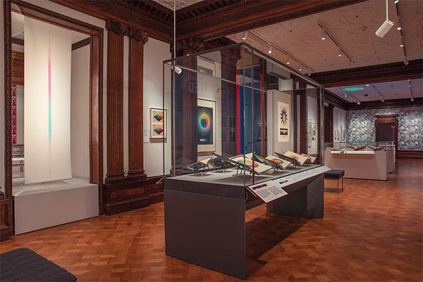
Photo: Matt Flynn © Smithsonian Institution
COPYRIGHT:Cooper Hewitt
Anything else you would like to mention?
I am really excited to be going to the Munsell Centennial Symposium to give a poster presentation on Wednesday afternoon. Looking forward to hearing these speakers whose books I have been pouring over. So many of the authors that will be at this event totally informed my knowledge that helped in putting together this show. There is going to be so much conversation around color education which I find fascinating. I am going to give a poster on an exhibition Cooper Union Museum did which resulted in the library of Dorothy Nickerson, along with some other members of the ISCC being donated to the museum’s library, now Smithsonian Libraries.
Saturated: The Allure and Science of Color will be on view May 11th, 2018 through January 13th, 2019. If you get a chance to see the show, we would love to hear about your experience. Drop us a line in the comments below.

Leave a Reply