Every painter knows what ‘mud’ is and we don’t like it. We have all experienced it in our paintings. It’s that area in the painting where the colors suddenly become very unpleasant reminding us of dishwater or playing outside in the rain. You had no intention of creating this hue, yet there it is and it detracts from the rest of the painting.
Our reaction is usually one of frustration or exasperation followed by, “How did that happen?” Or “Where did that come from?”
Muddy paintings can be the bane of our existence. Frustration when mixing color hinders our creative process. It can even cause us to doubt our abilities. Would you like to be rid of mud in your work? Would you like to know how you created it in the first place? Let me explain.
Understanding Complementary Colors
The making of mud starts with one of the first concepts of color theory you learned early in school. It resides in understanding complementary colors, also referred to as color opposites, and the role they play in mixing color.
In my years of teaching color, I have discovered that there is a tendency for artists to gloss over the important concept of complementary colors. I am not sure why this is, though I will speculate. I believe it is because the concept is something we learned so early on in our lives AND because the rule of complements is seemingly simple. It is a simple rule. However, it is also complex with profound consequences.
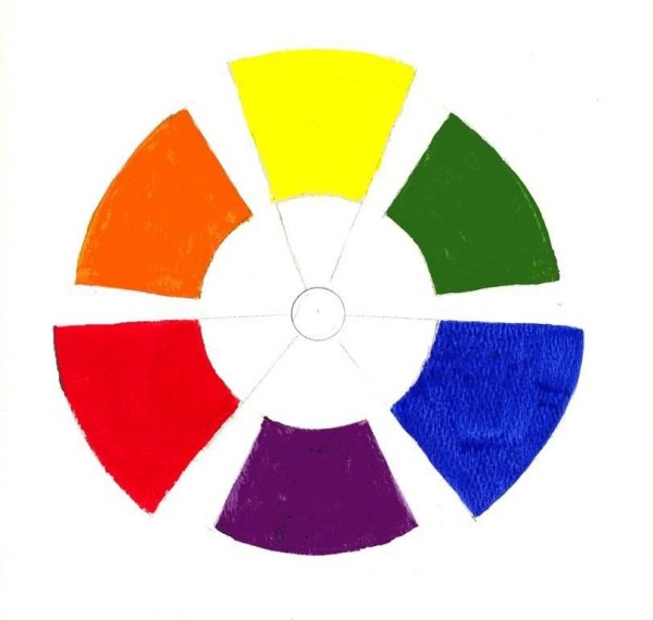
For review, complementary colors are:
- Red and green;
- Yellow and purple;
- Blue and orange.
In a 6-hue color wheel, they can be found opposite from one another as seen below.
One of the rules we learn as painters is that color opposites cancel each other out when mixed. In other words, when we combine a pair of complementary colors on our palette, the original or parent colors lose their intensity or chroma. They mix into a black or brown.
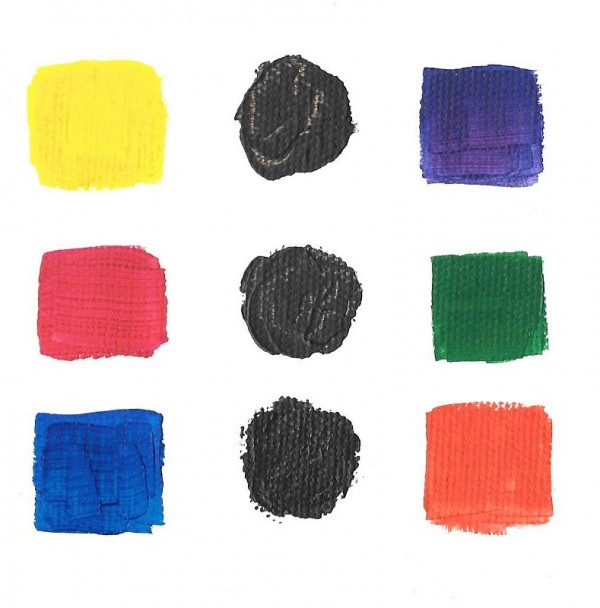
In art classes or workshops we are typically directed to take these three pairs of color opposites, mix them and paint a swatch of the results. You can see an example here.
Unfortunately, the art instructor usually ends the discussion about mixing color opposites and moves onto another color concept, again, because complementary colors are easy to understand. This is when I say, “Wait, there is much more to discover! You have only just tapped the tip of the iceberg.” The application of this color mixing skill needs further exploration. Now is the time to gather up your paints and explore the potential of complementary colors.
Mixing Complementary Colors
Begin by choosing six colors in your tool box that represent the three pairs of complementary colors. In other words, pick out a red, yellow and blue – a set of primaries – then pick out a set of secondary colors so you can mix them.
Mixing Chromatic Scales
The next step is to mix a ‘chromatic scale’ for each of your pairs of complementary colors.
A chromatic scale is a set of hues that shows the gradual shift in color as the ratios of paint change. The chart below demonstrates this. The following directions will lead you through the creation of a few chromatic scales using your tubes of paint.
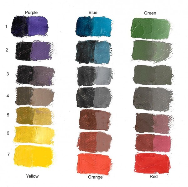
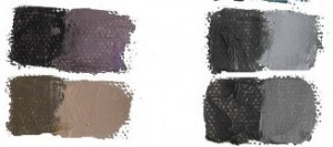
With your first pair, paint a swatch of each of these parent colors about 10 inches apart onto your painting surface. The parent colors are in rows #1 and #7. Next mix the two parent colors to the point where neither of these colors is evident in the mixture. It will be a black or dark brown. This is your middle color or #4 in the chromatic scale. Paint this swatch. Note: if the mixture of the two complementary colors you chose creates a green, then they are not complementary colors.
For the intermediate hues – rows #2, #3, #5 and #6 – mix different ratios of the colors. In this example, the hues in row #2 are predominately the purple, blue and green with just a little of its opposite added to it. Sometimes the subtle color differences are somewhat difficult to see. You will notice that I added a little white to each swatch of color to make it easier to see the change in hue in this digital setting.
Blue & Orange Chromatic Scales
This next chart shows two more BLUE and ORANGE chromatic scales using acrylic; in the previous example I used oils. On the right hand side of each swatch I added a little water to see a lighter value of the hue. Watercolorists can do the same.
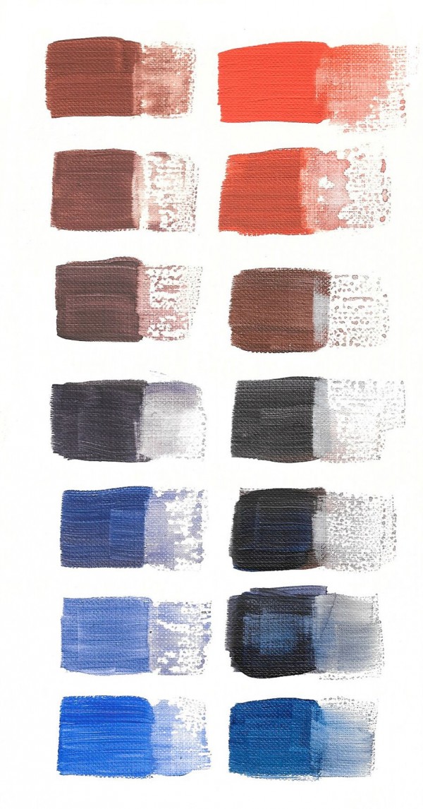
Isn’t it a delight to see all of the colors you can mix with just a pair of color opposites? Can you see the potential of painting an entire painting with just one pair?
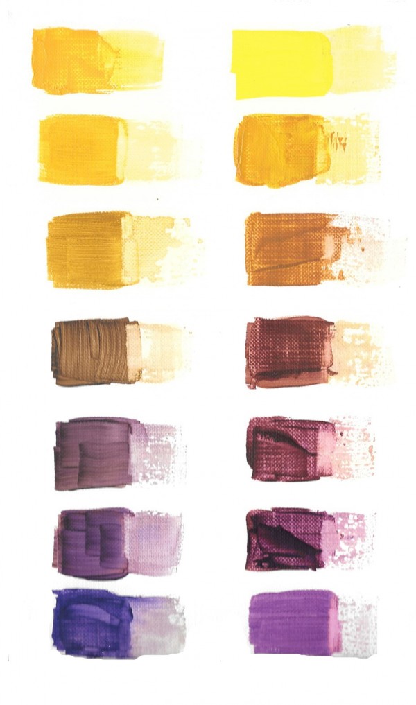
Yellow & Purple Chromatic Scales
Many painters avoid mixing and exploring the color opposites of YELLOW and PURPLE until we experience and see the results with a color chart like the one below. Often our experiences with yellow and purple are not pleasant. When you look at the variety of hues I mixed using yellow and purple, can you see the colors of straw, blond hair or the beach? There are some delightful rich browns and greys.
Red & Green Chromatic Scales
The below chromatic scales show you the variety of hues possible when mixing RED and GREEN.
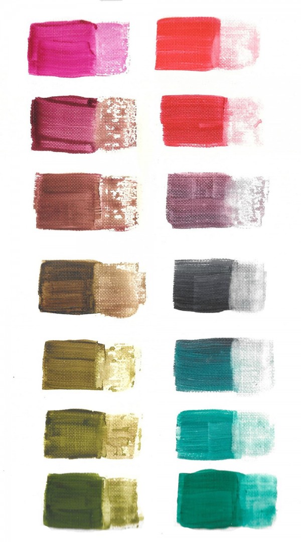
It’s magical isn’t it? When you study each of these chromatic scales, you can see how just a small amount of the complementary color starts to de-saturate the parent color; the intensity of the color or chroma immediately begins to decrease when its complement is added. You can also experience the additional rich hues that you can begin applying in your paintings.
What Does All of the Above Have to do with Mixing Mud?
In each of these examples of chromatic scales, you can see ‘muddy’ colors. The difference is that you created them with intent in these charts. The muddy color did not just appear and become a source of angst. You can now choose to mix and apply these yummy de-saturated hues (we won’t call them “mud” anymore), when you want them in your work.
In Part 2 of the series, Carol dives further into understanding complementary colors to take it to the next level of complexity.
About the Author

Fine artist, Carol McIntyre, is passionate about color and loves to teach artists the magic and logic of color both online and in live workshops. Through her unique approach to color mixing, painters experience more success translating what is in their mind’s eye onto canvas or paper.
McIntyre is an award winning artist in several media. She was President of the Minnesota Watercolor Society and cover artist of a national arts magazine. Her paintings fuse realism with abstraction while transporting you to another time and place.
Her paintings can be viewed at: http://carolamcintyre.com

Interesting post. Thank you.
As a young artist who has always tried to descretely rebel against the typical ‘rules’ or ‘standards’, this article means the world to me. This entire school year I’ve been trying to show my art teachers and the other students the gorgeous possibilities that arise when you mix complementary colors! I’m so happy to see that someone out there sees what I see.
Hi Ella;
Thank you for your comment. I am so pleased to hear that my information has been helpful. You are by no means alone in your artistic journey even though it may feel that way at times.
I too have been that ‘rebel’ that you refer to. I was often told to paint differently. This always confused me because I thought art was about self expression and finding your own style, message, etc! I grew a thicker skin and let those comments bounce off and I am glad that I done so.
Keep on painting and exploring color. It is a marvelous study that is endless. If you are interested, I do write a blog bi-weekly that usually focuses on color. You are welcome to subscribe by going to: http://celebratingcolor.com/blog
I am sort of a dunce I think because I can’t make out what is what in the last three examples of chromatic scale which are made of two columns I get the first example of what happens when mixing comp colors (that one has three columns) but in the next example what is being added to what in the two column examples? Is the main point in the second column only or what is the first column the one on the left intended to show me? Sorry to bother you is it enough to just understand the first example where there are three columns?
The last three examples of chromatic scale is an expansion of the first one. They are just using different variations of the primary and secondary colors. For example, the very last example I have created two different chromatic scales by using different pairs of red and green. They are mixed the same as described above. On the right side of each swatch of color, I have added a little water so that the hue is easier to see. These chromatic scale exercises are a great way to discover the variety of colors you can mix by just using your complementary colors. I hope this clears up any confusion.
Where’s the “LIKE!!” tab on this page ^^
This was interesting but really strange. At the beginning you helped to explain opposites cancel each other out when mixed?
I tried the same colours and this was my results.
YELLOW + PURPLE = MEDIUM BROWN MUSTARD
RED + GREEN = BROWN
BLUE + RED = PURPLE
None of the colours I mixed ended up with Grey or Black the same as yours did?
Can you help to explain where I’m going wrong?
Thanks for all the info.
oops…
I meant BLUE + ORANGE + PURPLE.
I think my orange was a red/orange so that maybe why it went purple. I tried a more pure orange and it turned brown.
Yes complementary colors, when they are true complements, do cancel each other out. The results of your mixtures is completely dependent on the parent colors that you start with. Blue and Orange are complements, for example, but is depends on the color bias of the blue and orange. Keep trying different mixtures which is a great way to learn about your paints and the delightful colors you can mix.
True complements, when mixed, will result in gray/black or brown. Hope this helps. Carol