Paul Foxton is a self-taught artist who believes that anyone can learn to draw. He helps people learn to draw and paint better by sharing effective practice methods on his website Learning to See.
In this two part series, he talks about how utilizing the three dimensions of colour resulted in mixing a better painting palette.
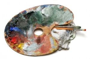
My First Brush with Oil Paint
I was around twelve. My Mum had given me some oil paints and I was about to try them out for the first time.
As I squeezed the paints out of their tubes the distinctive smell of linseed oil and pigment tickled my nose.
I was fascinated, intoxicated as much by the idea of painting in oils as by the smell, eagerly anticipating the wonderful piece of work I was sure to produce.
An Unmitigated Disaster
Some experiences stay with you. I remember the disappointment of that first attempt at oil painting as if I’d done it yesterday. It was supposed to be a painting of an owl. It very quickly became an indiscriminate mess of dark, grey-brown smudges of paint.
I had just experienced my first scrape with a fundamental problem that many beginning artists face when they try oils:
I had produced mud.
What Went Wrong with Mixing Colours?
The main reason for this quite common experience is that most artists’ oil paints are dark straight from the tube, that is, quite low in value. Value, measured from dark to light, is one of the three dimensions of colour according to Albert Munsell, and arguably the most important one to artists.
In order to match the value of the majority of the colours we see in the world around us with oil paint, large amounts of white must be mixed into the paint in order to lighten it – to raise its value.
Munsell Colour Theory to the Rescue
Back when I made my first unsuccessful foray into oils, I didn’t know anything about Munsell. I was twelve, I didn’t know much about anything at all. But I struggled on regardless and gradually improved with time.
Fast forward thirty years. After a period away from painting I had returned with renewed enthusiasm and determination. I was lucky enough to meet the accomplished American allegorical painter Graydon Parrish, who first introduced me to the Munsell approach to colour.
My experiments with using Munsell to learn about value in painting completely changed my approach to painting in oils. Munsell gave me an objective way to approach colour that freed from colour dogma. It’s no exaggeration to say that Munsell unlocked my palette.
Your Colour Palette Was Locked?
It was. My palette was locked by my own lack of knowledge about colour.
- I wasn’t aware of the full range of the colours I could achieve with my paints, so I didn’t know what could and couldn’t be achieved.
- I wasn’t aware of the actual hues of my paints (red, blue etc). That made it much harder to predict the results when I mixed them together.
- I didn’t have a practical framework within which to understand colour. If I had a colour in mind that I wanted to mix, the only way to achieve it was through trial and error. Mostly error.
There had to be a better way , and as it turned out, there was.
Munsell: The Key To Colour Knowledge
Munsell unlocked my palette by filling the huge gaps in my knowledge of colour. The Munsell colour space with its three dimensions of hue, value and chroma fundamentally changed not just how I approach colour practically, but how I conceptualise it.
- Munsell shows me the range from dark to light, from grey to high chroma of my paint. I can either pinpoint a colour within the range of my paint, or know when a colour I see is outside the range of my paint and I have to compromise.
- The colour chips in the Munsell Book of Colour show me the actual hues of my tube paints. They show me that raw umber, for example, is not just a dark greeny-brown, it’s actually a low chroma, low value yellow. Now I can more accurately predict the results of colour mixes based on these actual hues.
- Most importantly, Munsell gives me a practical framework for colour that allows me to systematically mix the colours I want rather playing ‘pin the tail on the donkey’ with paint.
Since so many artists struggle with colour mixing, I’ll explain a little more about how using Munsell got me those wonderful results.
An Inauspicious Start
You can’t always rely on first impressions. The first time I saw a colour expressed in Munsell notation I was considerably less than impressed.
5YR/6/4
After all, we artists deal in the fine vibrations of the soul, gentle whispers of the imagination and fugitive moments of inspiration.
5YR/6/4 looks much more like science than art.
And in fact it is. It shows the hue, value and chroma of a specific colour, measured objectively.
As artists we’re used to considerably more romance in the names of our colours, thank you. Burnt Umber, Monestial blue, Raw Sienna. These are colours to fire the imagination and feed the soul. What possible use could that dry numerical representation be to an artist?
As it turns out, quite a bit. Let’s look a bit closer at what the numbers mean.
YR expresses the hue, Yellow-Red in this example (or orange as we’d more usually call it).
6 expresses the value, in this case slightly higher than a middle value.
4 expresses the chroma, in this case a fairly low intensity, closer to grey than say, the colour of an orange.
It’s these three dimensions of colour that provide a way to understand colour that is as practical as it is simple.
Here’s what 5YR/6/4 looks like (accepting monitor differences of course) on a colour chip from the Munsell Book of Colour.

Matching the Colours We See
One of the most important skills for artists (at least, those who paint realistically) is being able to match a colour we see with paint.
That might sound simple. Anyone who’s tried to do it will be able to tell you it isn’t.
Why not?
Well, let’s say we’re looking a collection of objects we’re about to attempt a painting of that includes an apple. We want to match the colour of that apple. We have a number of immediate difficulties to deal with:
- There is often different light on our palette, where we mix our colour, than on our subject. So even if we match the colour perfectly on our palette it will look different there. So it follows that if the colour we’ve mixed looks right, it will more than likely be wrong. That’s not going to help.
- When we put that colour we’ve just mixed onto the canvas, the surrounding colours will affect our perception of it. If much of our canvas is still unpainted and white, the colour will look very different again than it did on our palette. And of course it will probably be in different light again than it was on our palette, changing our perception of it still further.
- Then there’s the paint. We’re faced with the task of choosing the right pigments to combine in the right proportions to achieve our desired result. We want to match the colour of the apple before us. But achieving that colour with our pigments is far from simple.
Let’s look at that last point in a little more detail in Part 2 of Munsell Unlocked My Palette.

Wish this coding system was a required standard amongst all oil paint manufacturers!
As an artist, I can see how these posts will really help me. looking forward to the next post!
The best explanation I have read about why it is difficult to get the color results we want on our canvasses. Thank you.
Hi David,
thanks, I’m really glad you found it useful.
Hi Liz,
I completely agree! It would make it so much easier for artists to evaluate the differences between colours, and also which would be the most useful to them.
hi, your website is very nice
[…] I mean all the things I was taught in school about color theories and harmonies, color trends and palettes, color coded visual communication, and culture in general. That little blogging experiment has […]
[…] to elaborate in the identification of a color based on the color of a blob of mixed paints on the palette, it suffices to compare it with a similar hue chip-sample inside the space (Munsell Book) to […]
[…] I originally came across the Munsell Colour System when I bought the student set back in 2001. Compact, but nonetheless very comprehensive, the set also included practical exercises which were a great way to apply theory to practice. I was looking for something that would complement my existing knowledge of colour theory, something that was accessible and that I could also use for my work as an emerging designer. Books on colour theory at the time were great in many ways, but didn’t really help me refine my understanding of colour when it came to practical design applications. Using Munsell was a real eye opener. I started thinking about colours in a completely different way… and in the third dimension! As a spatial designer whose work is mostly 3D, this notion is very important. I also enjoyed putting together the colour charts that came with the student folder (not as easy as it first seemed) and experimenting with colours using the exercises, or making my own palettes. […]