In this second part of our series, we talk to Ralph about Frank J. Reilly’s contribution to the Munsell system, the three things that can’t be painted, what colors painters should use, the importance of value, advice for young artists and more.
Can you talk about Frank J Reilly’s contribution to the Munsell system and his expansion of it with the Reilly Greys?
Reilly improved on Munsell a little bit. Reilly understood that from white to black there is nothing whiter than white paint and nothing blacker than black paint. By separating white to black with nine equal steps, you are able to recognize what value each one is. Since there is no color, you have to give each step a number. Without that, who could recognize the difference between a fifth value, sixth value or fourth value? Too few steps wouldn’t be enough, and more steps would be too complicated to identify exactly what each value would be. These nine values were manufactured by Grumbacher and tubed as Reilly Greys.
You talk about the three things that cannot be painted. What are they and why can’t they be painted?
Obviously you can’t paint the sun because there is not a paint in the world as strong as the sun. You can’t paint the glint of the sun on water, because again, there’s such a reflection of the sun that cannot be mimicked with pigment. And finally, you can’t paint a bright red coat or object in sunlight. Remember, cadmium red light is the strongest color we have. There’s no way we can paint a red coat like that, at the value that it is outdoors and keep it red. Red is the fifth value, and to paint it, you have to lighten it. As soon as you lighten it, it starts to become pink. So you cannot paint the red coat, or the red dress, or the red balloon at exactly the color it is outdoors. What you do is you lighten it, just a little bit, and that’s it, that’s all you can do. Those three things, you cannot paint.
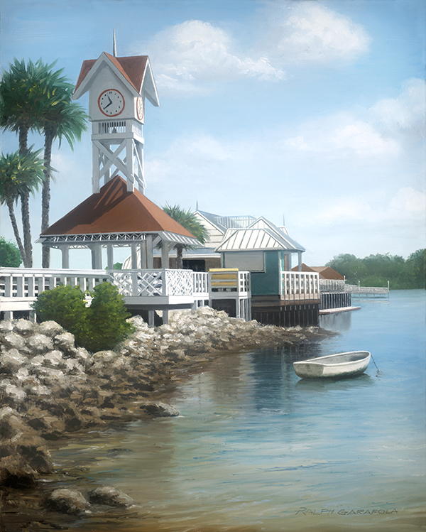
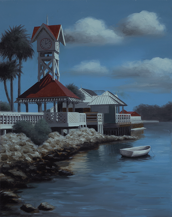
Bridge Street Pier Sunny Day on Ana Maria Island
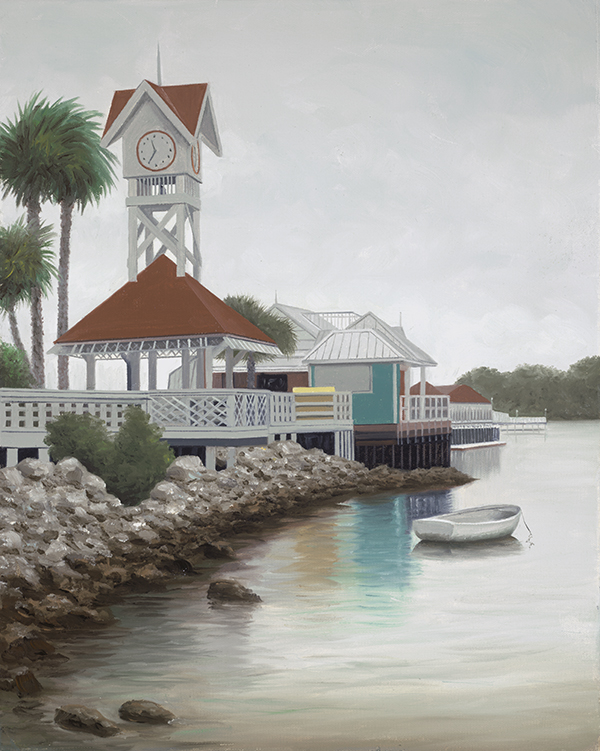
Bridge St Pier Overcast on Ana Maria Island
You could paint the moon the full moon, the value of the moon and the color of the moon. The value of the moon is nine and a half, just slightly darker than white. The moon is viridian, it’s green, which surprises a lot of people. Viridian is lightened with white up to a nine and a half value – that is the exact color of the moon. This is a Reilly thought.
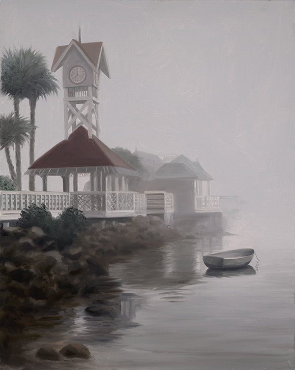
Bridge Street Pier Foggy Day on Ana Maria Island
Bridge Street Pier Moonlight on Ana Marila Island
I tell students that all their lives we’ve looked at the sky, we’ve looked at the clouds and so on, but you only see what you know about color, you can look, but you only see what you know. For instance, a nice healthy cloud flying in the sky, some of it is in the light, some of it is in the shadow. The shadow side of that cloud is the same value of the sky right next to it. The sky is blue, the cloud is grey… if you squint your eyes, they blend together… they’re the exact same value. So I say, now you know it, now you’ll see it. When using one light source, and if you put two pieces of paper on a window sill, a white piece of paper in the shadow and a black piece of paper in the light, the black piece of paper is lighter than the white piece of paper. The black paper is four and a half value and the white paper is the fourth value. This is the stuff Reilly taught, it was incredible.
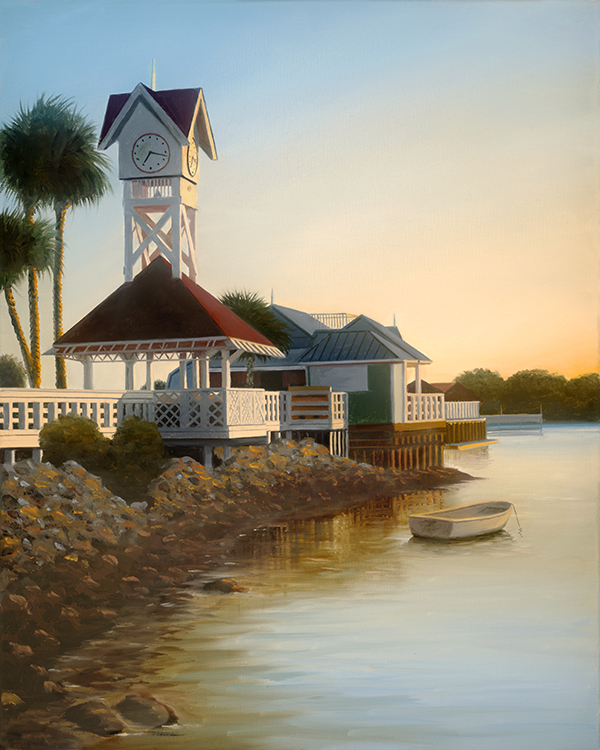
Bridge Street Pier Sunrise on Ana Maria Island
Did you paint outdoors or spend more time in the studio?
Although I don’t paint outdoors as much as I used to… it’s fun, really fun. I used to do quite a bit, but lately, along with a lot of things, moving from New Jersey to Florida, buying a house and teaching – I’m teaching in Florida at two places – it’s not that often that I go out and paint.
Outdoor painting from the Reilly perspective could be a whole book itself. If you want to paint what you see outdoors, we have a nine value range between white and black, so we have to squeeze everything in nature into the nine values. Reilly figured out how to duplicate nature with the nine values we have. That’s a whole separate course. I have five outdoor paintings of the same subject which I show to my students. They are paintings of the Bridge Street Pier on Anna Maria Island in Florida. Painting No. 1 is a sunny day, painting No. 2 is an overcast day; painting No. 3 is a foggy day, painting No. 4 is moonlight and painting No. 5 is sunrise. When you know the values, you can paint them in your studio. I paint realism, I don’t try to change nature. Nature is fantastic, so I’m not going assume that I can improve on nature, I try to duplicate it when I paint. For my portraits or seascapes or landscapes, I just try to duplicate what’s there. An outdoor painting is a mood painting, it should show the time of day, the kind of day, and the season.
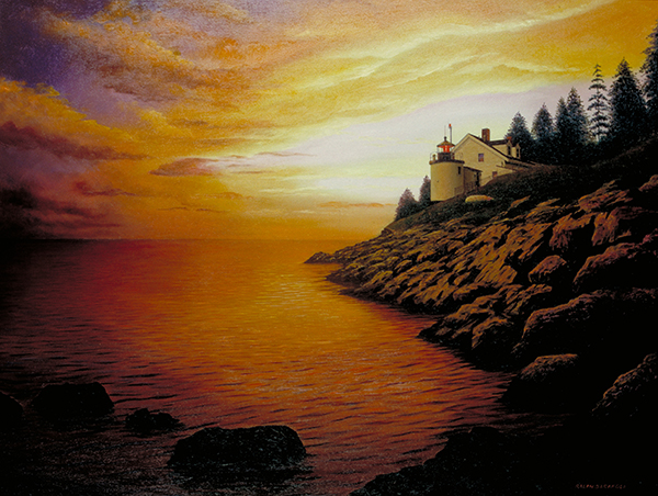
Browns Head Light
What colors should painters use?
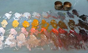
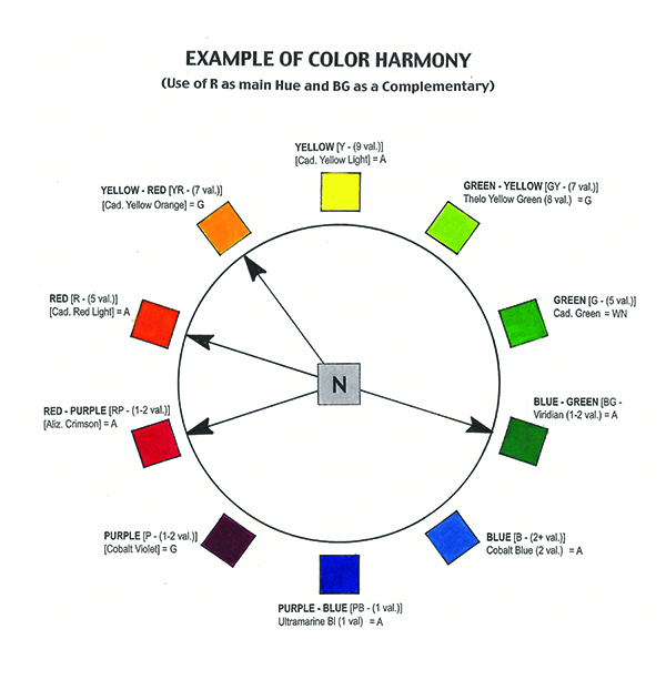
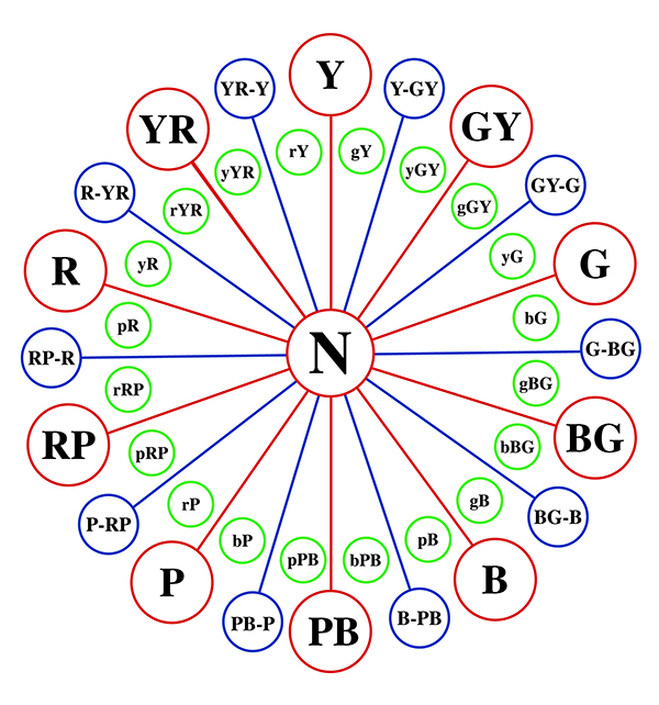
You lighten every color with white, there’s no other way to lighten color. But you darken the color, theoretically, with its own color. For the key warm colors, you darken it with its own color. Other colors can be darkened with black. But you can go in between color. Take a look at the color wheel that we use, there are 10 equidistant colors around the color wheel – they are equally distant. These ten equidistant colors (hues) are Y-cadmium yellow light, YR-cadmium yellow orange, R-cadmium red light, RP-alizarin crimson, P-cobalt violet, PB-ultramarine blue, B- one-half ultramarine blue mixed with viridian, BG-viridian, G-cadmium green, GY-one-half cadmium green mixed with one-half yellow light. You will also need white, black, raw umber, burnt umber and your nine values of neutral grays. With these you can mix anything. I’ve never used anything else and I’ve painted everything. Even in illustrations, I use these colors. That is because they’re equidistant around the color wheel. Of course there are other specific different colors and shades; if you need those colors, you can buy them, but you don’t really need them. I’ve never used anything else except the ten equidistant colors and the two earth colors, raw umber and burnt umber and then obviously black and white. That’s all I have. And I have had no occasion to use anything else.
Page 13 from “Frank J. Reilly – The Elements of Painting” by Ralph Garafola
Painting cannot approach the brilliance of nature, yet painting can fake what is natural – What are your thoughts on this?
As I have mentioned, nature is expansive, which has so many different variations – we don’t have anything to replicate it exactly, but we have to use the nine values and pigments to illustrate what is out there. With the colors we have, we have to duplicate what nature offers us. We have to compromise to duplicate what is found in nature.
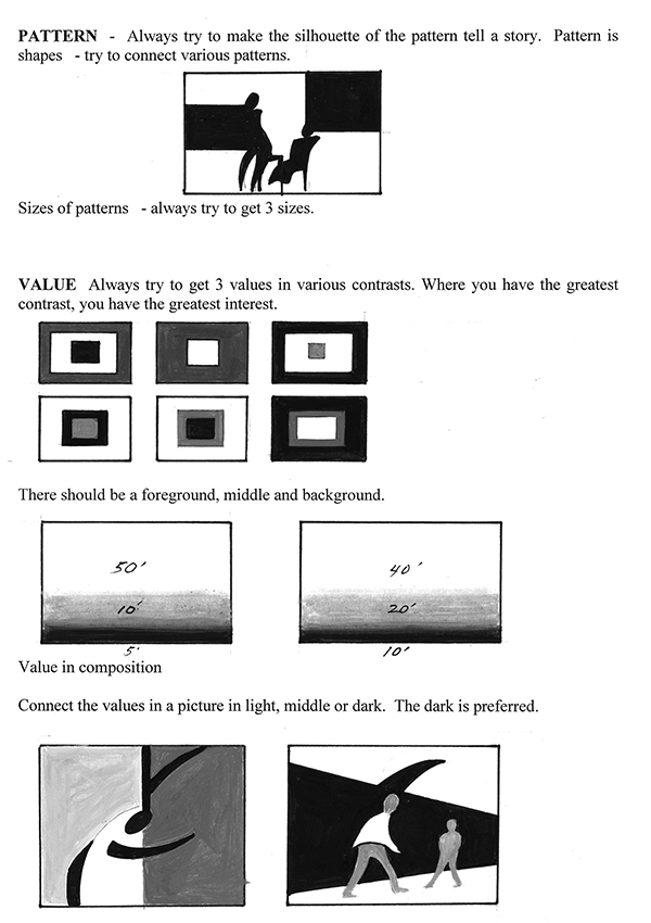
Why do you feel that value is the most important component in creating a painting?
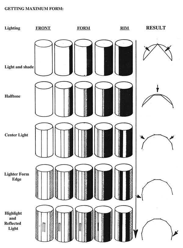
Values make form. If anything has three dimensions for light and shape, that’s a value change. There are objects that are in the shadow, objects that are in the light – this is your form. Form is only value, color does not give you form, it has nothing to do with form. You could use any color to create an object but not to create form. With values, you can have form without color. So value gives you form. That’s why values are more important than anything else there is. It is more important than the color. The color doesn’t matter, if you’re painting form.
Page 68 from “Frank J. Reilly – The Elements of Painting” by Ralph Garafola
What do you think of paintings that have all the same value, where there is no form?
In abstract painting, it’s about shape, design, patterns, and so on. If you’re patterns in an abstract painting are the same value, or the same chroma, it’s monotonous. It’s nothing. Abstract paintings should be beautiful and should have different values, different chromas, different colors and different shapes. All paintings should have a point of interest – which is called an effect, good composition and balance. That is why with a good abstract painting, you can hold it upside down, sideways, and so on, and it still looks good. Unfortunately, many abstract painters don’t know that or don’t pay attention to it… they squeeze colors out of a tube, the colors all fight each other, there’s no design pattern… all the important things are neglected. It’s really painful. I’ve seen abstract paintings hanging at the museum and there’s two colors, a green and a warm orange color, both with the same intensity and same value… I mean how ridiculous can we get?
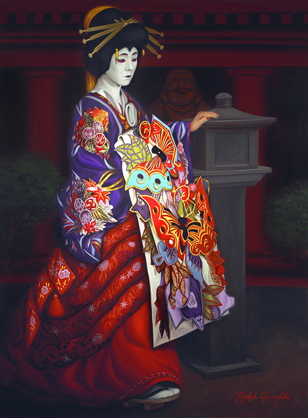
Kubuki Courtesan
What do you think of Josef Albers? And his color theory?
He’s using some of the same theory as Munsell. The charts he derived are just showing the different kinds of chromas and values and their relationship to each other. But there’s no usable theory there. He’s just showing what happens when you put colors next to each other. Let’s think about this, when you want to paint a wall in your house, you go to a store where they have all these color charts with the paint they’re selling, these are all figured out using the Munsell system. They change the values and the chromas and it’s all controlled by using the system. There’s no other reason to use anything else.
Why do you feel that students, artists and teachers should follow the Munsell system along with Reilly’s updates?
There are warm greys, cool greys and then there are neutral greys. How do you make a neutral grey with white and black? If you mix white and black to get a grey, that’s a cool grey, because there’s blue in black. To make it neutral, you have to warm it up, so you add just a touch of orange to get rid of the blue in the black. Then it will be neutral, not warm, not cool… neutral. A neutral grey doesn’t change any color, it just weakens it. Munsell talked about this in his theory and Reilly came up with the nine neutral greys. These were manufactured as paints and called Reilly Greys, but when Reilly died, they said they were too difficult to make because they had to be the exact match to each value and equally distant from each other. They felt it wasn’t worth the trouble making them. So we need to be able to make our own. Understanding how to do that is so important. Manufacture, Golden came out with a line of neutral grey acrylics which I thought was fantastic.
Page 18 from “Frank J. Reilly – The Elements of Painting” by Ralph Garafola
What is your medium of choice?
For fine art, I prefer oil. My illustrations were water color; for 50 years I painted with opaque watercolor. I’ve used acrylics in some illustrations, because it’s similar to watercolor. You have more control with oils.
Reilly was a stickler on soft edges that gives you three dimensions. Ninety percent of the artists paint edges that are razor sharp – you lose form when you do this. I show students, how we see in three dimensions so you must learn how you paint in three dimensions. We have two eyes that are side by side, and the space between our eyes is the width of one eye. When we see an object, if we look at an object and we are seeing the left side of that object with our right eye, we’re seeing the edge of that form. We can see that same left side with our left eye and we’re seeing around the corner. So all vertical lines on objects are out of focus; they’re all soft. That gives you the three dimensional look – actually looking around the corner with each eye as you look at it. Horizontally our eyes are on the same plane, so horizontal lines are harder because each eye sees that edge the same way. Consequently, using soft edges on all forms gives you a three dimensional look. I also show my students how to paint soft edges. Unfortunately a lot of people ignore those edges. This is something Reilly would emphasize.
Diane Tucker
What advice would you give to young artists who are starting to learn color theory?
I’ll tell you what’s not done in most art schools today… drawing from figurative sculptures. For hundreds of years this is how a student would start to learn to draw. The reason this is so important is that you’re not confused with color, you’re drawing values and you’re drawing form. That’s an important thing. Whatever you’re drawing, you must learn how to draw form, and then you add the color.
Page 215 from “Frank J. Reilly – The Elements of Painting” by Ralph Garafola
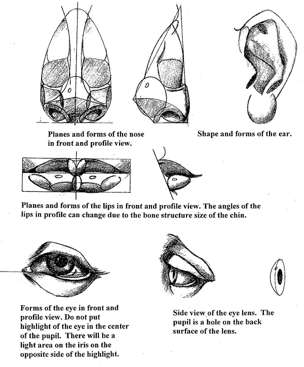
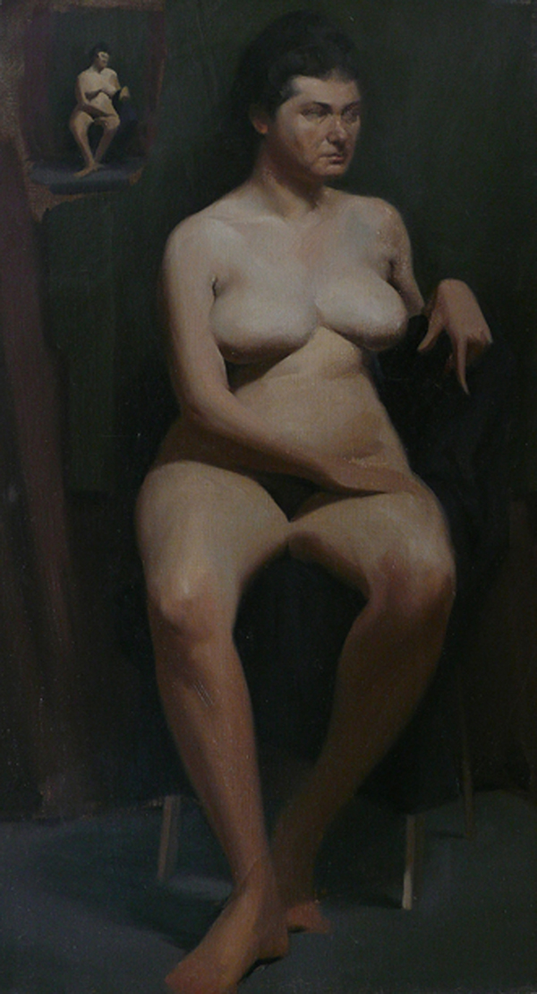
The other critical thing is to draw from life, draw the human figure. The human figure is one of the most complicated things you can draw. It’s alive and moves and if you learn how to draw and paint the human figure, you can draw and paint anything. Most people copy the human figure. What you should do is understand the construction of the human figure. People teach anatomy for that reason. But the most important thing is the structure, the planes and forms, superficially what you can see. Anatomy is nice when you can measure bones and muscles and so on, but you can do it without anatomy. Doctors know anatomy, but they’re not artists. What’s important is to know all the outside forms and planes of the figure that you’re painting and their relationships to each other. In the Elements of Painting, I have all the forms and planes of the human head and palettes to paint complexion – a row of greys, a row of orange and a row of red – with this you could paint any individual in the world. You can’t find this stuff in other books.
Page 140 from “Frank J. Reilly – The Elements of Painting” by Ralph Garafola
What is great today is having individuals in art studios that are teaching fine art. The big schools do not teach fine art painting. Find a mentor and learn from him or her. That was what Reilly did for me, with The Elements of Painting, it tells you what you need to know in order to paint. This is a must read for both the aspiring painter and accomplished artist – and everyone in between. This book presents principles and concepts of craftsmanship involved in the graphic arts. Pure Reilly method; it is written from my class notes as it was taught to me. It is the best investment any artist or educator can make.
Page 175 from “Frank J. Reilly – The Elements of Painting” by Ralph Garafola
About the Author
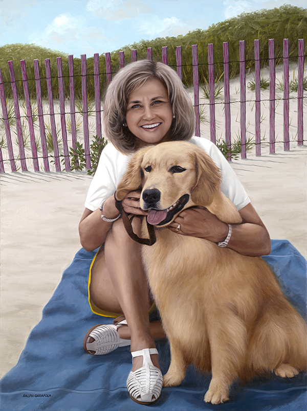
 Ralph Garafola; born in Brooklyn, NY has made a living as a commercial illustrator and fine artist for more than 65 years and brings his style of contemporary realism to his oil and watercolor paintings of portraits, landscapes, seascapes, still life and animals/pets. “All my paintings are portraits. Whether my subject is a person, landscape, seascape, still life or pet, my approach is to realistically portray my subject in its natural environment. It puts the viewer inside the painting”.
Garafola studied at the Art Students League for seven years with Frank J. Reilly, Instructor and Commissioner of Art for New York City. He travels throughout the Southern United States, Italy, England and France in search of new subjects and locations for future paintings while studying the works of the Old Masters. Garafola teaches in Florida at the Art Center Sarasota and Art by the Bay Sarasota. Garafola is also available for private lessons and workshops.
You can see his artwork and learn more about him at http://ralphgarafola.com/.
All of the images are Copyright protected by Ralph Garafola. Reproduction is prohibited.

Leave a Reply