I have had a passion for color for as long as I can remember. I am fascinated by its use, meaning and how it affects human behavior.
Although I consider myself a fairly sensible person when choosing colors for my design projects, I discovered the importance of working with an accurate and universal color system like the Munsell color system after graduating from college. I studied interior design and worked on small independent projects for a time while living in Mexico. During that time I learned about color control thanks to the mistakes I made when choosing paint colors that didn’t work as I’d expected. The Munsell Book of Color would have been helpful in those situations where clients wanted to match the color of their walls, but did not remember the name of the paint they had bought years ago.
Color Communication in the Global World
My own curiosity and need to find a way to communicate color accurately and consistently led me to investigate more about the way we visually match color as the result of Albert H. Munsell’s work nearly a century ago. Using Munsell Color Theory is, in my opinion, the best way to identify and understand the relationship between colors even in the simplest projects. It has also been extremely helpful, in my experience, as a blogger. For example, I receive many questions from readers that want to decorate their home using a similar color from an image just shared on my blog. How can I explain to a reader who lives in another country what color he or she could buy to achieve the same result? I could investigate what stores they have locally and look through the inventory of those stores to see which colors closely match, or I could simply find a similar tone in the chips (Munsell book) and send them the code so the color can be recreated in their local paint store. I could take it a step further and look for other colors with similar hue, value or chroma that would create a harmonious palette for their entire home.
Color in the Surface & Print Design Industry
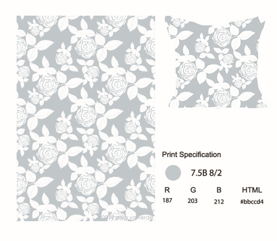
My career as a designer has brought me the curiosity to start a new adventure designing patterns for home decor products such as pillows, shower curtains, wallpaper, dishware and other decorative items. Shortly after starting to explore the industry I discovered the importance of understanding and using a global color system to communicate color accurately with companies and manufacturers. Understanding the same language of color throughout different parts of the design and printing process is much easier when we communicate with a code or nomenclature that allows a consistent color match in every part of the world.
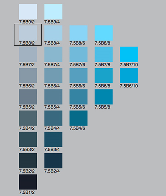
During my research I found the Munsell color order system as a functional tool to communicate and reproduce colors consistently. The system is based on a three-dimensional model represented in the Munsell color tree with each color having three qualities or attributes: Hue – colors like red, orange, yellow, etc. Value – the lightness or darkness of a color and Chroma – saturation or brightness of a color.
Why is this important? Because the interpretation of a color varies greatly from one person to another and from culture to culture. For example, working with a global client, often all I have to work off of is a virtual brief, i.e. I have not met the client in person during the project. If they say “use a sky blue”, but my idea of “sky blue” is very different from theirs (because we all see colors differently) this has the potential to cause confusion and errors. To make it easier, I can provide a hexadecimal number, Pantone number or Munsell code to identify the exact shade of sky blue they envision.
Companies may also have restrictions of colors on manufacturing for technical reasons, based on brand guidelines, or may be following a strict trend of color. This is when color books become useful. Companies can specify a color to a designer and know how it will look when printed because the code is universal.
It helps to be aware that computer monitors are calibrated differently which can also lead to unexpected print results. However, if we are using a Munsell code, this tends to minimize the risk and stress.
Specifying Color with Munsell
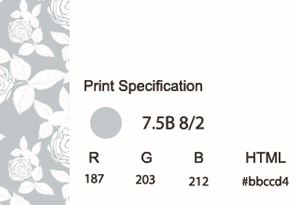
If I am designing fabric for pillows with a light blue floral print, I convert the #HEX code, in this case #bbccd4, to a Munsell color system code. When I send the document to the manufacturer I will specify the background color as: 7.5B 8/2 with 7.5B meaning the color in the middle of the blue hue band, 8/ meaning medium value (lightness), and a chroma of 2. This way I have the desired background color under control.
Aside from the importance of the using the Munsell system as a color matching system and industry standard, I found Munsell color theory quite functional when choosing color palettes while working in graphics and patterns digitally.
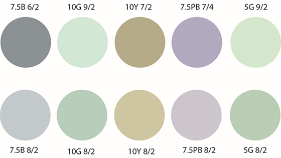
During the creative process I have found that I tend to use a large number of solid vivid colors in the range of approximately 8 chroma. When trying to create color palettes with lower chroma being less pure (more washed out, like with pastels) I could not get the desired result for some reason, i.e. the palette looked dull and dusty. Thanks to the exploration of the theory of color, including the book, A Color Notation by Albert Munsell, I have learned to identify new ways to create harmony in the color palettes and select colors with the same visual description as different values of a single hue and different chromas of a single hue.
In the surface design industry, it is extremely important to accurately communicate between all the parties involved, company, designer, manufacturer, and retail, and make sure that all parties regardless of where they are located are speaking the same language of color. It is also essential to remember the importance of color in the industry and stay ahead of global color trends. When developing a new pattern or print collection, color has the power to create an impression that separates it from other designs which in turn, helps to sell the product.

About the Author
Elba Valverde, designer, blogger, and founder of Live Colorful. She found her passion for color at an early age, ever since then she has been passionate about learning more about the meaning of color, it’s use and how it affects human behavior. Elba has several articles published on various online magazines and blogs. She has also created Live Colorful, a website about the use of color as a tool for branding, designing and personal empowerment. On Live Colorful she shares cheerful projects, fun color palettes and often talks about her obsession with color trends in fashion, decoration and design. Recently her passion for color, design and patterns has led her to jump into a new adventure as a surface pattern designer. Visit her website here.

Leave a Reply